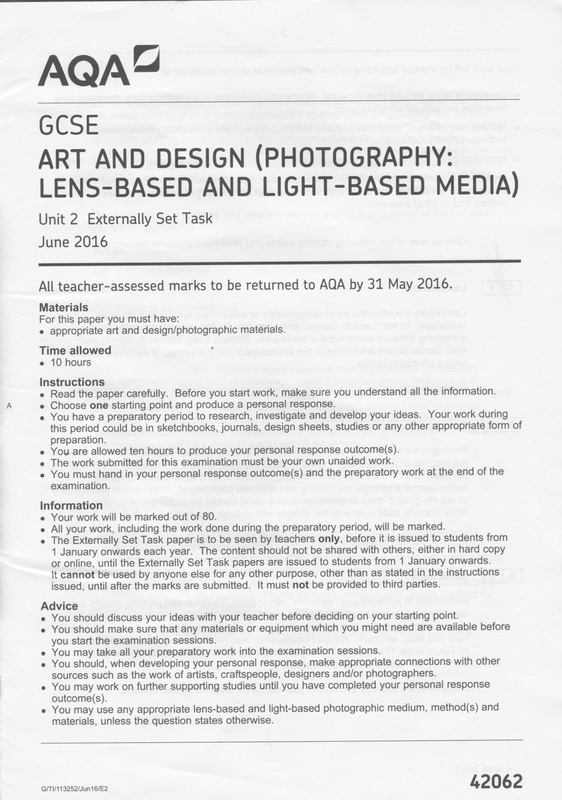
Unit 2, Externally set task: Reflections
 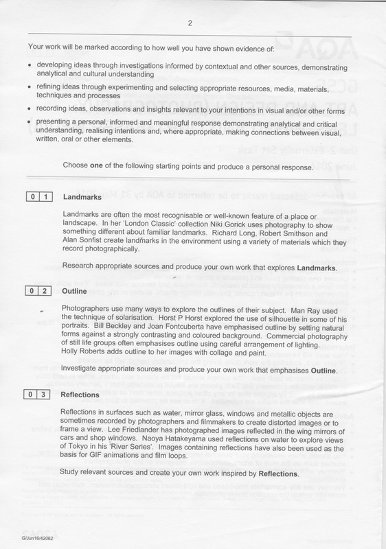   |
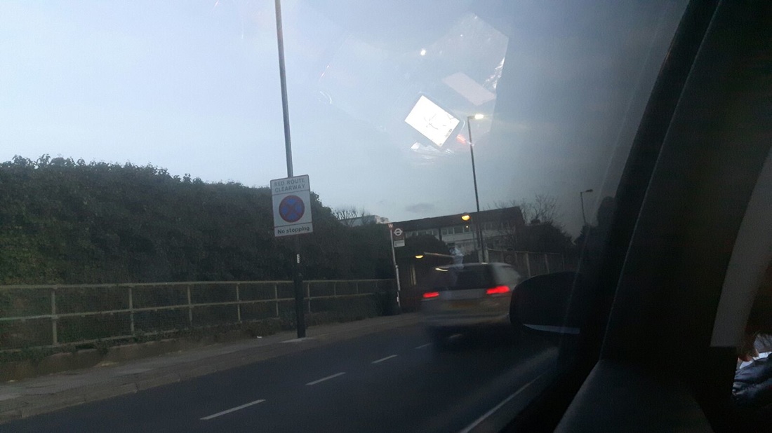
For the Unit 2 externally set task Ive chosen to do Reflections. This is because I looked at some of the example work on Pinterest and I really liked the look of them. Some of the work I liked was created by Lisette Model. I liked how she takes images of reflections on Buildings as they look really effective and always looks different then normal reflections. I think that I am going to have a go at taking images based on Lisette as I feel like i can do more with this than any off the other themes given above. I can do more with reflection as its quite an open theme which is why I chose it.
Im also going to have a look at some more photographers and see if their images appeal to me too and then take some images based on theres or merge both of their ideas together. INITIAL PLAN:
|
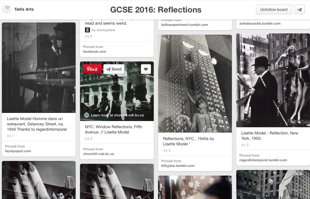
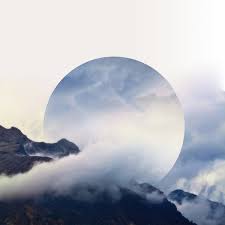
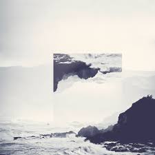
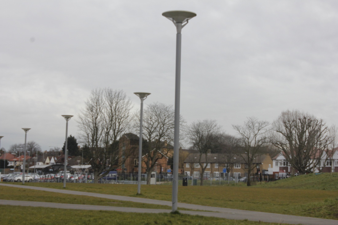
Click below to view some initial ideas
LISETTE MODEL
|
|
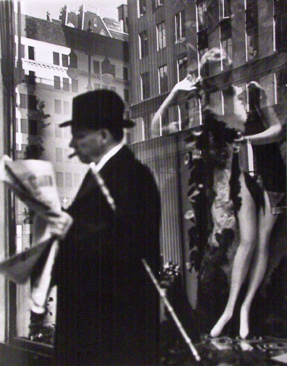
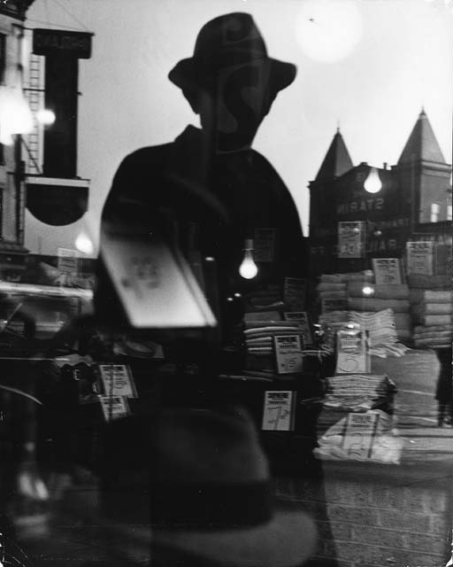
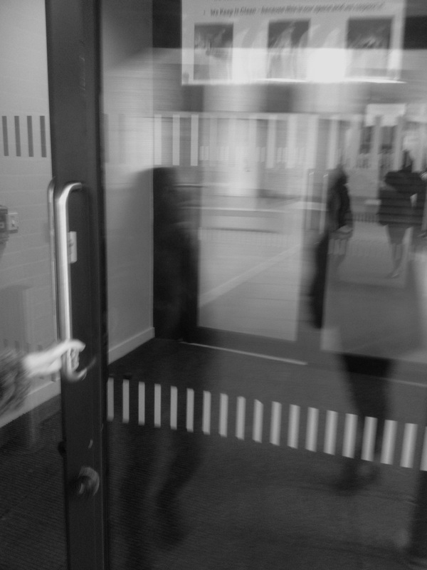
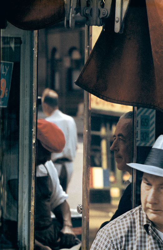
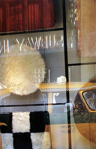
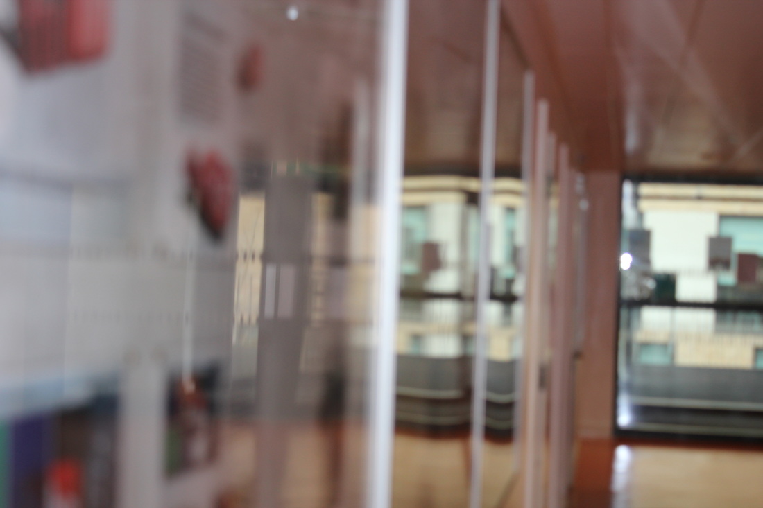
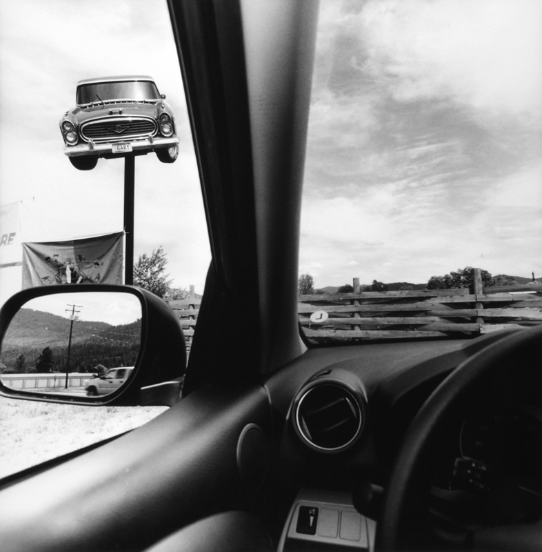
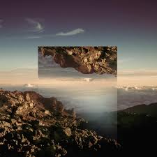
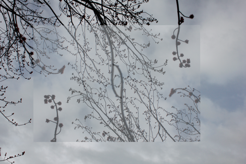
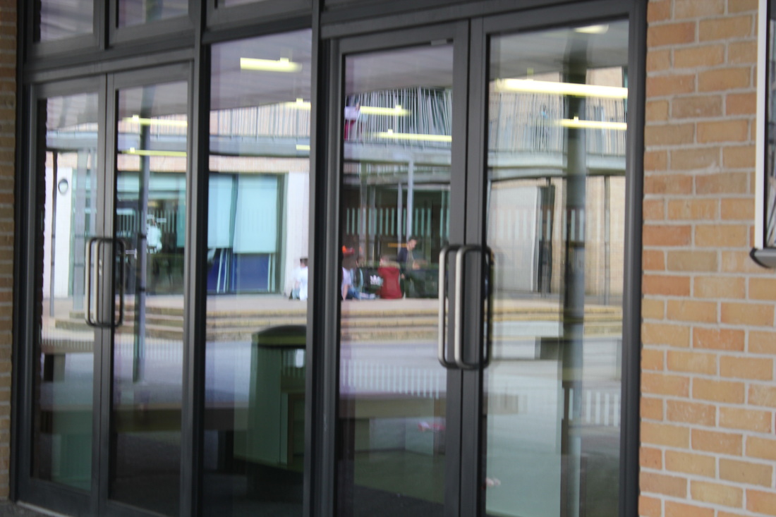
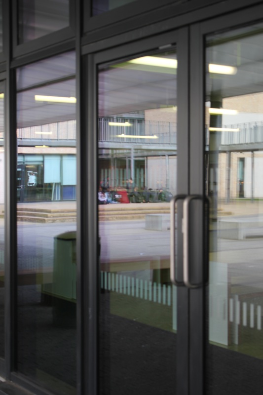
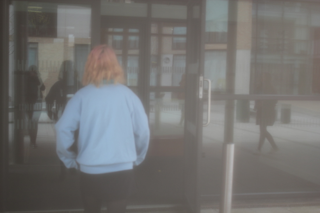
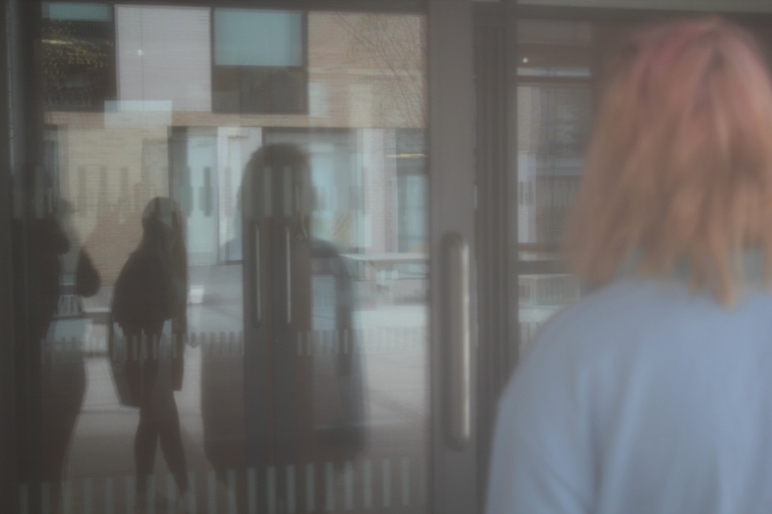
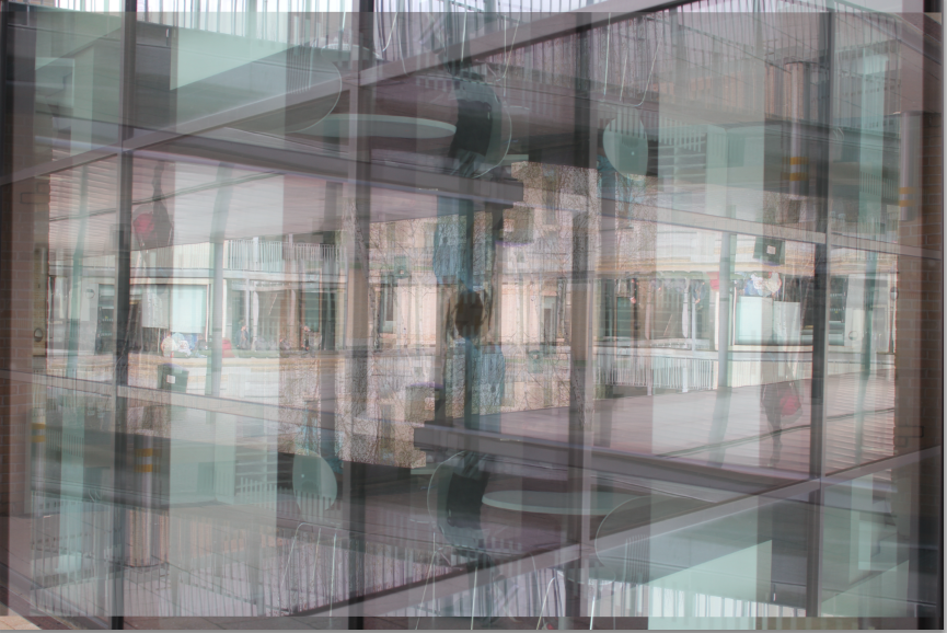
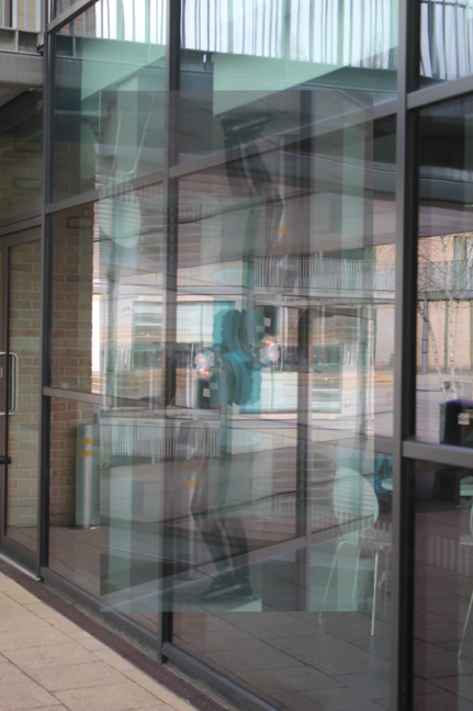
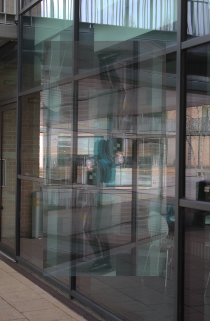
The first artist I have decided to research is Lisette Model. Ive decided to pick her as my first artist as I like the way she takes photos of people which have been reflected on to another person through shop windows or building windows. I like this because it looks like she has merged two images together when he hasn't its just a reflection. All of Lisette's reflection images are all taken in black and white and all Gelatin silver process. I think that this makes the image more effective as I think that it brings out the refection more than if it was in Colour. Most of the images she takes are quite surreal looking as well. The composition of all her images are interesting as she captures a figure of a person in the centre in most of the images. The figure is usually surrounded by movement and the busyness of the city. |
|
This is one image that I early like that Lisette has taken. The reason why I like this image is that I like the way she has captured the man in the who or bar and it looks like he's actually in the road and not in the shop. I also like how she's captured the reflection of buildings in the background. There is a mix of light and dark tones from where the light is shining into the window and the dark tones where the light has created a shade. I also lil show she's captured a shadow of another man in the background too as it makes the image more interesting and gives an eerie effect to it too. I think that the way she's captured it makes it look really vintage and interesting because of this. I want to try and take some images like this as my first experiments. |
|
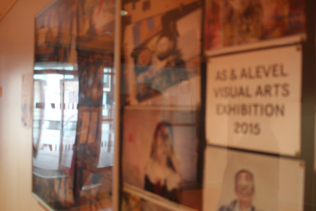
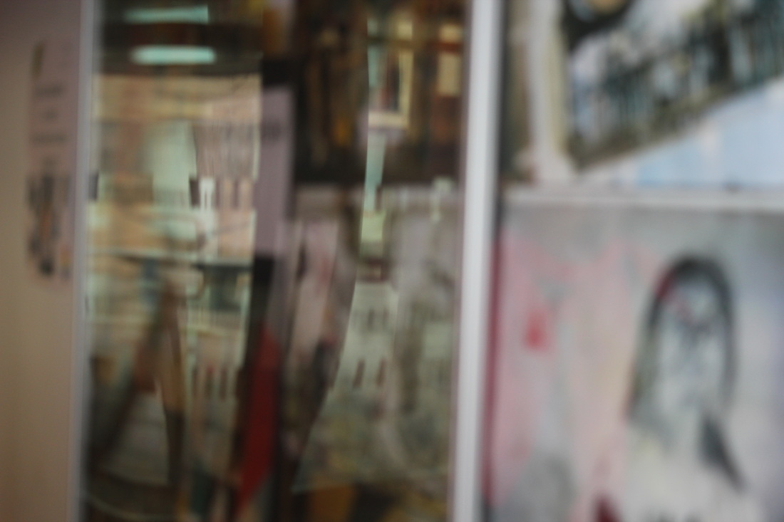
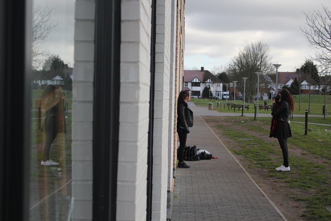
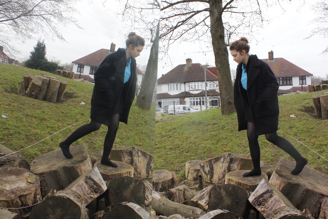
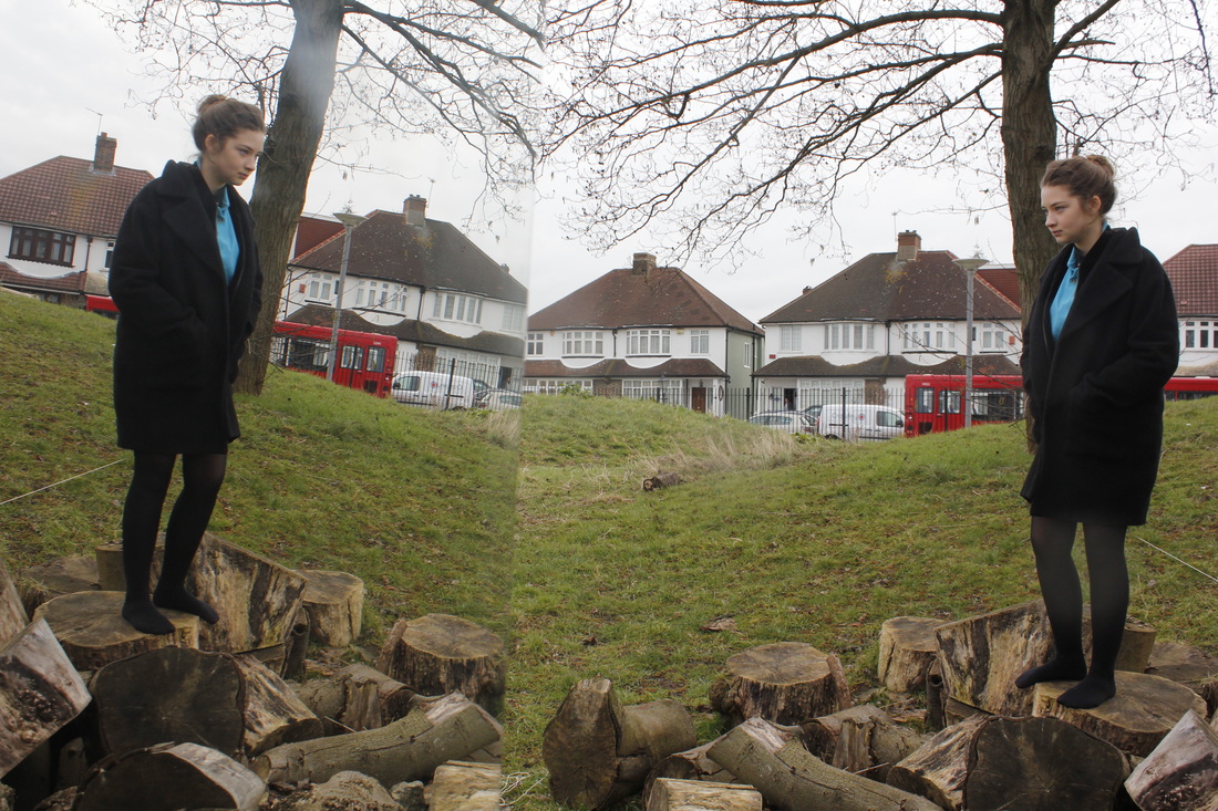
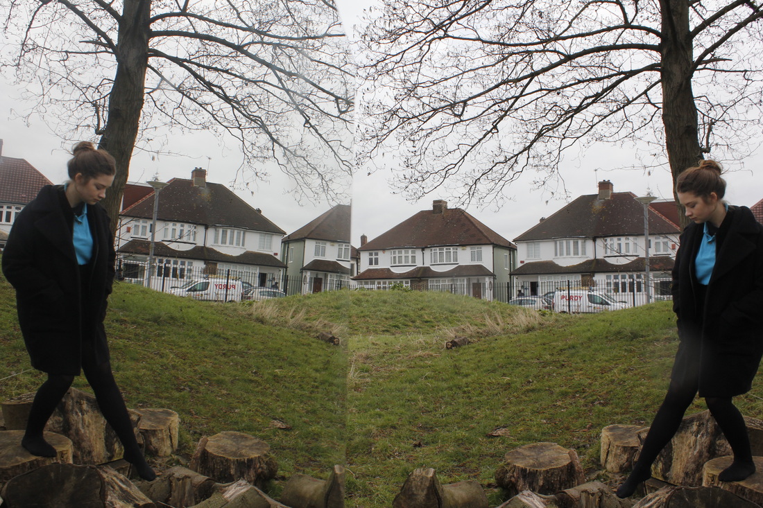
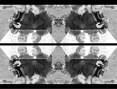
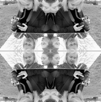
MY FIRST EXPERIMENTS
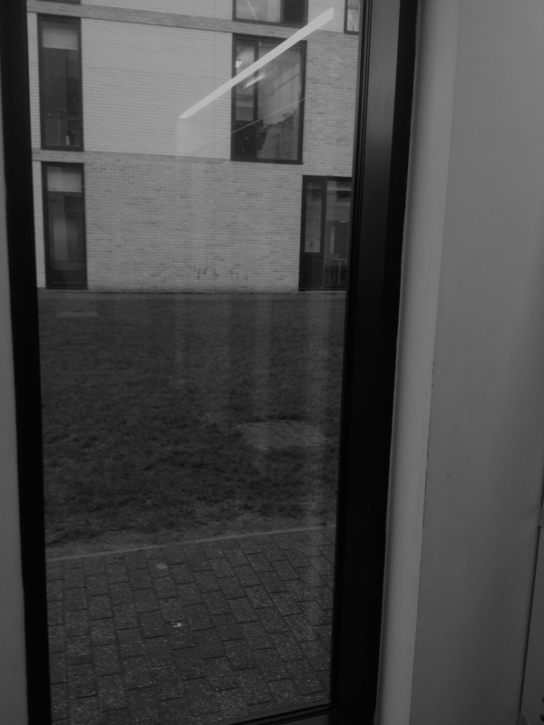
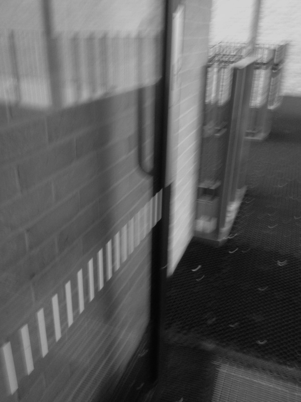
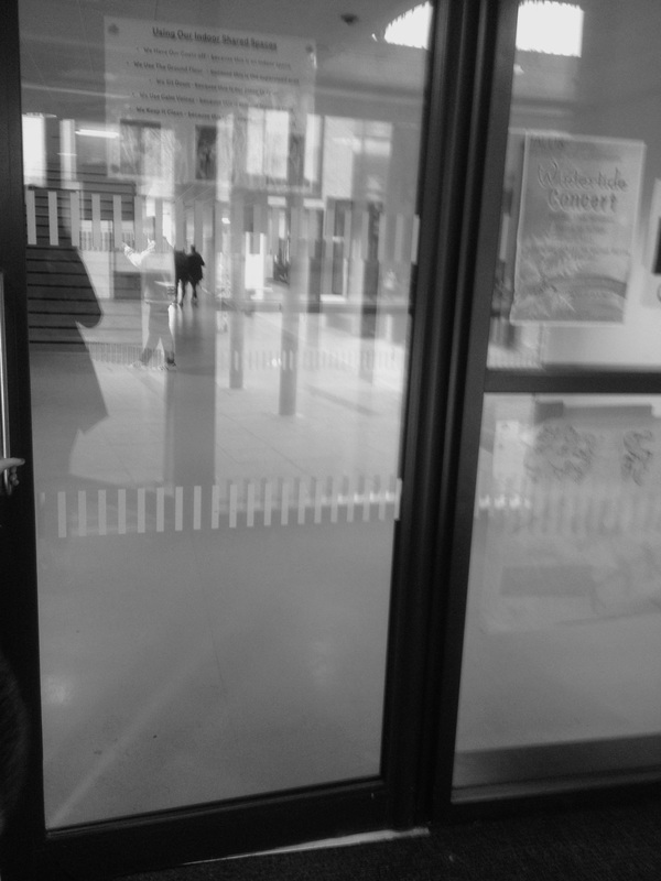
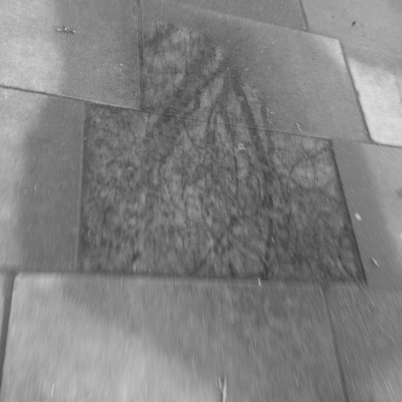
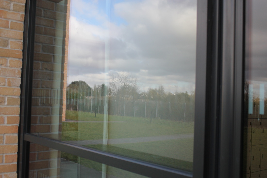
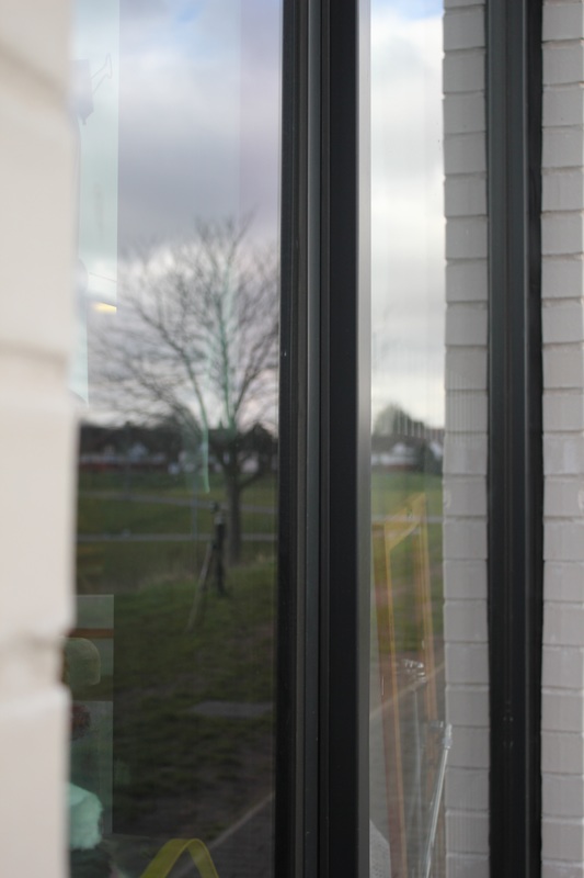
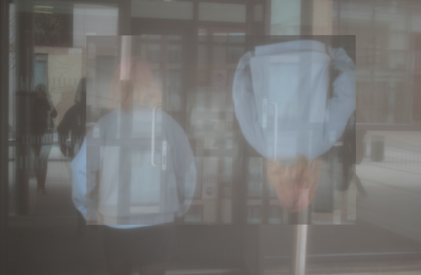
This was my first experiment I have done for reflections. I took these images with a iPhone and captured them all in black and white. I think that some of these images work and some i think need to have a clearer reflection in them. One image that didn't work too well was the last image. This images doesn't really have any reflection within the image, it just has light being shone onto the ground. I think I need to try capture more of a reflection for example maybe having a figure standing there or trying to capture the reflection of the lockers or another object through the window. One image that did work well however was the first one on the last row of images. I think that this worked well as I have captured the reflection of two figures.
SECOND EXPERIMENTS
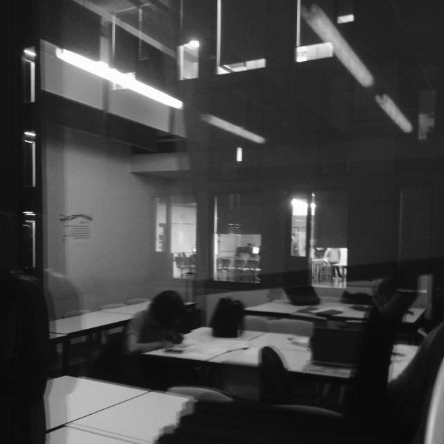
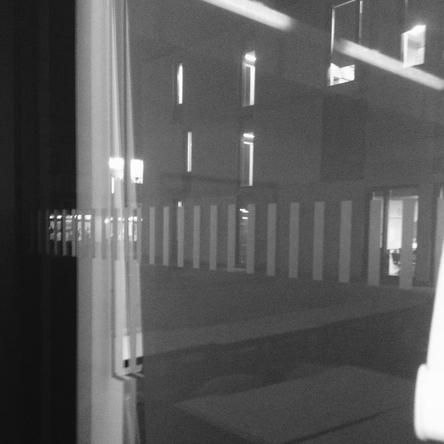
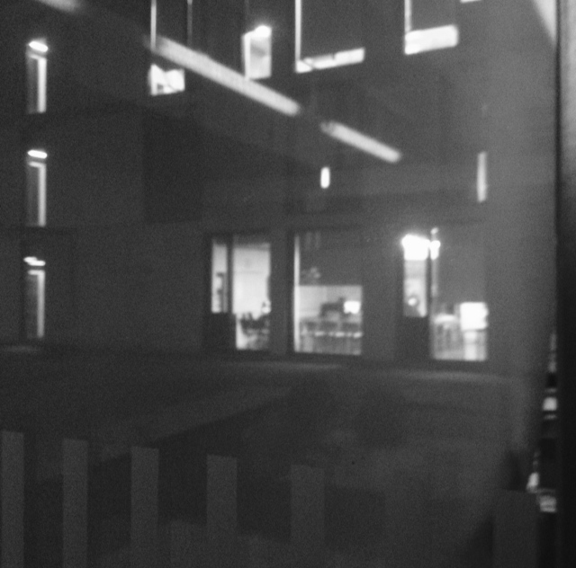
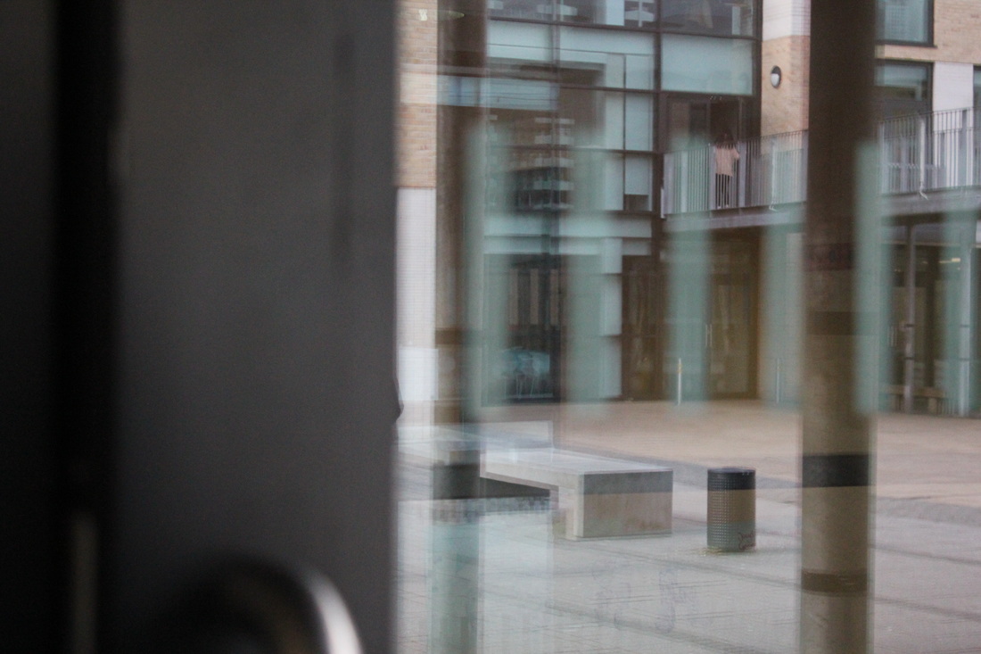
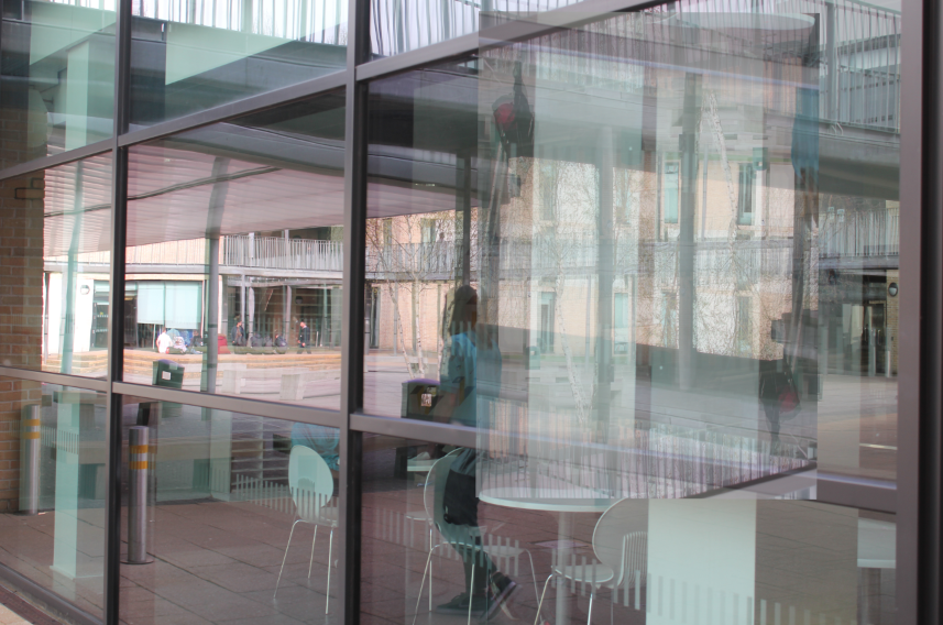
These images were my next set of experiments. I took these images with a iPhone camera again. I think that some of these images went well however some could of gone better. An image that worked well was the first image. I think this image turned out well as I have managed to capture the reflection of a building and its light onto a window which has a reflection of tables and a figure in it. I captured the image in black and white as I feel like it brings out the reflection more of the buildings and the lights and also it has a good contrast of tones making it effective. One image that didn't work so well I think is the first image on the second row. I think that this image didn't work so well because it has a lot if movement within the image. This makes it look blurry and not show the reflection too well.
SAUL LEITER
|
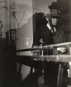
The next artist I have decided to research is Saul Leiter. Saul Leiter's images are similar to Model's images in the way that they both take images of reflections of buildings and people reflected onto them. However there are some differences between the work of both of these photographers. For example Leiter doesn't take all his images in black and whit like Model does. Also Leiter has included cars in most of his images as well as people and buildings. Next, I want to try and take some images based on him, including images of both cars and people and buildings and take them in colour.
|
|
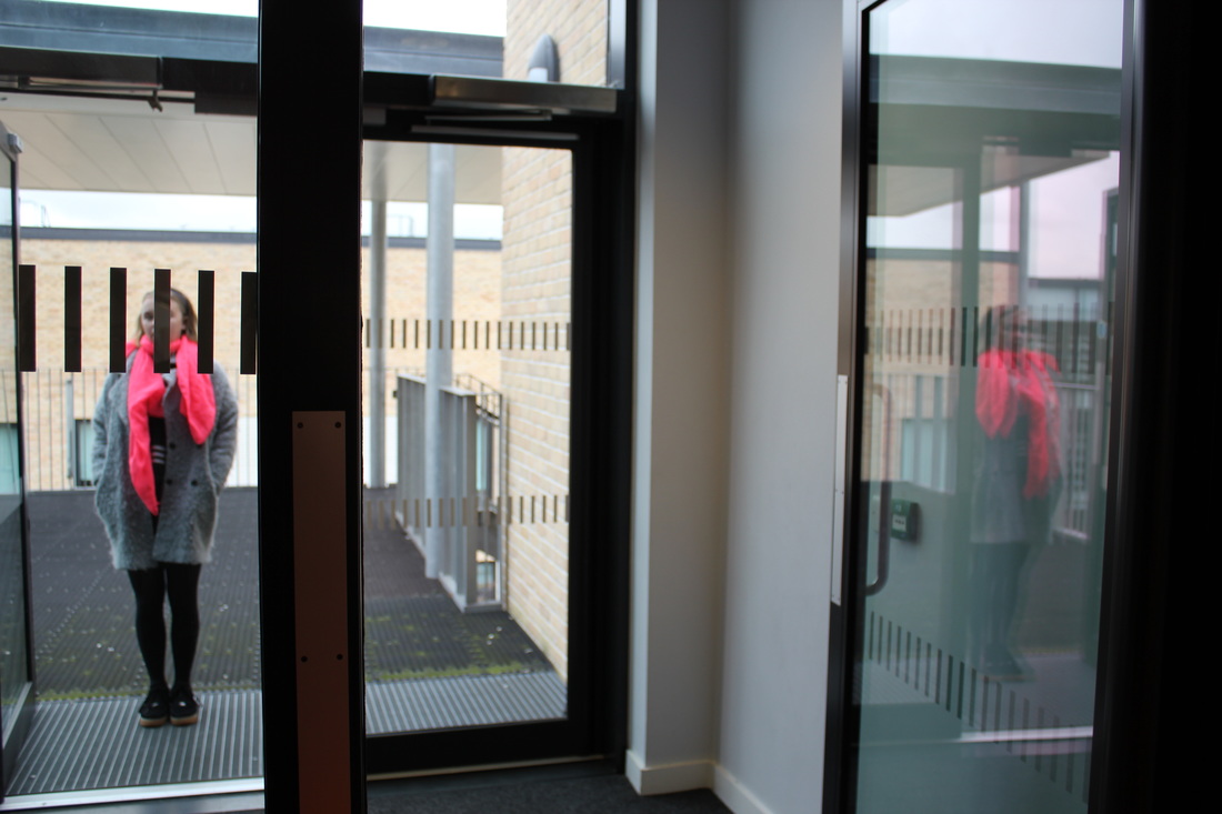
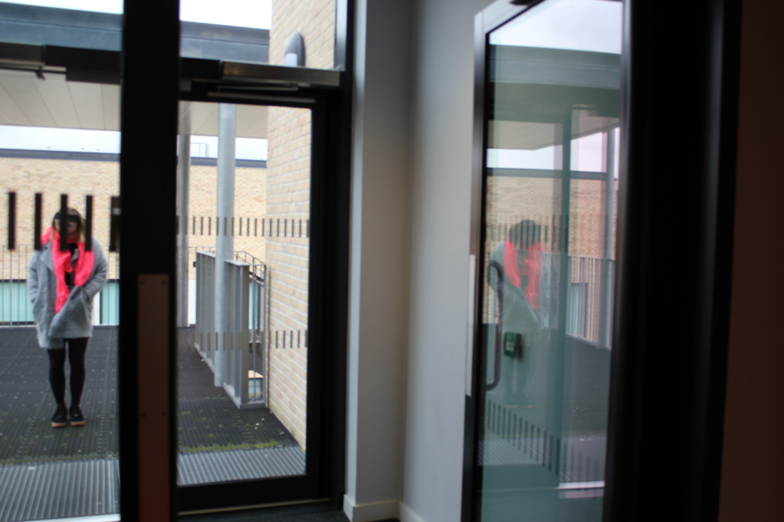
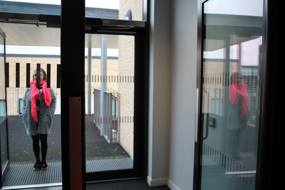
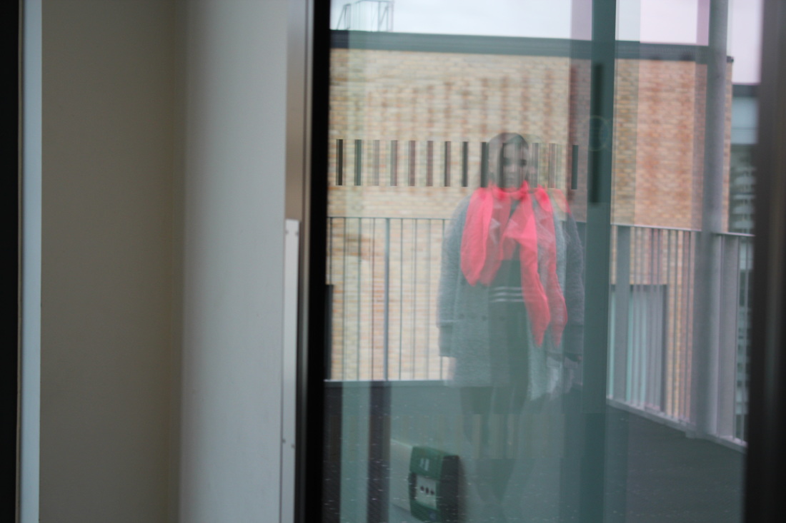
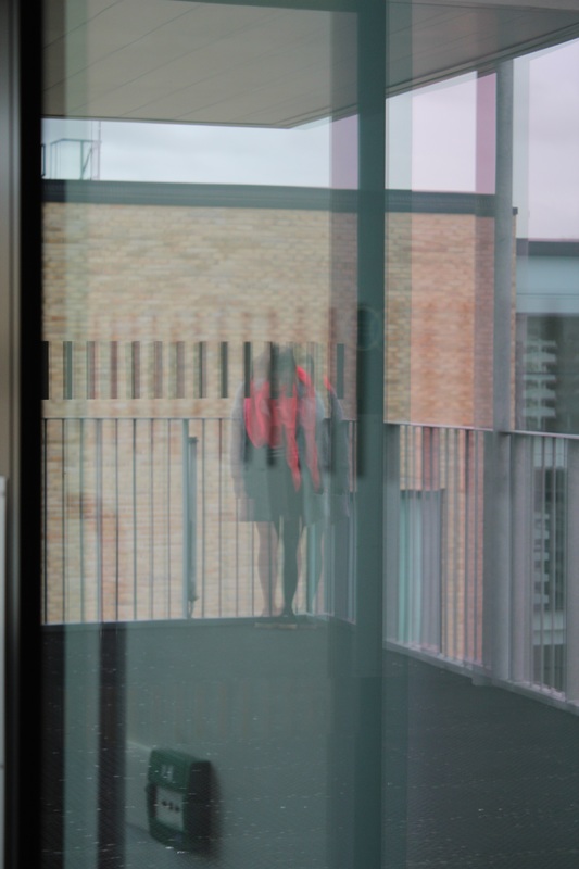
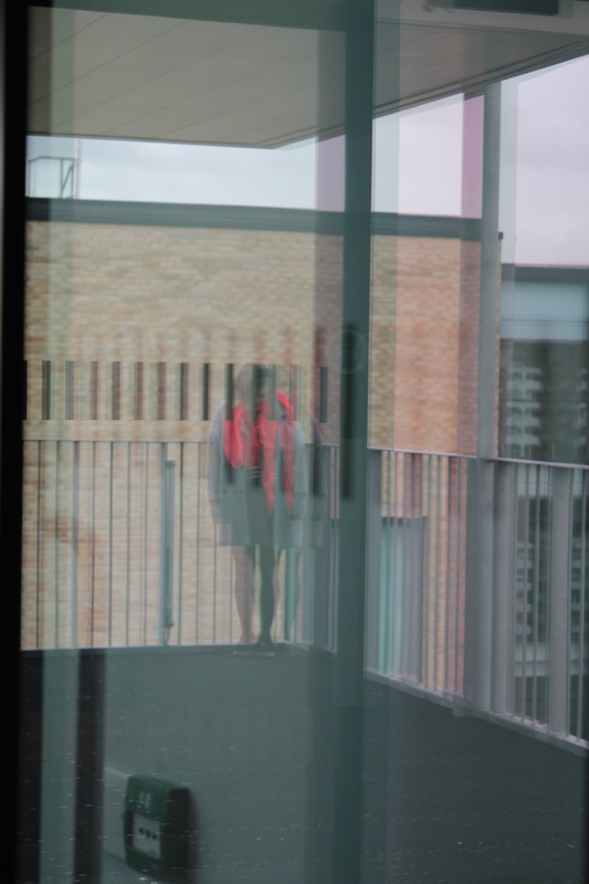
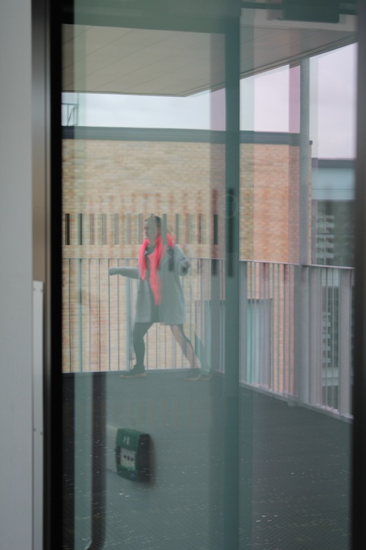
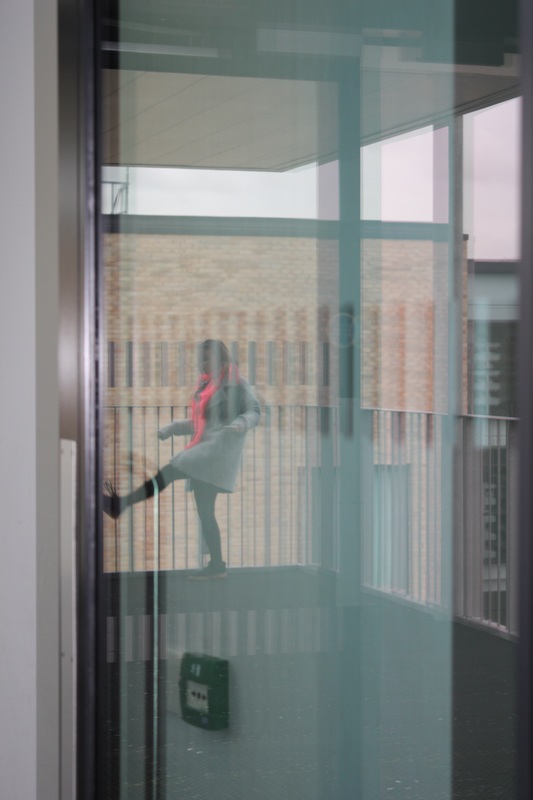
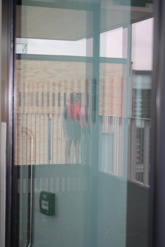
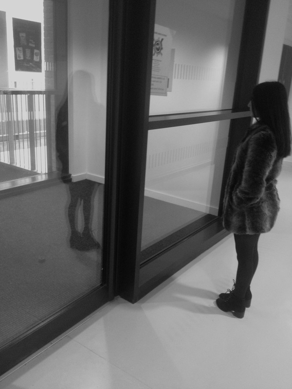
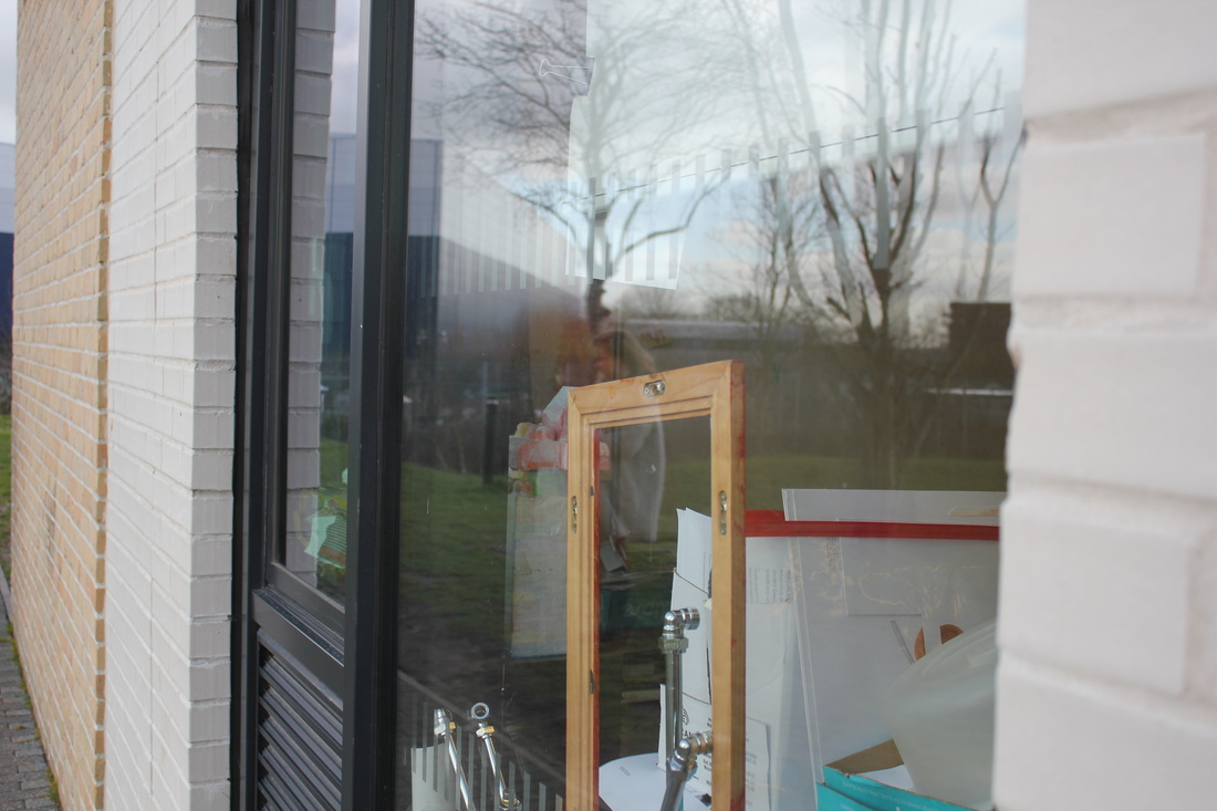
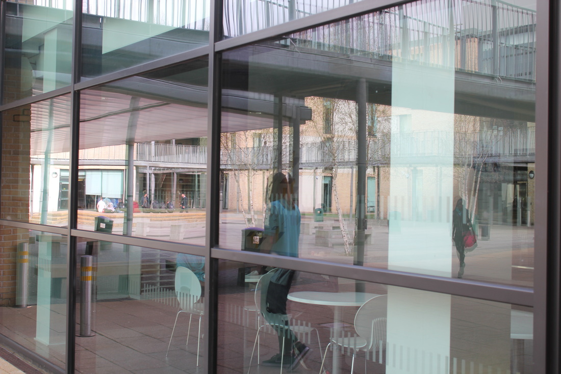
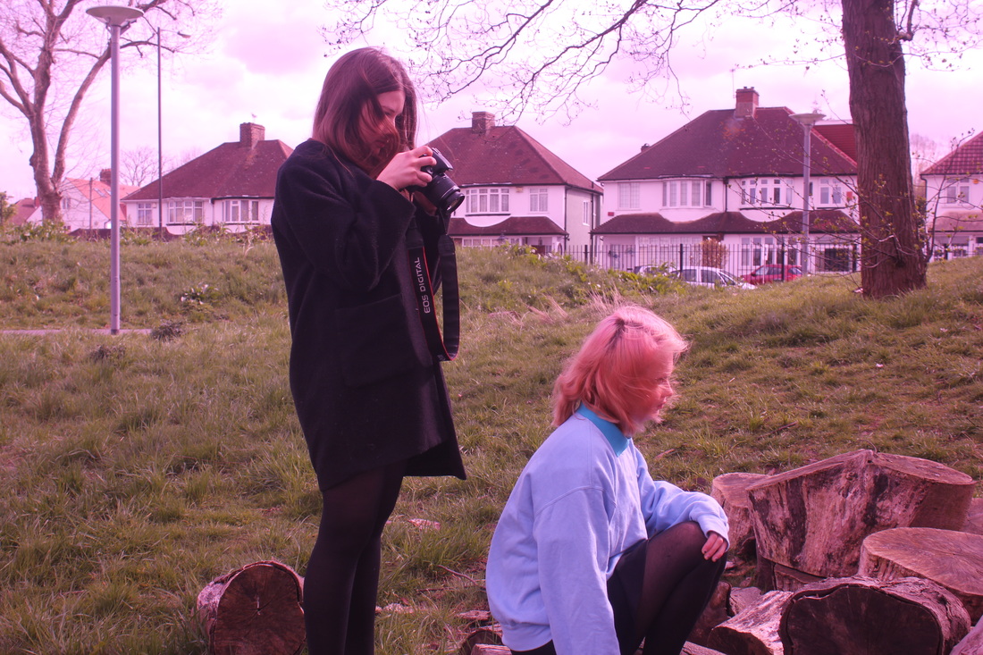
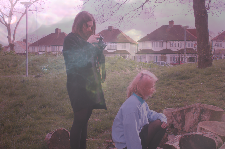
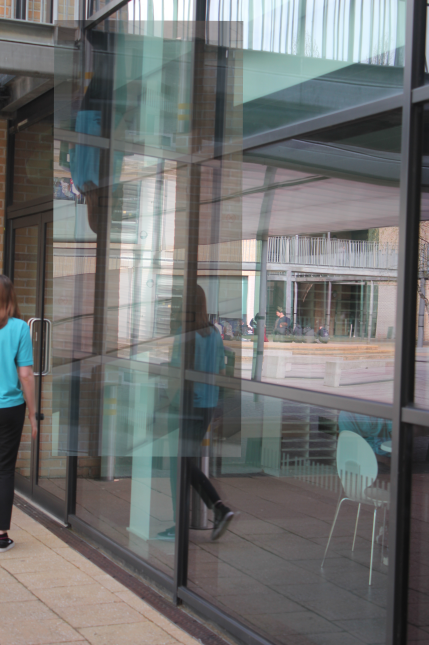
These are my next set of images I have taken. I took these images with a DSLR camera. I've captured all the images in colour. I based these images on both Model and Leiter's images. I think some of these images worked well however some didn't turn out too well. The ones that didn't work out so well were the ones reflected on the display boards. These were the first four images above. I think that they didn't work out so well as I feel like you cant see the reflection much. Also because there is a lot of colours within the actual display board, it doesn't show the reflection as well as it would if it was a plain display board so to improve these images I think I need to find a plain, clear or transparent background to reflect an image on so the reflection actually comes out. However the images that did work well were the bottom half of the images especially the ones in the last two rows. I think that that these set of images worked well as I like the way that the images are quite blurred out and aren't really in focus. Within the images there is a reflection of both the person within the image and also the reflection of the doors and the building. The thing I like most about these images is the fact that they have all been captured in a similar colour but have the colour of pink in them. I think that this makes the image look more interesting as it adds a bit of colour to the image even though its not in black and white. It adds a sort of life to the image. I also like how the image has a sense of movement to them, for example the way I have captured the main subject moving her legs in the air in the second to last image on the bottom row and the last Image on the fourth row.
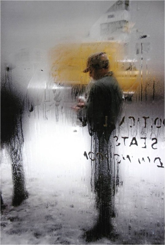
LEE FRIEDLANDER
|
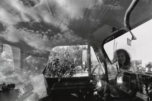
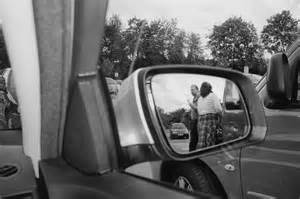
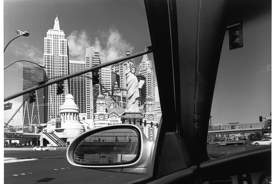
Lee Friedlander is the next photographer which I have decided to research. I found Friedlander by looking though some images on Pinterest. The images that Friedlander takes really grabbed my attention as I like the way he has quite a small reflection but captures a interesting background to compliment the image in the reflection in the car window. I also like how he takes most of is images in black and white as it kind of gives a a story to the images and when everything is in black and white you aren't drawn to one thing because of it colour, it makes everything in the image equal. I want to have a go at taking some images like this and try and capture images that have or tell a story behind them. |
|
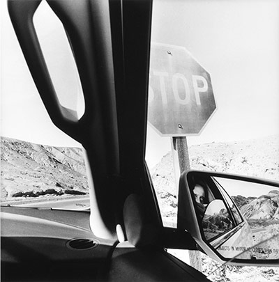
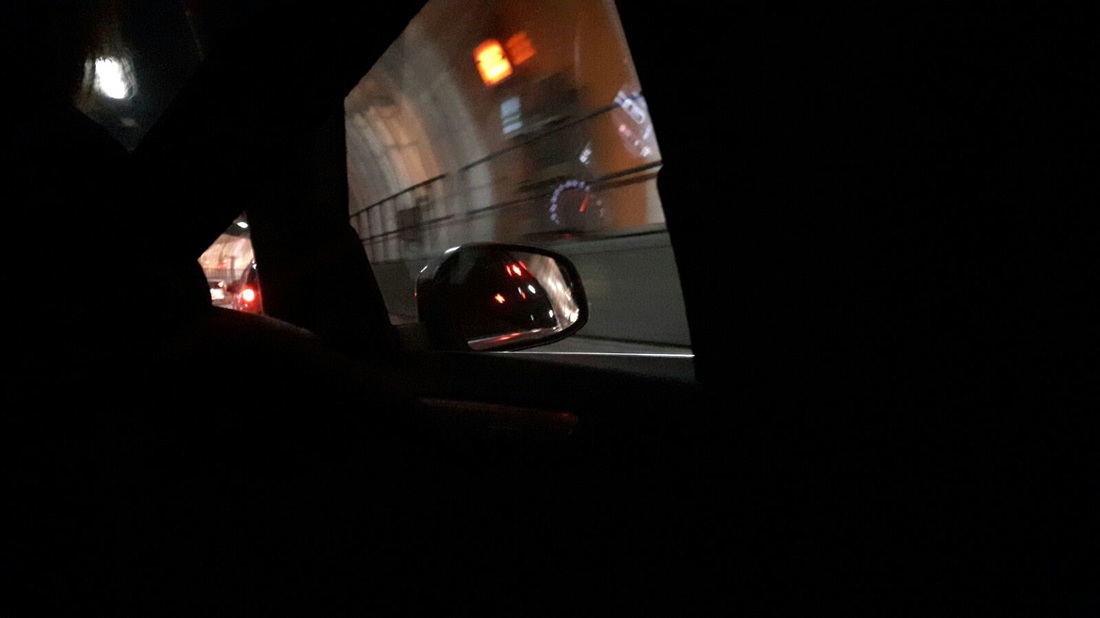
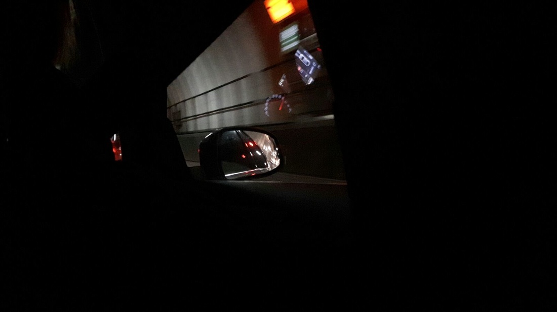
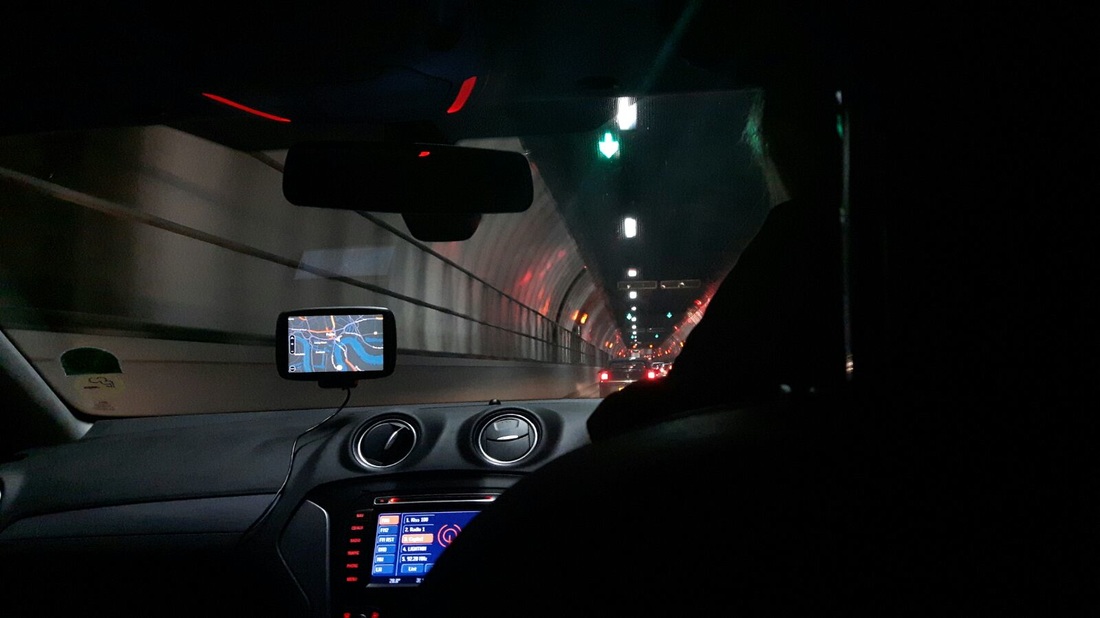
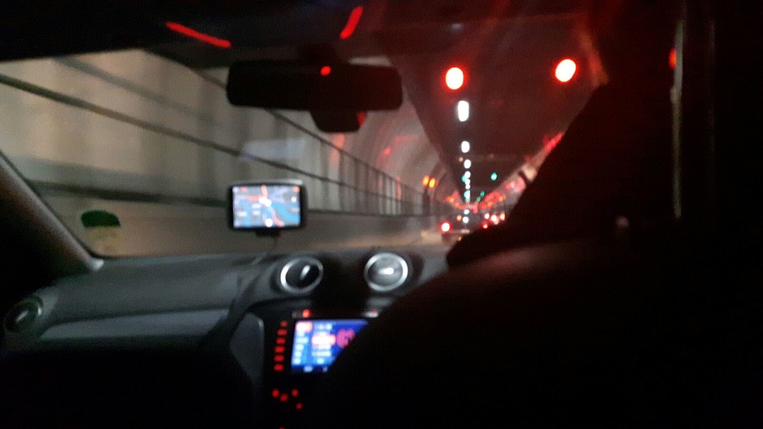
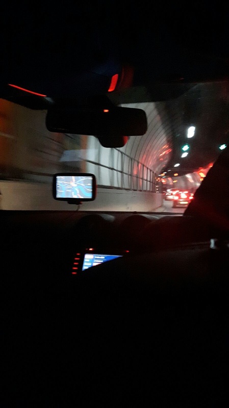
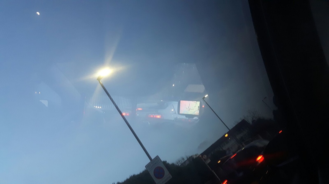

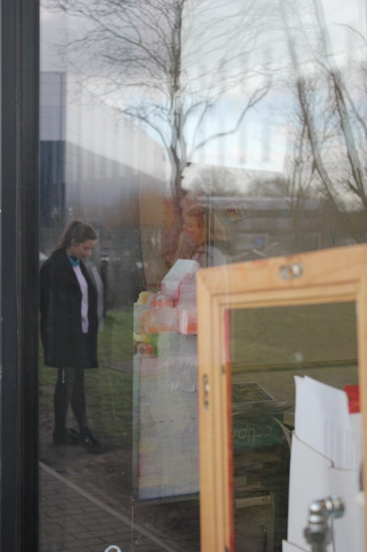
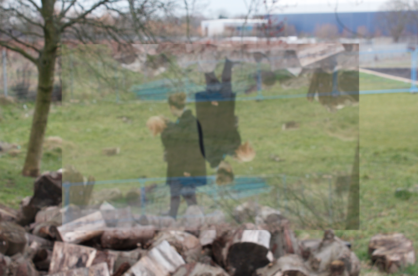
These were another set of image that I have taken during the half term. With these image I focused more on the reflection you would see in every day to day life. In the images above I have captured the reflections that are visible in the car for example he sat nav and the car lights of other cars but also the reflections of the lights of the tunnel. I think that the images turned out well and have a clear reflection however I feel like their really repetitive and are all very similar. For example the image of the front of the car reflected on the sky is very similar to the other image next to it on the right they just have been taken at different angles. I think that I need to experiment a bit more and try to take some images out of the ordinary and not similar images to the ones I have already taken. For example with the images above I maybe should have tried to take some images that aren't exactly the same and maybe some that included the reflection of buildings or people on the cars too to have something different.
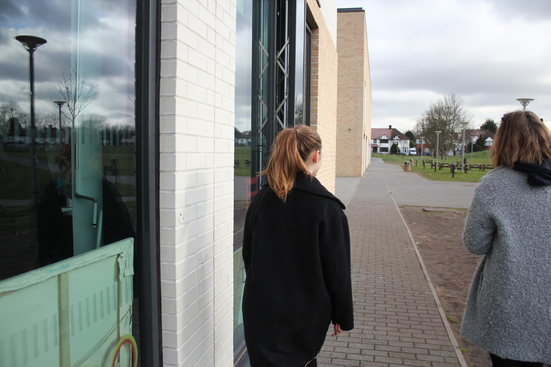
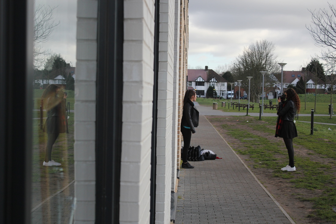
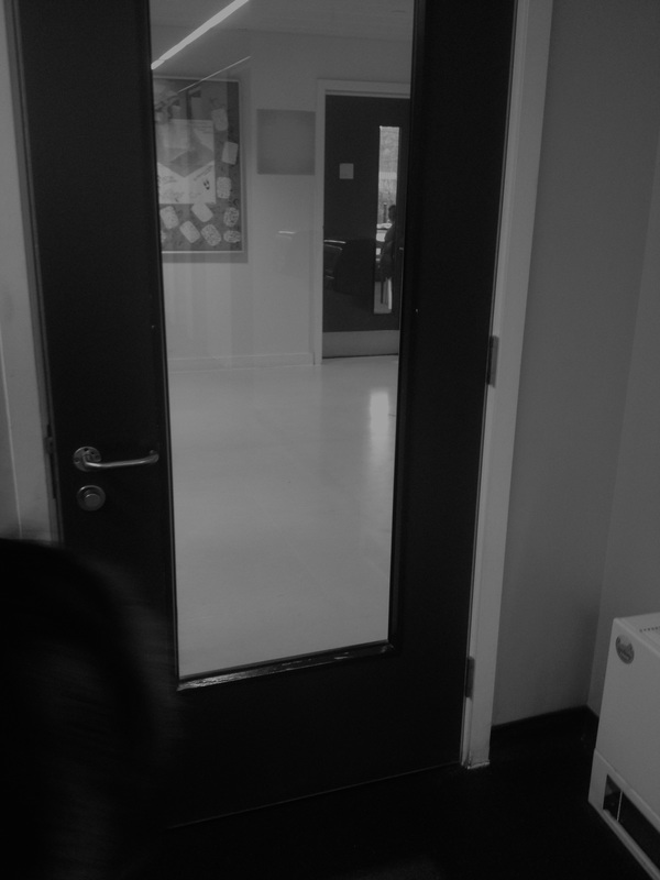
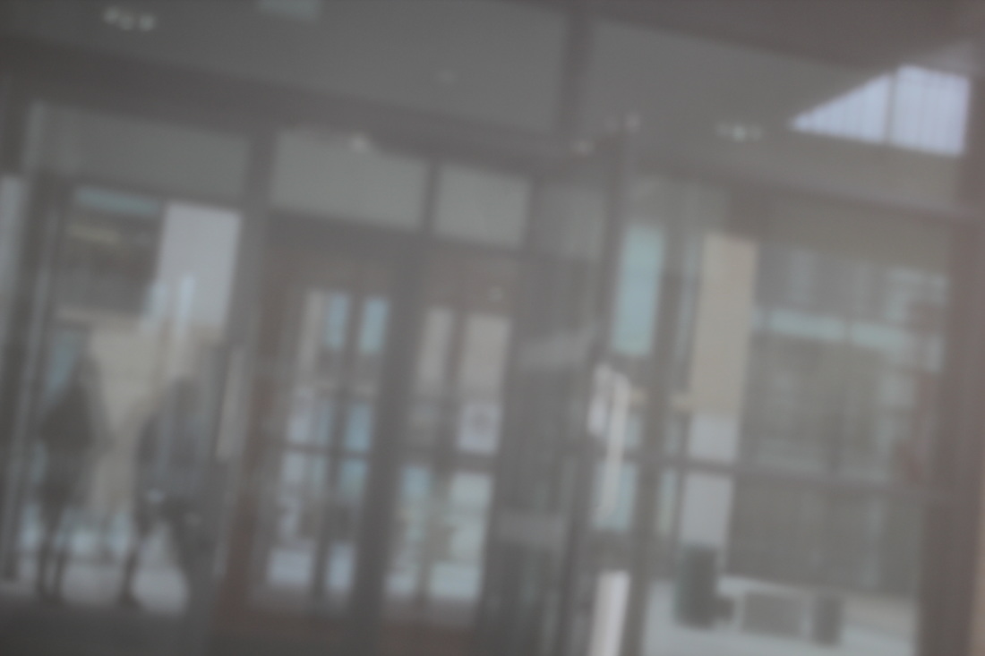
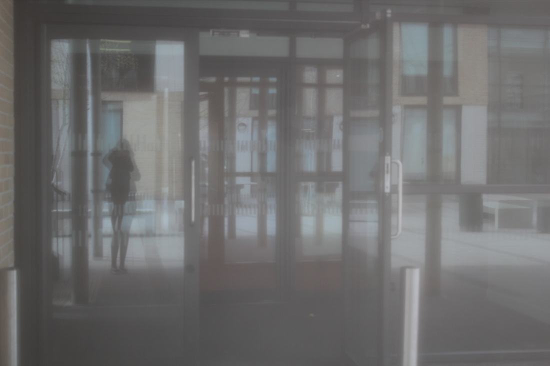
With these images, I wanted to take images based again on Saul Leiter as I really enjoyed taking images based on is work before. With these images I took some of them based around the border of the window so the reflection would just be centred and composed in the border and not have anything else in the surroundings in the images. I think that this makes the image look neater then having lots of other things in the area just interfering with the image. Most of the images contain figures in them which gives the image a bit more of a story too them then just having a plain image with a plain reflection. It makes you think behind the image and wonder what the figures are doing there in the image. After this I want to develop these images maybe using photoshop or researching a new artist and taking pictures based on their work.
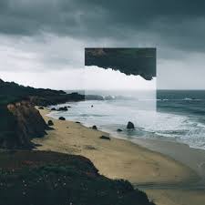
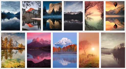
VICTORIA SIEMER
|
|
Victoria Siemer is the next photographer I have decided to research. I have decided this as I like the way she edits her work having parts of the image Photoshopped upside down on the image. I like the way its photos of landscapes and nature as well as I think that if it was with normal everyday pictures then it wouldn't of looked as absurd and interesting as it does. I think I might use some of my old images firstly to have a go at creating some similar images to Siemer's on Photoshop, then I'm going to have a go at taking some new images and editing them as well on Photoshop. |
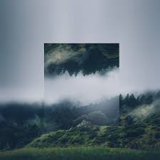
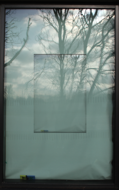
These were my first trials of experimenting on Photoshop. I used the images I had taken previously just to have a first experiment and experimented with photoshop to create images based on the ones Victoria Siemer had created. I think that these images have worked well and look really alike to Victoria's images. The thing I like most about the first image is that I like the way the actual background image is taken fitted into the border of the window as it its a border of the image. This works well as it makes the reflection look better as its all in its own border. I also like the fact that the image has a
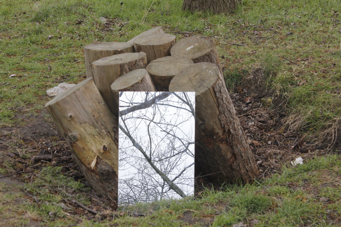
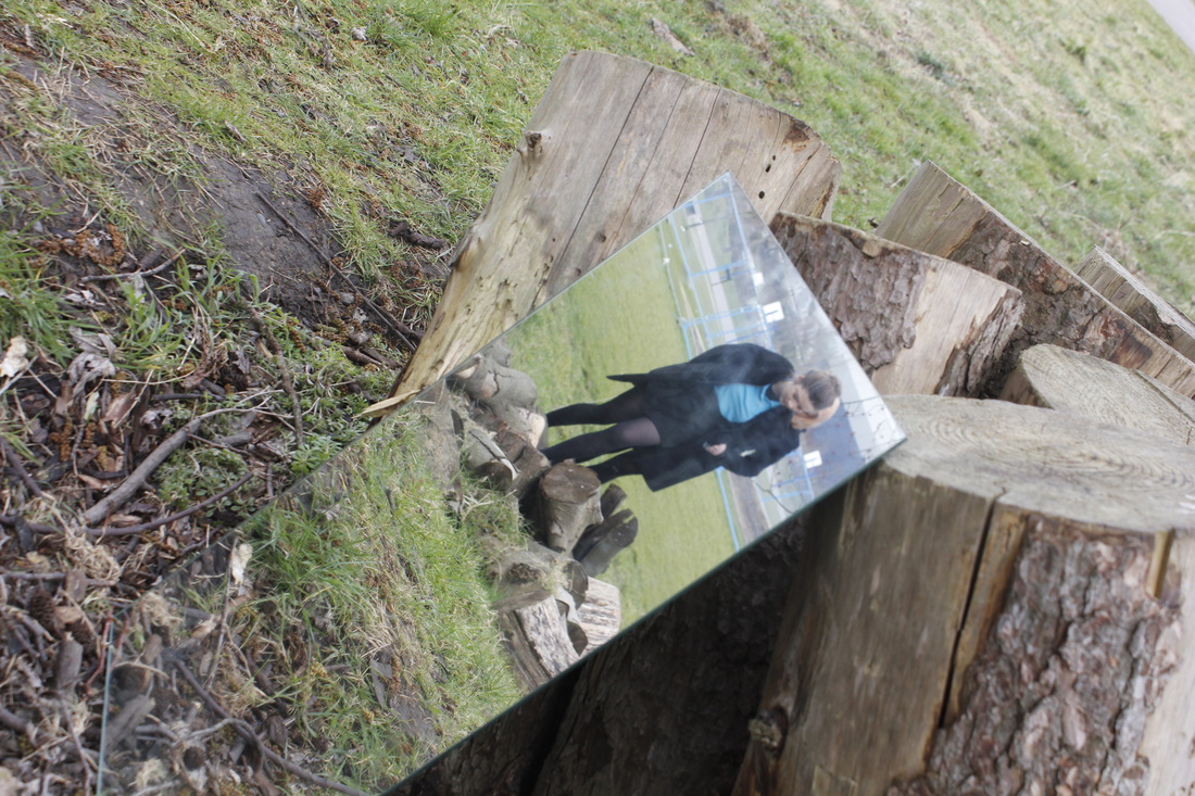
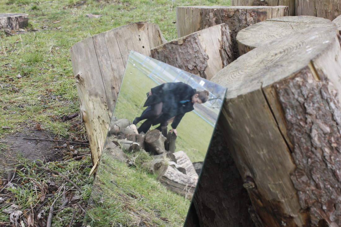

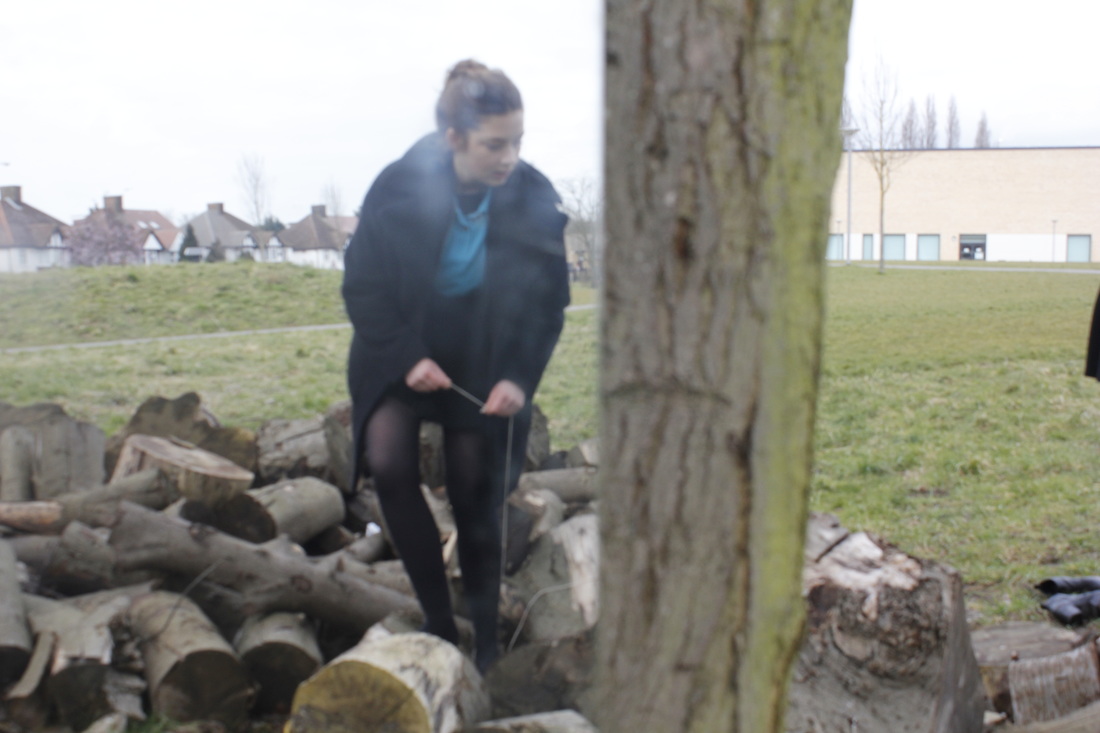
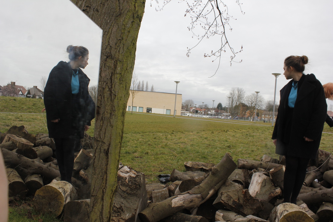
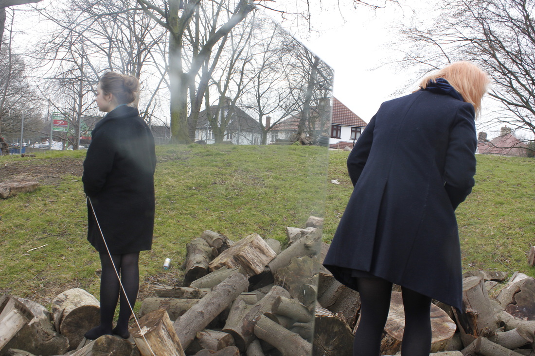
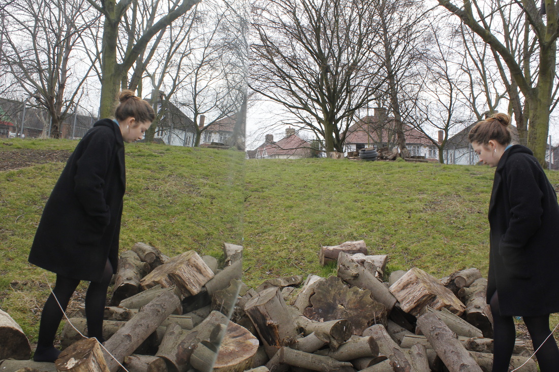
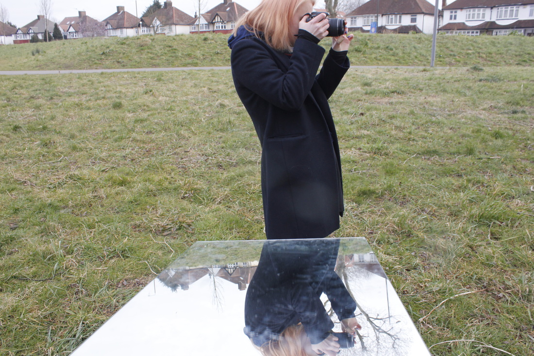
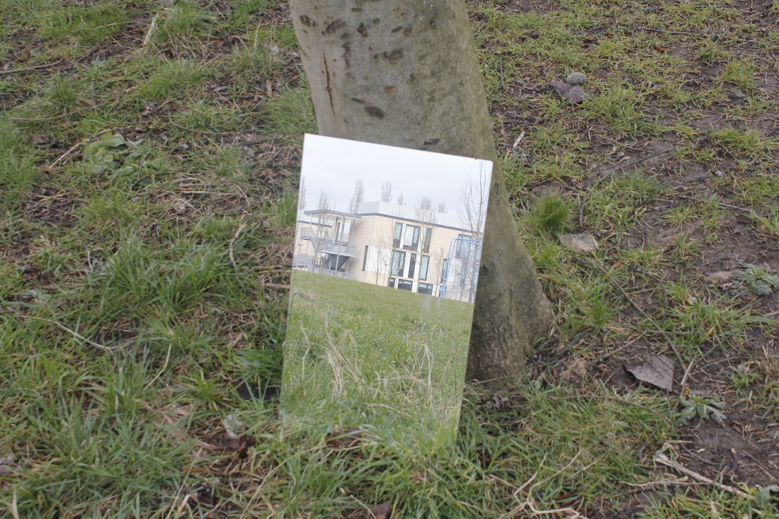
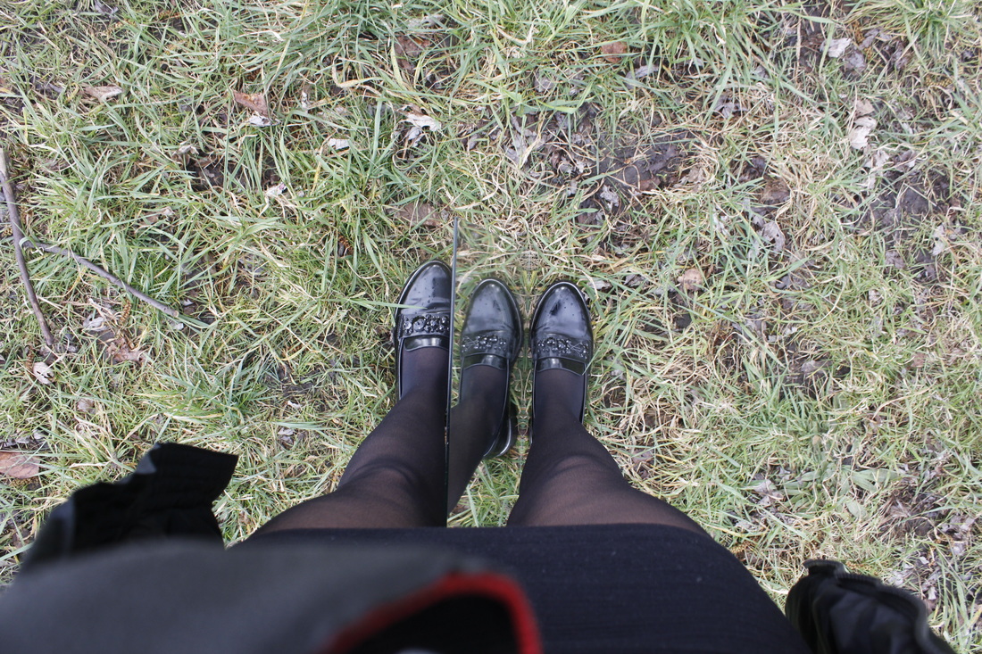
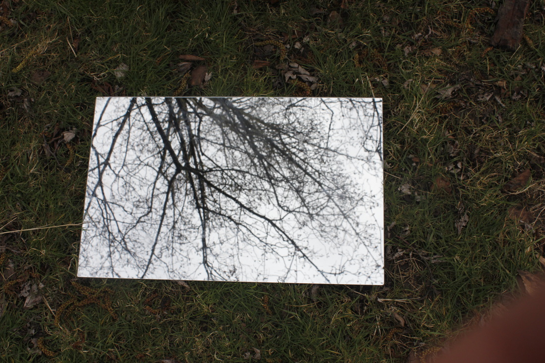
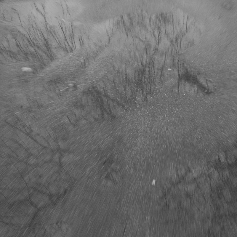
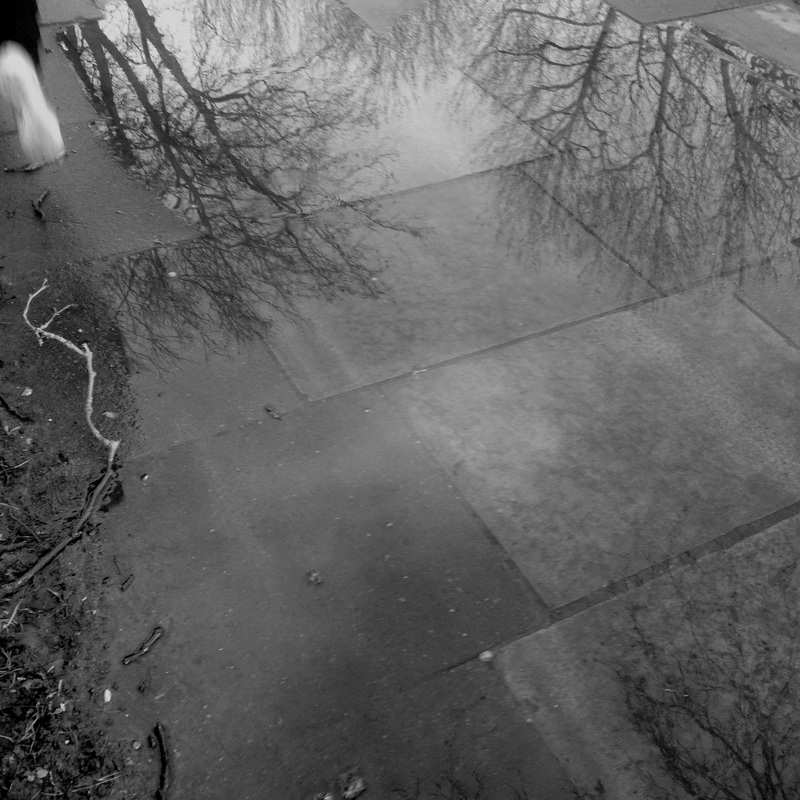
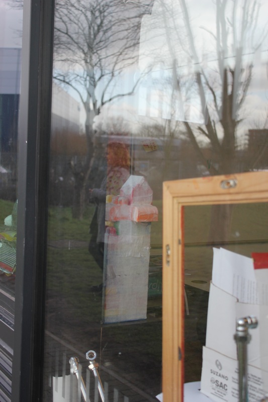
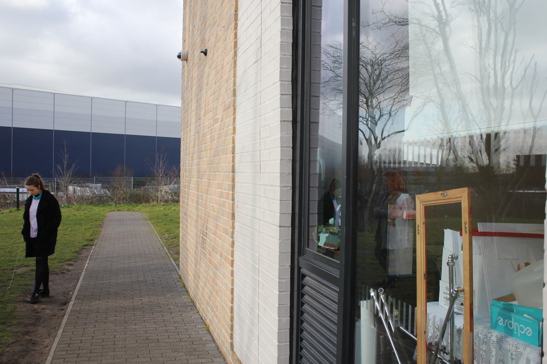
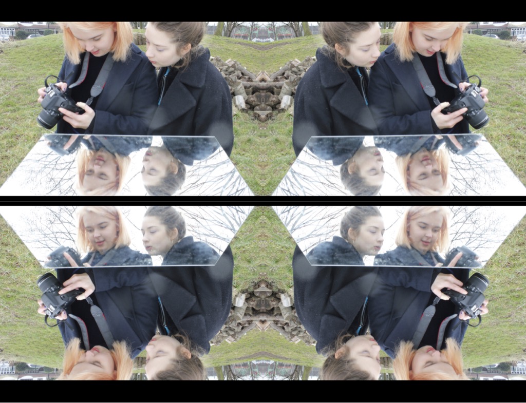
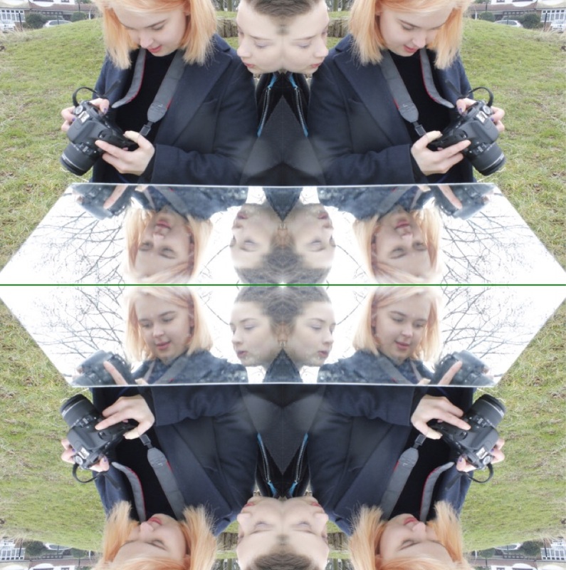
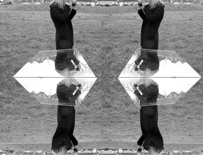
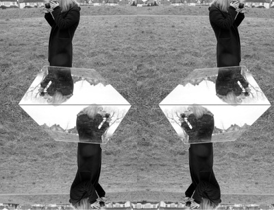
These were the next set of images I've taken. With these set of images, I wanted to take pictures of backgrounds I could use to edit on photoshop. But also at the time I had a mirror on me so I decided to take images with the mirror as well as images of the background. I think that the mirror images have worked okay but I don't really like them all. I like the images where i have used a mirror to reflect the body of a figure onto the mirror. I like them as It makes the image look interesting and because the background has been reflected on the mirror too it contrast with the original image making it look different and odd. With the background images, I have tried to take pictures of trees and grassy areas as well as buildings so I can experiment with more pictures rather than images just of buildings and shop windows.
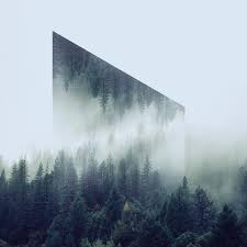
PHOTOSHOP EXPERIMENTS
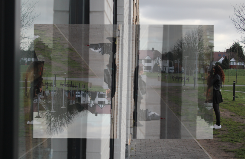
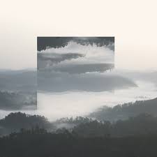
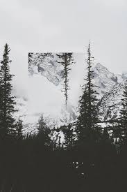
These are experiments I have done on Photoshop. I edited images I had taken before from another set of images and wanted to create images similar to Victoria's ones. I wanted to use the images that consisted of mostly nature as I thought this would look nicer and warmer then to have just buildings or poles reflected. I chose the image of the trees in the first example as I though its quite a plain image but the flowers within the image bring a bit of warmth to the image. I like the image of the two figures too as I like how they are composed within the image. They are centred in the middle and this make the image look more interesting as the reflection of them turned out in the centre too. I don't really like the third experiment as I don't like the actual image itself. The image used is quite a plain and boring image so the reflection hasn't turned out too well. The fourth image I do like as I like how the tree has been reflected. The reflection of the image creates a sort of spiral of tree in the centre. The last too images I do also like as they contain figures in them which create more of as story behind the images and make the viewer wonder what their doing there.
|
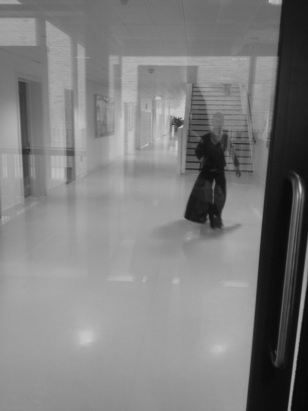
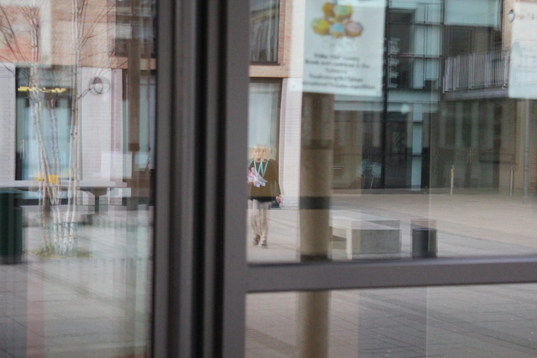
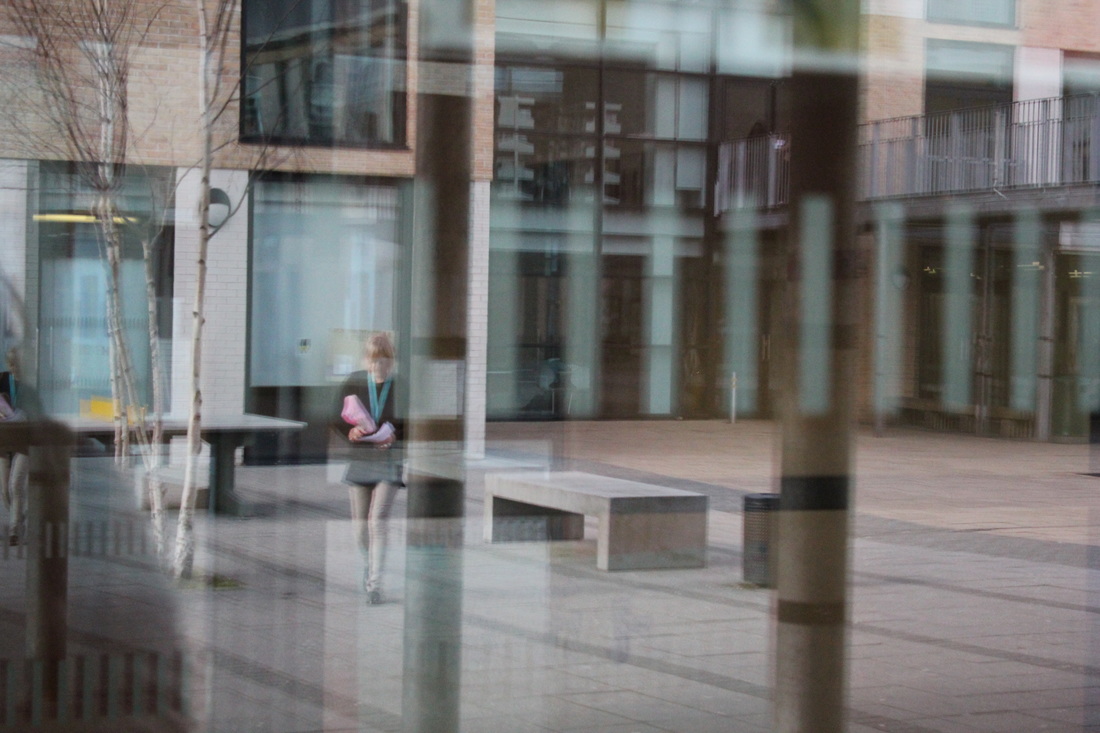
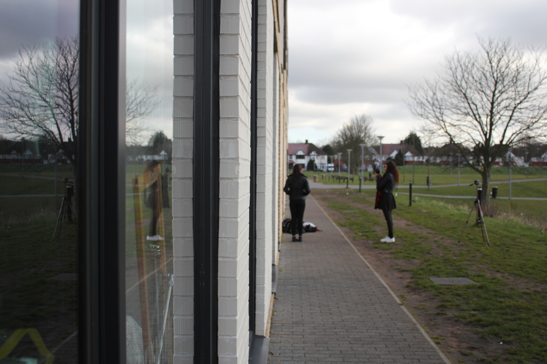
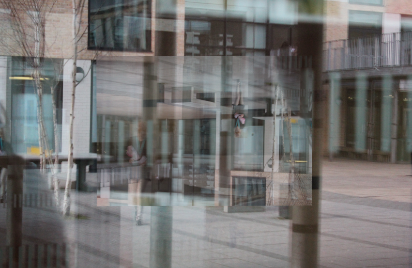
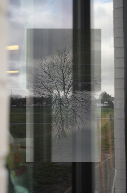
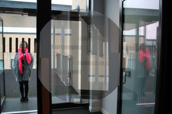
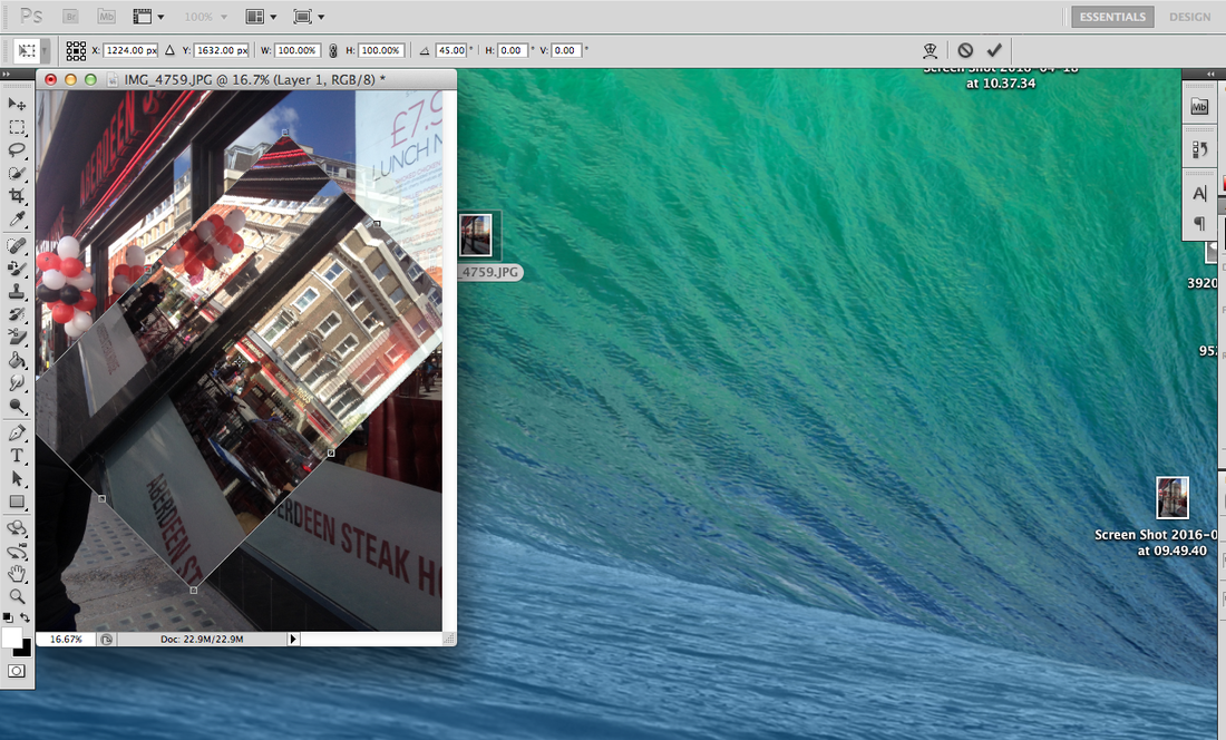
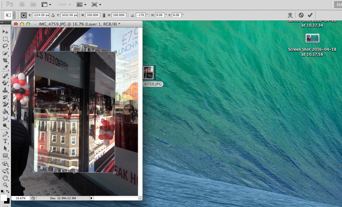
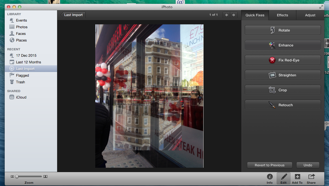
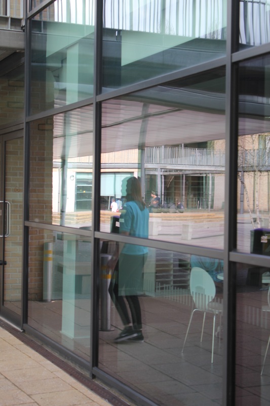
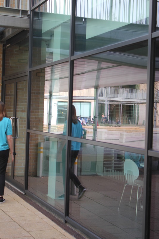
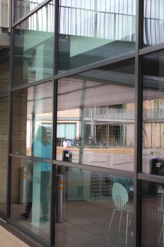
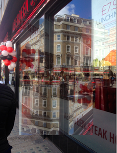
This is another image I have taken recently on the reflections on a window. I this image with an iPhone and I really like the way it has turned out. The thing I like most about the image is the fact that because its such a big window it has reflected a great amount of things in the window. I like the way the image has captured movement well in the reflection. For example there is movement in the cars and the busses and also the people walking in the background. I think that this makes the image look more alive and not boring and dull. Also the image has a good range of colours, ranging from reds in the shop and the balloons and whites and blacks but also little snippets of other colours such as yellows and blues which do make the image more colourful and vibrant. To improve this image I would like to have taken more images which are similar to this image so that I can compare them and have them in a group which could maybe make the images look better rather than having this images on its own. However overall I am please and happy with the way this image has turned out as it has captured the reflection of normal every day to day city street in an ordinary shop window.
|
|
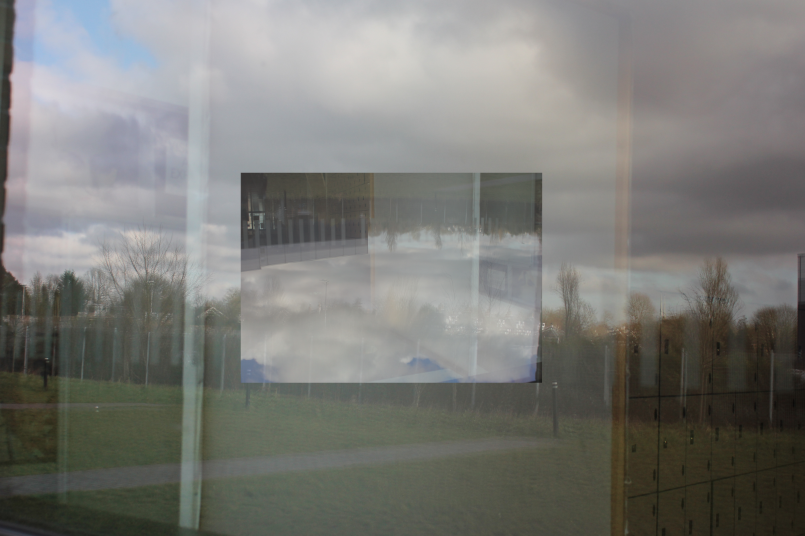
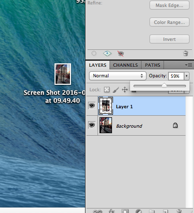
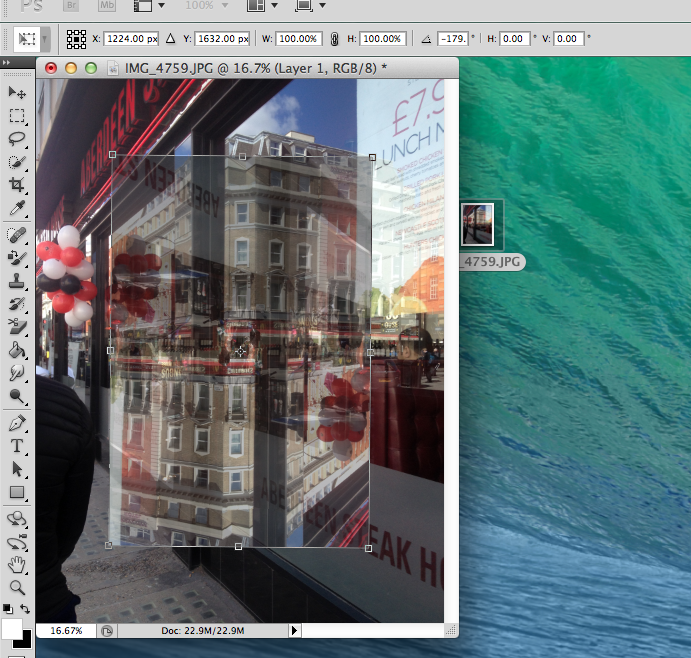
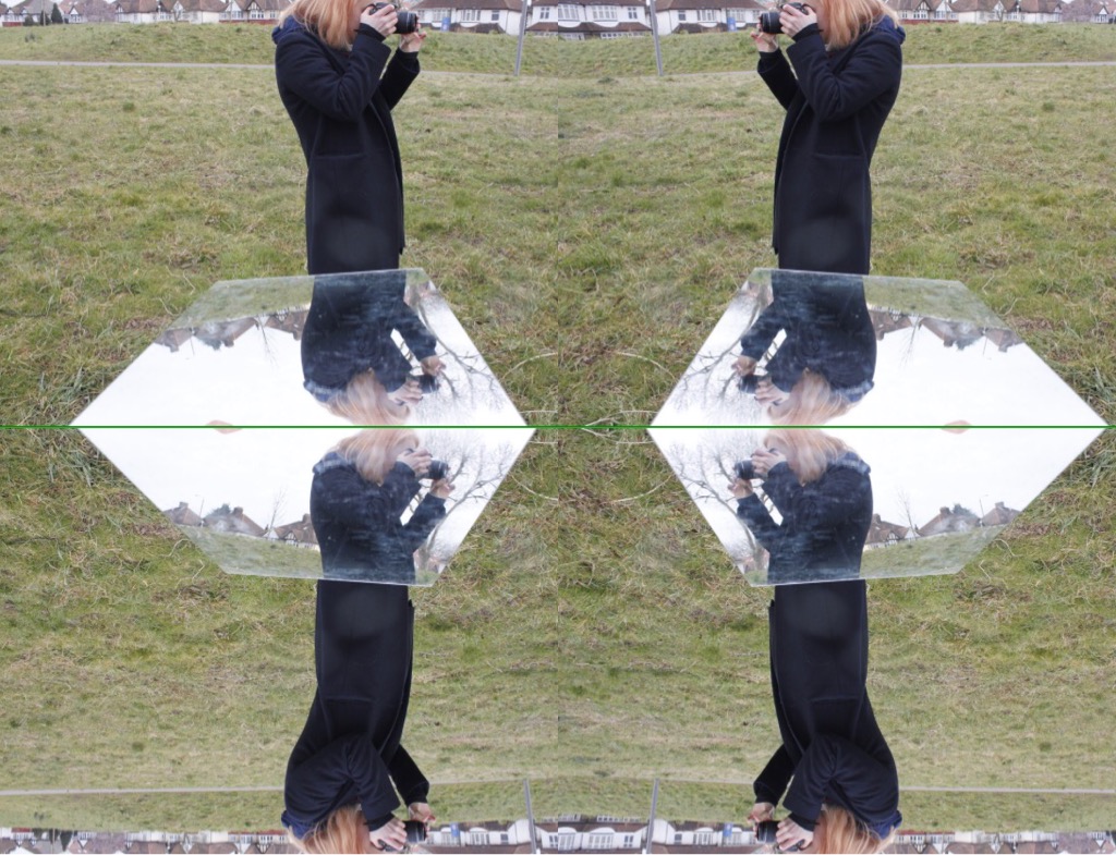
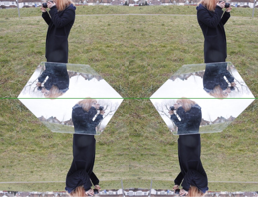
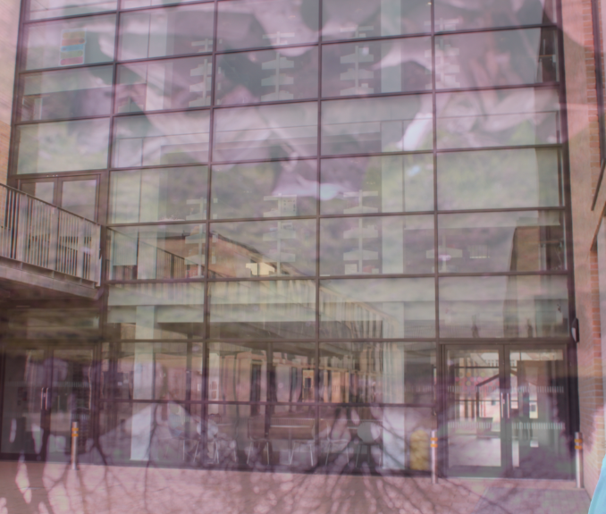
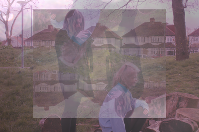
With the image I had taken above, I have used Photoshop to edit the image in the same way I edited the images previously. Using the ideas from Siemer, and the image I took above, I inverted a section of the image in the middle as shown in the images. Then I changed the opacity of the second layer 59%. I did this to the image so that you could half see the real image on the background and half see the rotated layer on too. I like the way these images have turned out and want to take more of them. Then using iPhoto, I enhanced the photo. I like the way the images have worked out and I think I am going to use this image as one of my final pieces.
|

|
BETH SPREADBOROUGH
|
The next thing I have decided to do is download the reflections app to have a go and use images i have already taken and maybe take some more to create simple reflections within the image just like Beth has down above. Although her images contain basic simple reflections, the final product looks really interesting and makes the image look 10x better then it would being just the plain image itself. Beth's images also contain a lot of vibrance and colour to them and this is one thing I really like about her pictures. I want to have a go at taking or creating images such as these. |
This is my first trial at taking these images with the reflection app. I have edited the images on iPhoto and switched them to black and white as well as I wanted to compare how they would look in both black and white and in colour. They don't look too bad in either but personally I think that the colour images look better than the black and white ones as I think they stand out more and also show the reflections on the mirror more clearer then the black and white filter as the exposure of the black and white filter is too bright in the mirror so the reflections of the trees don't come up so well. I like the way the images have turned out however and they way they have been reflected with the app looks really interesting and different.
NEXT SET OF REFLECTIVE IMAGES
|
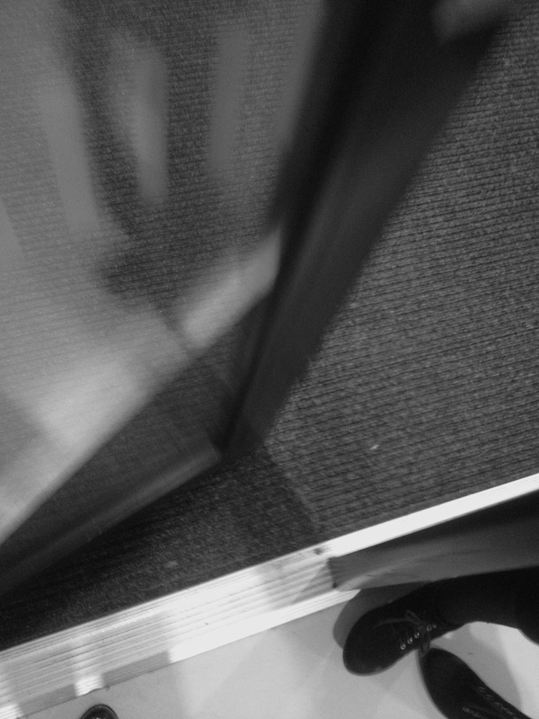
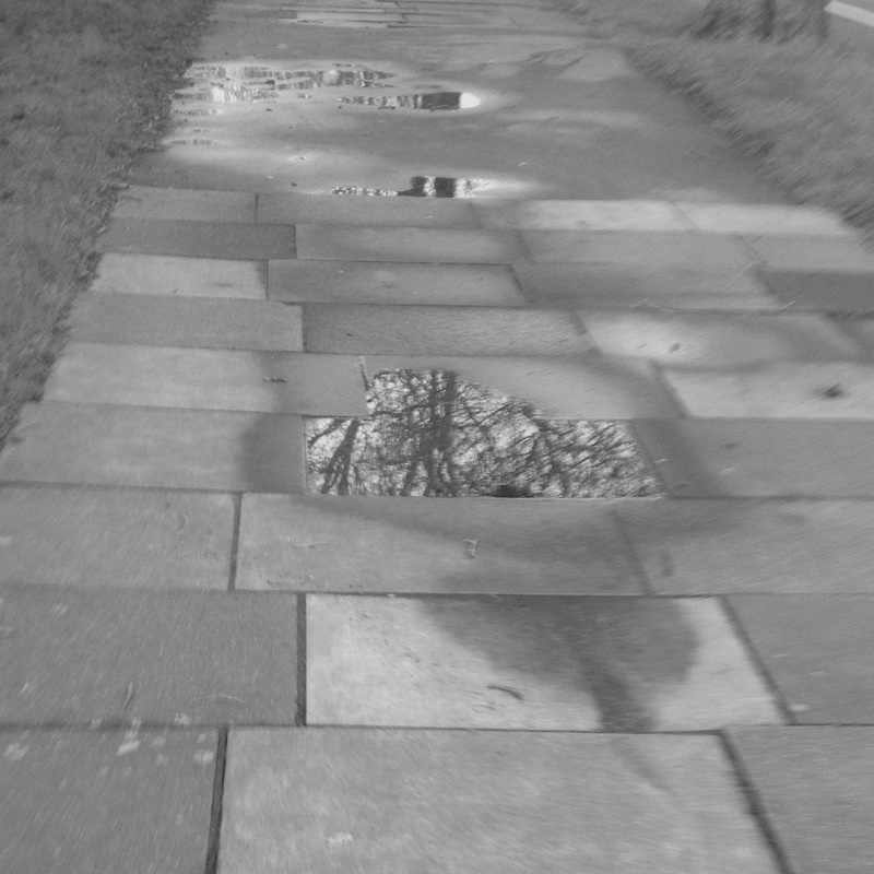
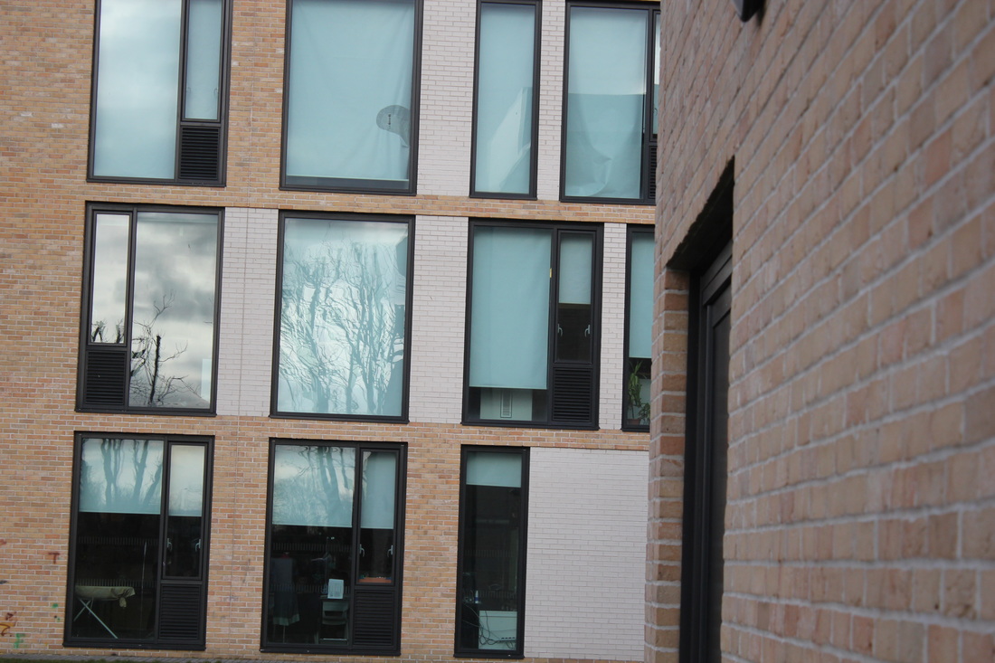
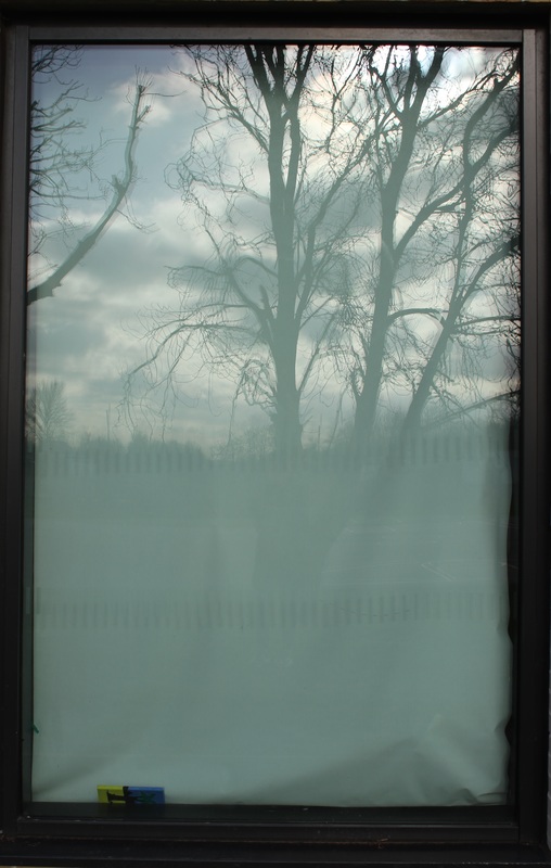
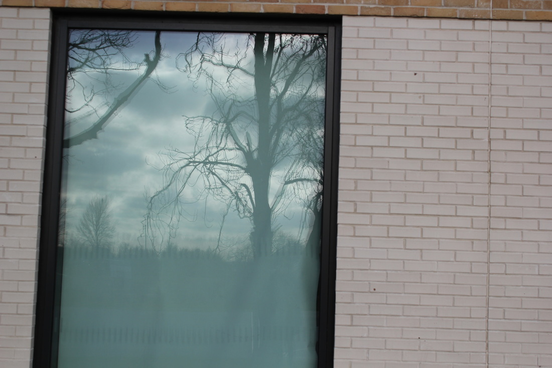
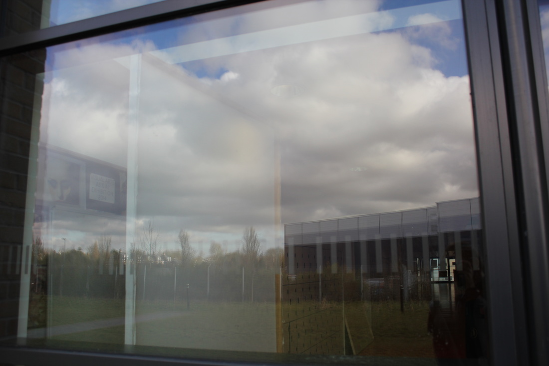
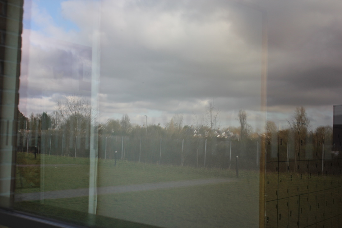
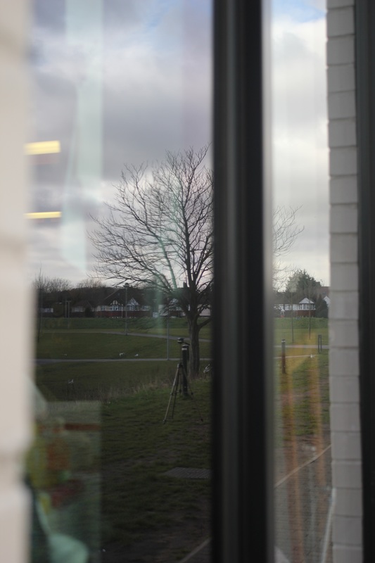
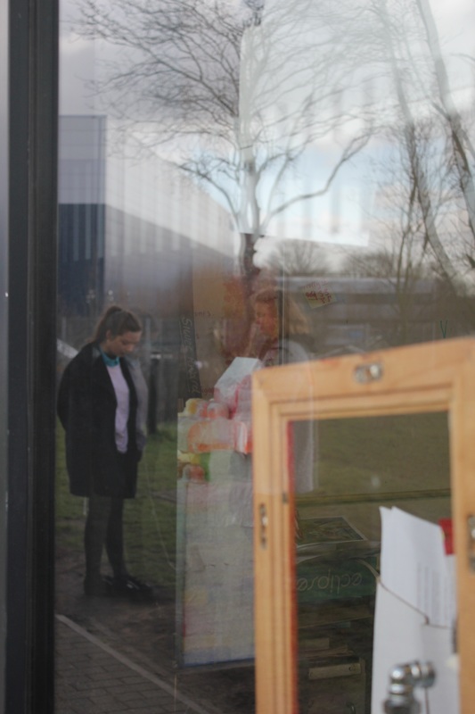
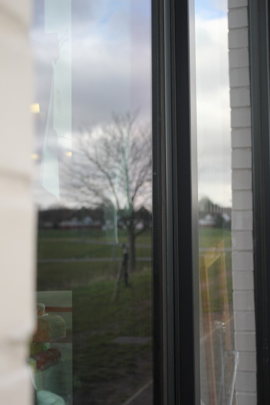
These are the next set of images I have taken. With these image I wanted to capture more reflections on a side window of a building like the one I have taken above these images. I wanted to do this as I like the way that image turned out so I wanted to take more like that hoping they would turn out as well. I have taken this pictures with a DSLR camera and on some of the images swell I have used lens filters on top so that it wasn't just another repeat of pictures with a reflection. For example on the last few images I have used a lens that made the images a little more blurry and faded. I think that this made the images look nicer as it gives them a softer colder tone then the normal filter lens of the camera. In some of the images I have tried to capture the reflection of light too for example the first one on the third row. This image captures the light reflecting from the food stand onto the floor which creates a shadow. The light is also reflecting onto the stand. The rest of the images were mostly taken against a building window reflecting the outside surrounding of the benches and the figures too. |
|
PHOTOSHOP EDIT
|
|
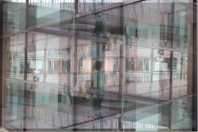
These were my next photoshop experiments. Again in these images I wanted to take an section of the Image and switch it up using Photoshop. I selected out a section of the image and the pasted it back onto the original image. Then I inverted the image and then changed the opacity all using photoshop. I like the way some of these images have turned out however I don't think they have all turned out well. For example I think some of the images look quite blurry and quite busy so you don't really know what to look at because there's so much going on. However most of the images work well as the reflection is clear and the editing of the images have worked out well. I also like how some of the images have a slight pinkness to them too. Despite all this, I don't think that I'm going to use any of these images as one of my final pieces as I don't feel like these are the best images that I have taken. |

FINAL PIECES
This is the first image I want to use as my final piece. I like the way the image has turned out and I think its the best of the images I have edited on photoshop. I like the way the image is just a normal every day to day street and the reflection really works well with the rest of the image. The colours in the image just bring the image to life which is also why I have chosen it as one of my final pieces. I think it also portrays the theme of the project well.
Final Piece 2


This is my second final piece. I have chosen this to be one of my final pieces as I like the way they all consist of ideas from all the artists I have researched within my project. I like the way that the images are all quite similar and they all have that same kind of reflection in the images, they all have a reflection of the original image that has just been inverted. I think the images also work well together because each of the images have a certain colour to them. For example the first image has a sort of green colour to it because of the background of the grass and the trees. The second and third image have a sort of paler blue to them which gives the images a warmer colour to them. The last image obviously has a more pinky colour to them as I used a pink lens filter. I think this creates a contrast with the colours on the figures.
FINAL EVALUATION
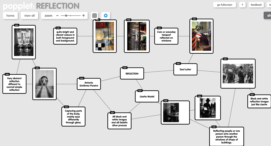
For this project I firstly had a look on Pinterest and had a look at some images that different artist had taken based on reflections, outline and clothing as they were the themes that stood our too me most. Out of the three themes I decided to choose the theme of Reflections as I thought this would be a interesting theme and creative and I thought that this was the one theme out of all of them of which I could do the most with. Next I decided to go back on my Pinterest and look more in detail at the images of reflections that artists have taken. After doing this I decided to create a mind map on Poppet to get all my initial ideas down all together. On this mind map I tried to think of ways the different ideas or artists linked to each other and what themes came under them. From doing this I got ideas on what I want to do or what I want to contain in my images.
After exploring on Pinterest and creating a mind, I decided to firstly look at Lisette Model and look at her images. What I liked about her images was that she captures a normal everyday to day image of a city in just one reflection. I like how she captures these reflections in a single building window. I also liked how she captured these images in black and white as it makes the image balance out and not draw attention to one thing in the image but look at everything equally.
After exploring on Pinterest and creating a mind, I decided to firstly look at Lisette Model and look at her images. What I liked about her images was that she captures a normal everyday to day image of a city in just one reflection. I like how she captures these reflections in a single building window. I also liked how she captured these images in black and white as it makes the image balance out and not draw attention to one thing in the image but look at everything equally.
