ABSURD
|
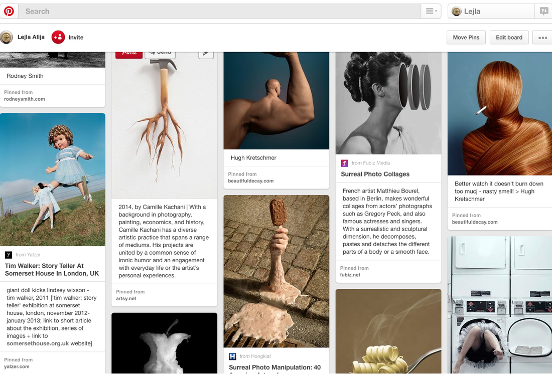
This is and example of an absurd image. This image has been taken in an ordinary laundrettes but the photographer has captured legs coming out of one of the machines. We can't see the persons head or top half of the body. I think by having the persons top half in the machine and having only the legs and feet captured inn the image really makes the image absurd as you wouldn't see this in every day to day life in the laundrettes. The image is very simple as well and then we get these legs coming out of one of the machines which is why its absurd. |
|
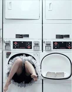
This is another absurd Image I have found on tumblr. The photographer has captured 3 bodies but what's absurd with the picture is that instead of having normal heads, they have balloon heads. This makes the images absurd as this is not what you would see in day to day life. Also another thing the artist has captured is instead of having a normal neck and normal legs, they have wired necks and legs. This again makes the image absurd as its not what you would see in every day to day life. The background is quite plain and when first looking at the image it looks normal apart from the heads but when you look at the image more clearly you can see that the legs and necks are different as well. |
|
First Experiment.
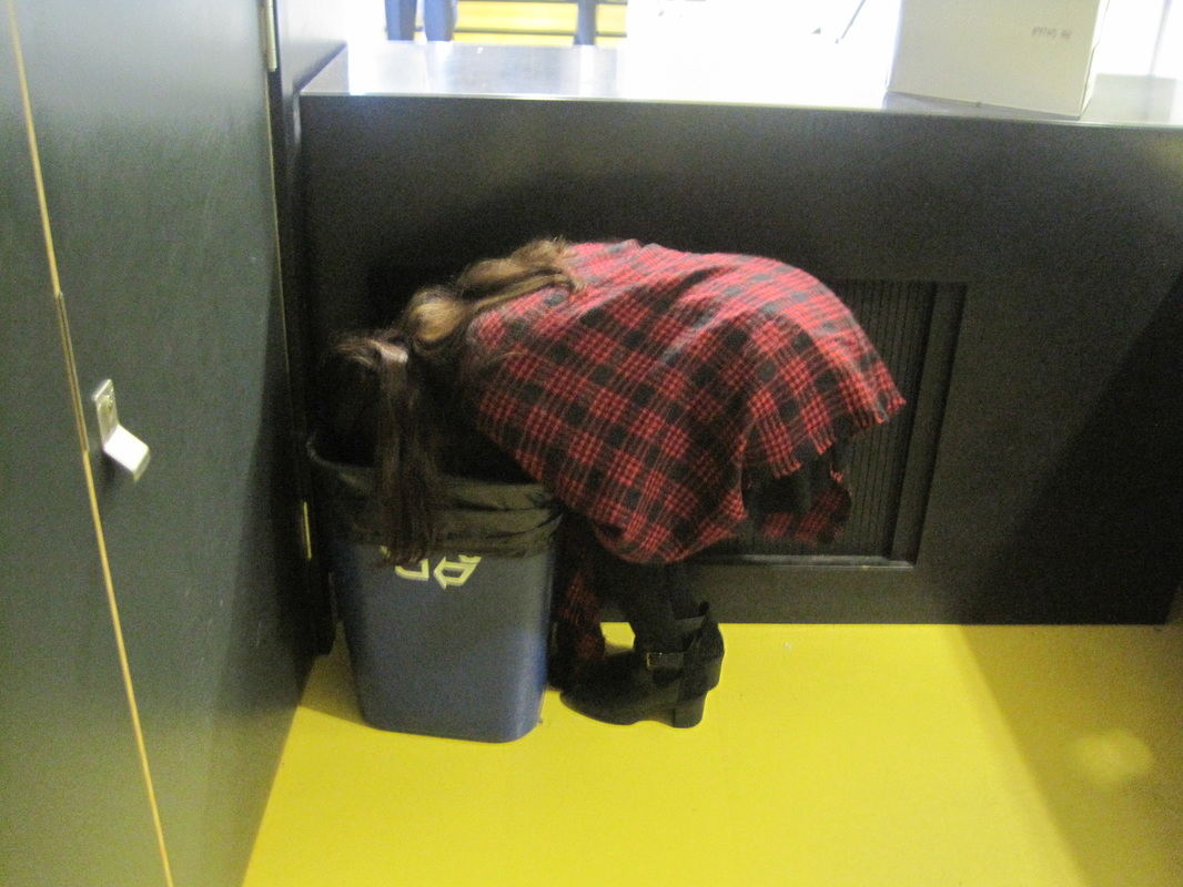
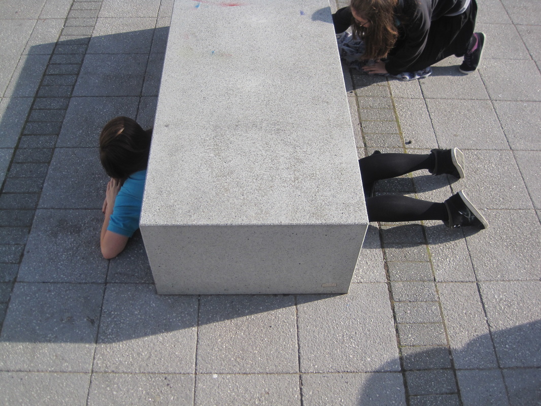
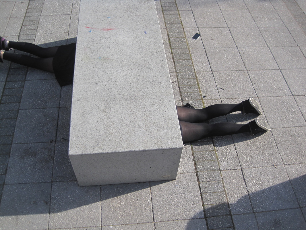
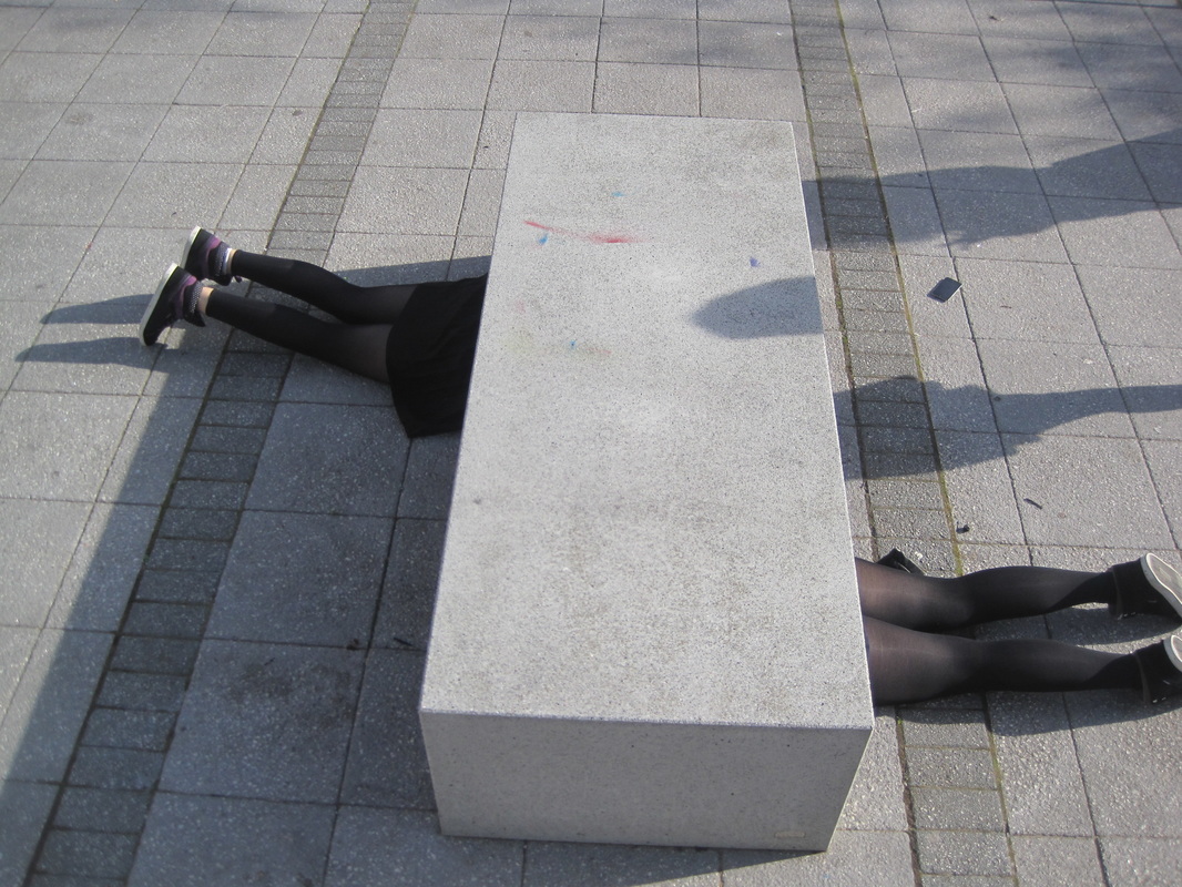
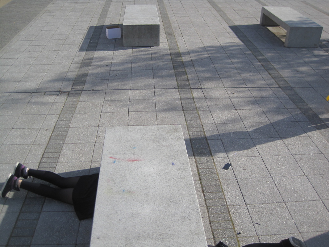
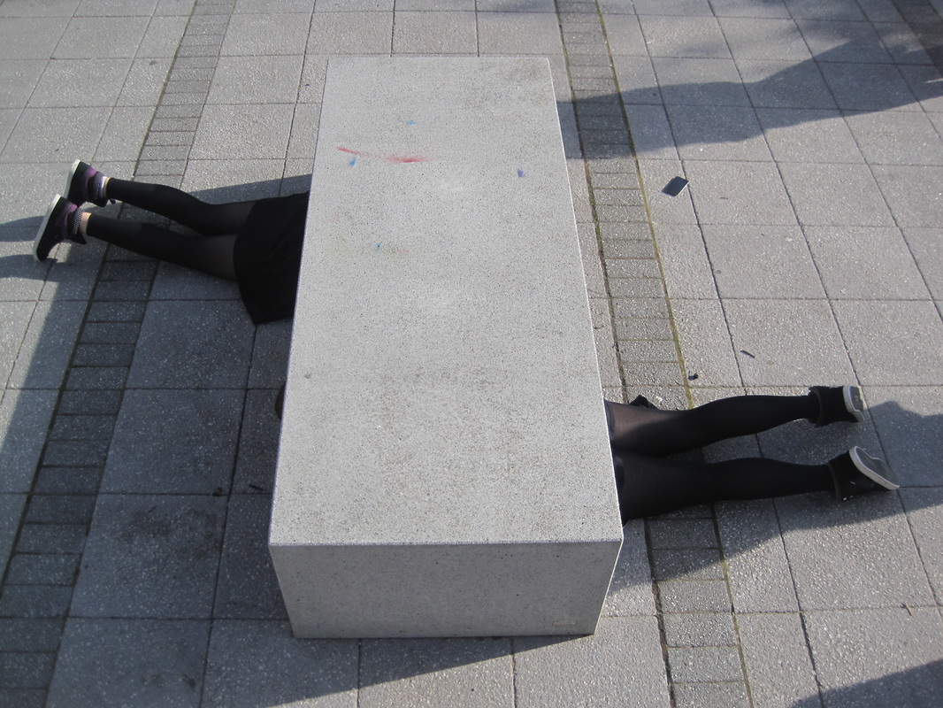
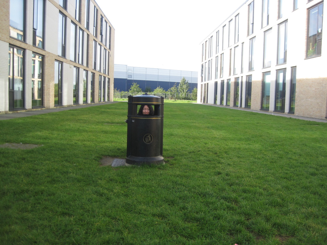
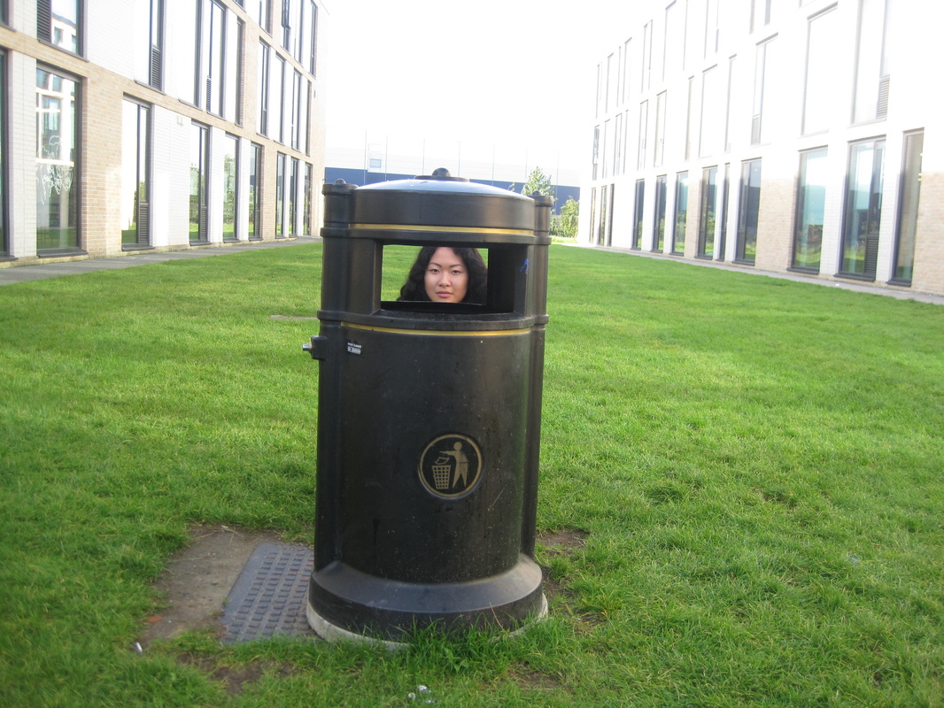
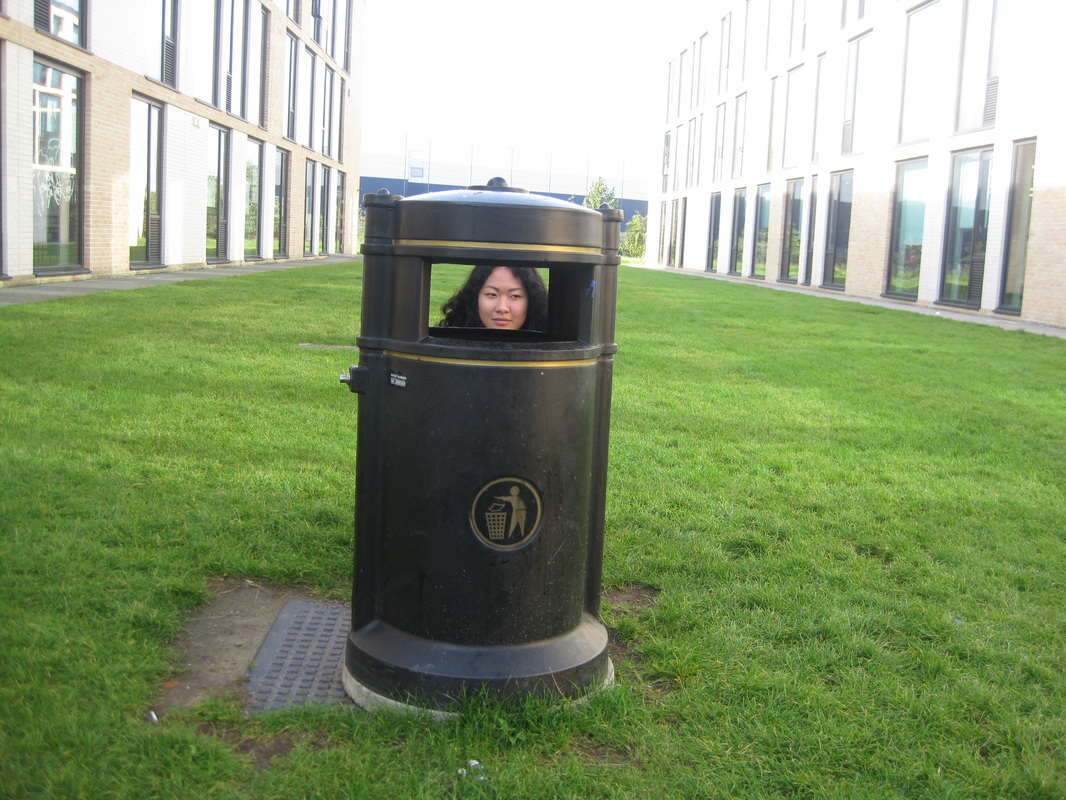
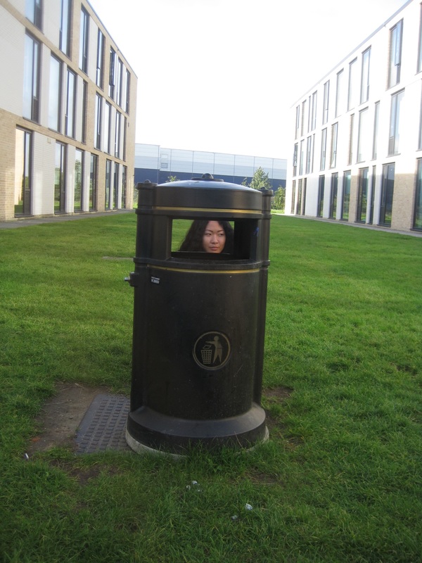
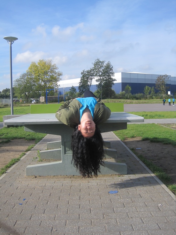
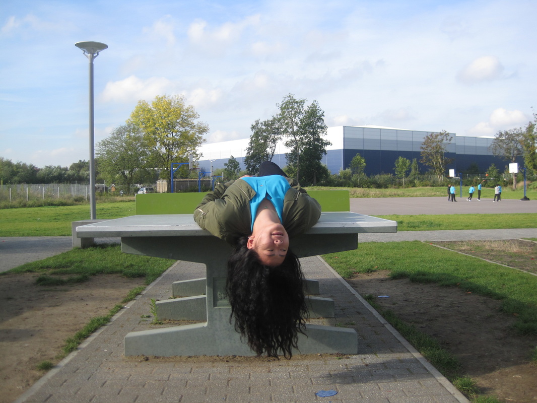
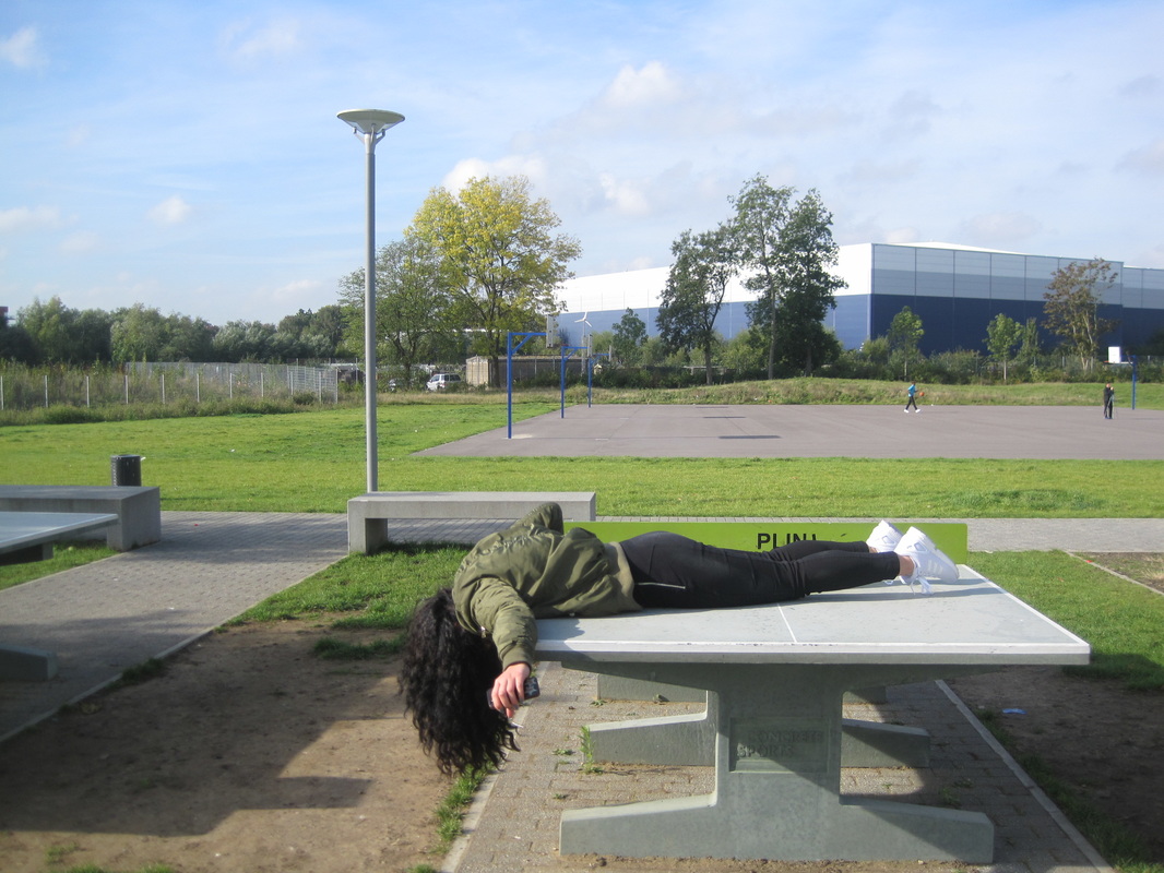
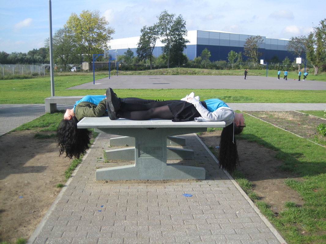
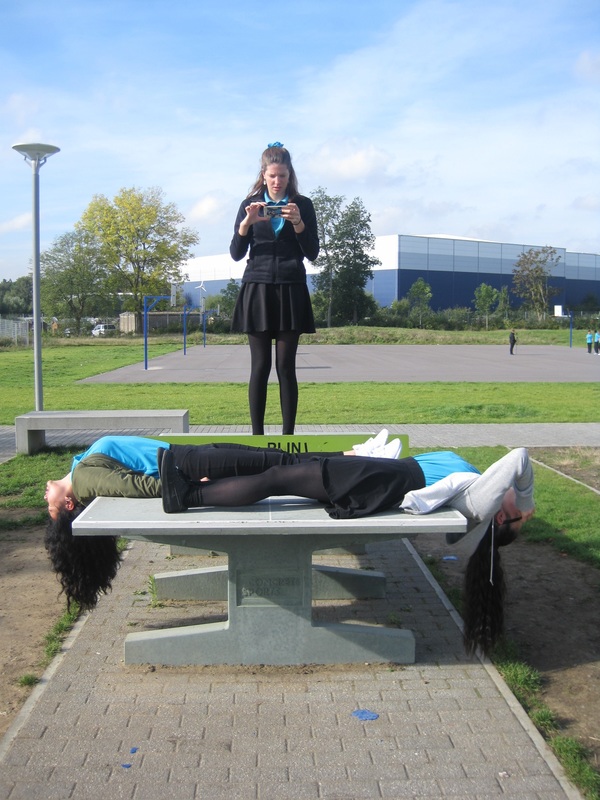
These were my first experiments. The photos were taken in school and i used an iPod to take them. I tried to think of some creative ways to hide different parts of the body or place the body in different ways. For example as you can see in one of the images, i laid 2 people down on top of a ping pong table but facing in opposite directions and having half of their body hanging down from the sides. I did this to try make the image absurd and i think it worked because you wouldn't generally see this in every day to day life. Another image which I think has worked well is the image of one of my class mates behind a bin. I think that this is absurd because it looks like the bin is here body and thats not what you see in everyday to day life.
Gallery
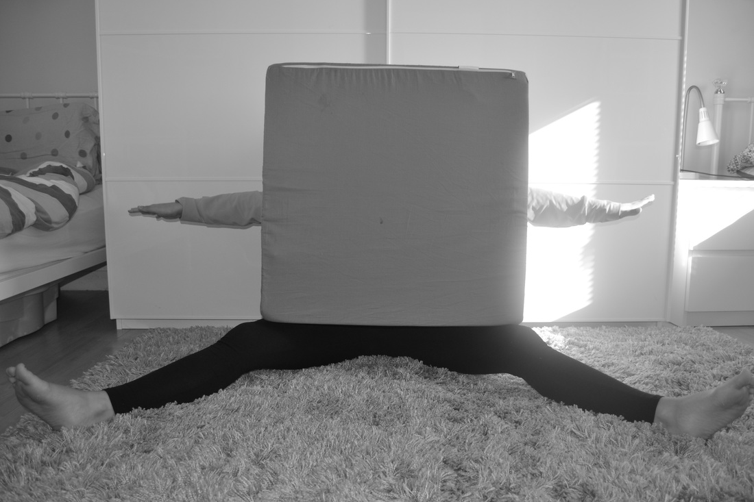
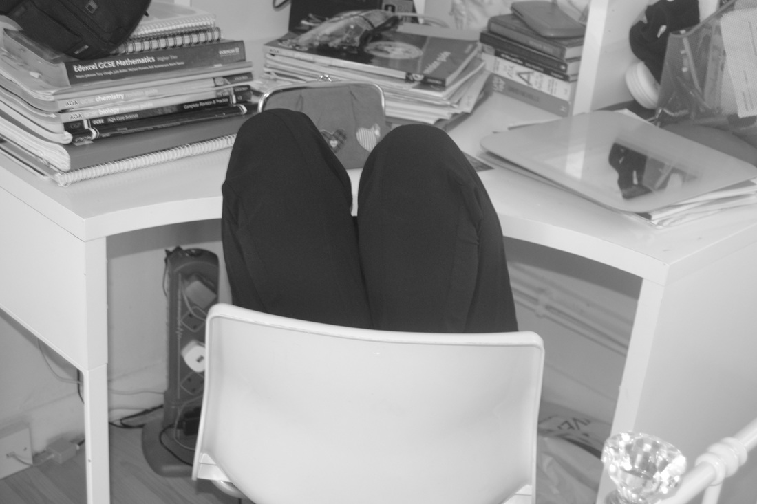
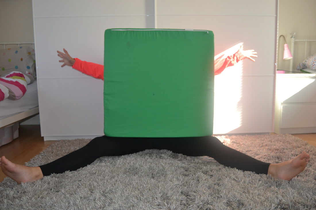
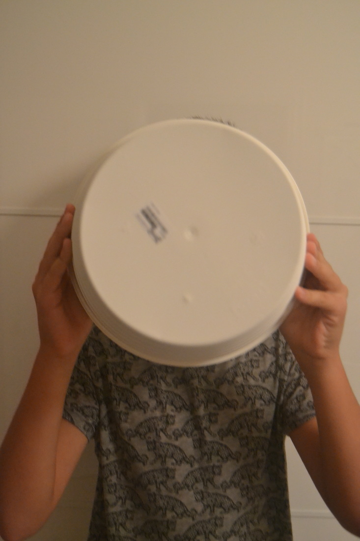
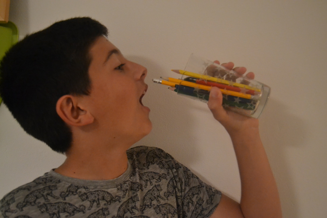
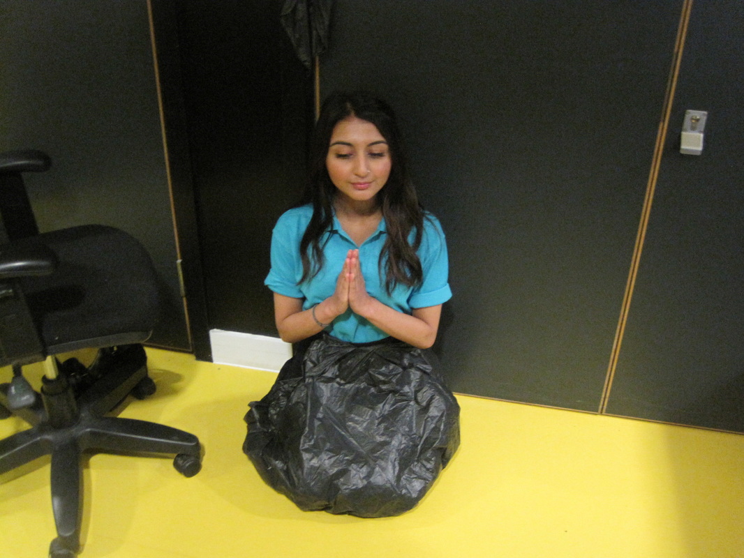
These were my first experiments done at home. To take these images I used at DSLR camera. Again, I tried to think of different ways to cover up and hide the body using objects in every day to day life. As you can see in the first image, I have captured and member of my family covered by a square cushion. All of her body has been covered apart from both her legs and both her arms. I think that this image was successful as it has completed the task i wanted to do, to cover different parts or hide the parts of the body. In another image you can see i have a captured another member of my family drinking from a cup but instead of drinking water or another fluid, he's drinking pencils. Although this isn't a covering up the different parts of the body, its still na absurd image as you wouldn't see someone drinking pencils in everyday to day life, so therefore i think that this was another successful image taken.
To refine from these images, I think i might try and just capture some images but only hiding one part of the body like an arm for example.
To refine from these images, I think i might try and just capture some images but only hiding one part of the body like an arm for example.
Third experiment.
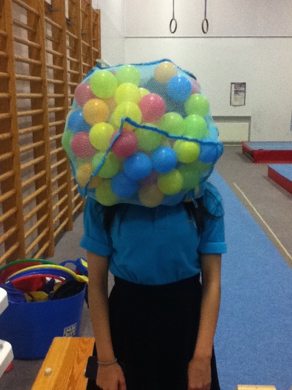
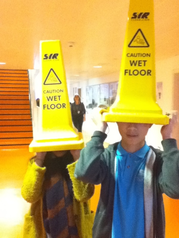
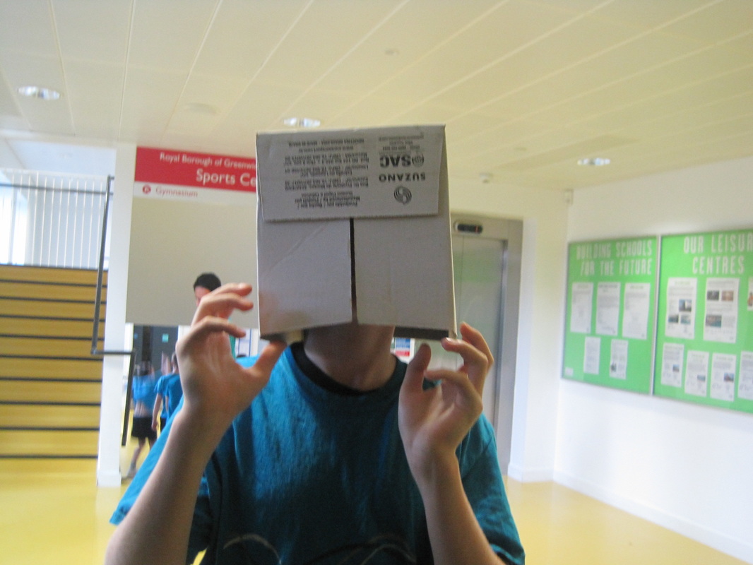
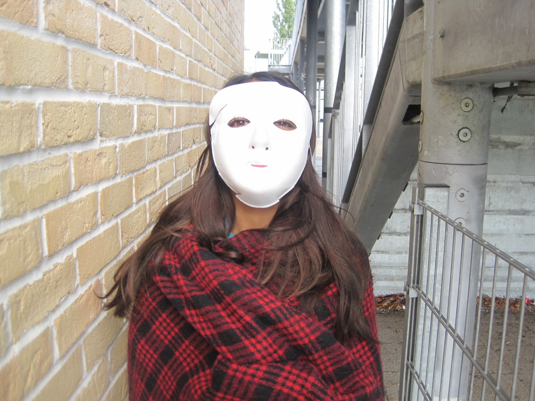
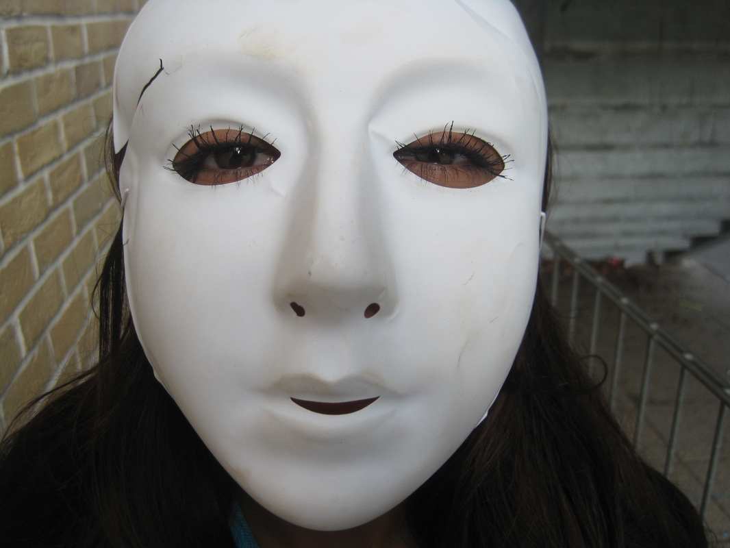
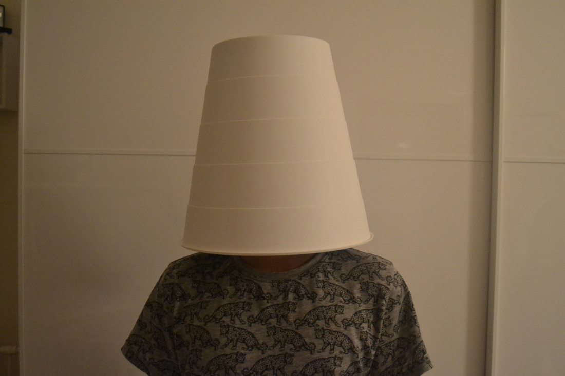
These were my third set of experiments. To take these images I used an iPod. I tried to think of different ways to cover the head but then I also took some other images that were absurd as well. For example as you can see, in the first image I have tried to take an image of a person but something covering their head. I used a bag full of balls to put on their head. I think that this was successful as it does look absurd however I think I could have improved the image by maybe doing it against a plain background so that the viewer can focus directly on the main subject. Again the image with the wet floor signs, I have tried to cover up the heads. I think that this image was less successful as it didn't cover up the face fully like the first image did, so to improve this image I think I need to try and cover the whole face and also again I need to make sure I take the image against a plain white background. In the other two images I have tried to take some more absurd images.
Home Experiment
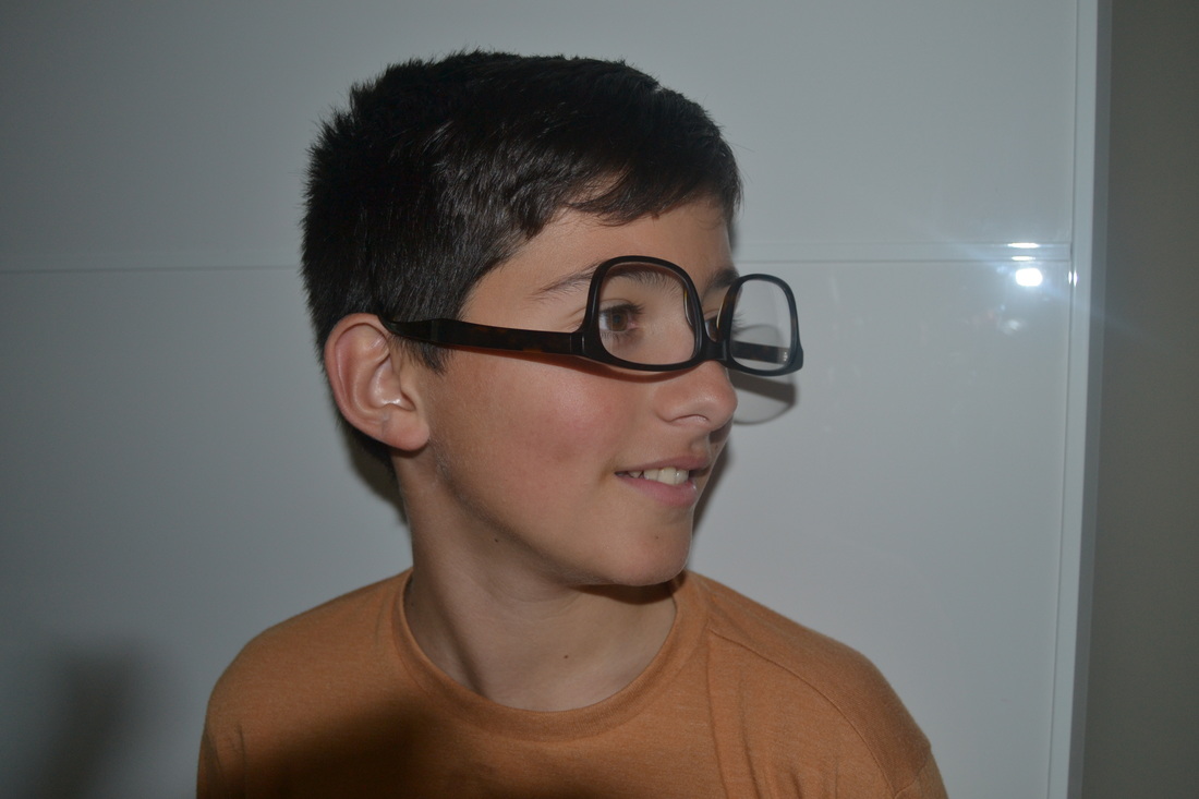
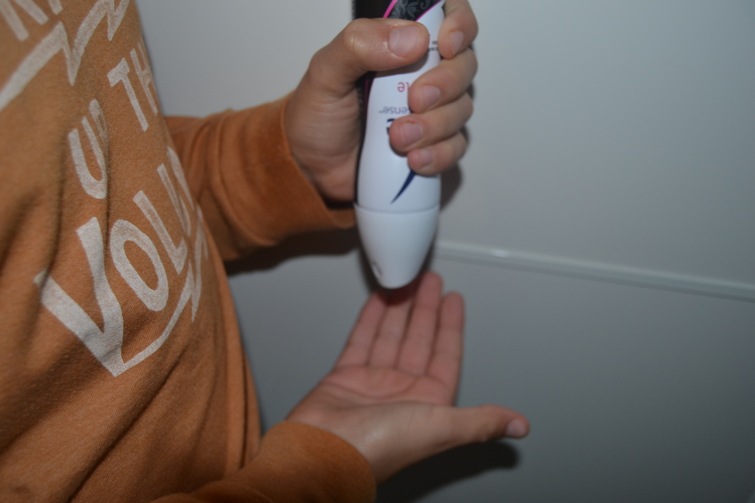
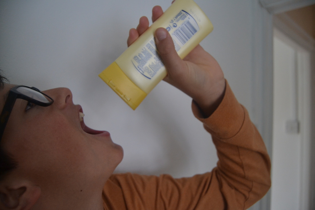
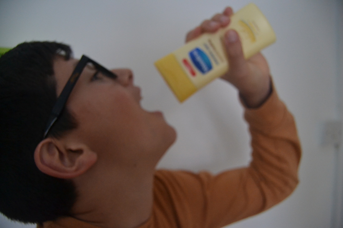
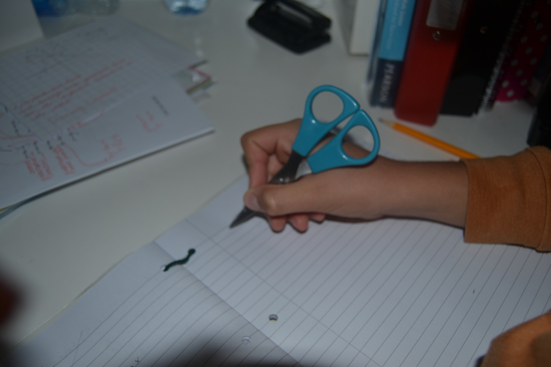
These were another set of image I took at home. With this set of image I tried to think of a absurd way to take these images so I decided to do a swap kind of thing with the objects in the images. For example in the first image it has the glasses the other way round instead of them being the right way round and fitting nicely onto the face. In the third and fourth image, the boy is drinking hand cream instead of putting it on your hand and using it for what its meant for. The fifth image is of a hand writing but instead of writing with a pen, their using a pair of scissors to write with instead. I think that these images have turned out well because you wouldn't see people using these objects like this in day to day life. To improve them I would've maybe had a go at taking some similar images to these but taking them outside and using public objects for example to capture them within the image.
David Shrigley
|
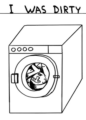
This is one of David Shrigley's images. I really like this image because although it's quite plain and simple like most of his images, it's very unusual. The image has a body in a washing machine and has a caption saying " I was dirty". I find this image absurd as When people are "dirty" they don't go in a washing machine to get cleared up. People go and have a shower. Clothes are what go in a washing machine but in this image David Shrigley has made it as so he is going into the washing machine to get cleared up, he has done a switch between them. Having the caption as "I was Dirty" as well makes it just stand out more and makes the image more unusual and absurd. I think that as well as the Caption having an unusual and absurd feeling towards the image, its also funny. It gives off a humorous effect and when you see the image at first it makes you laugh. This is why I like the image, it makes you feel in two ways. |
|
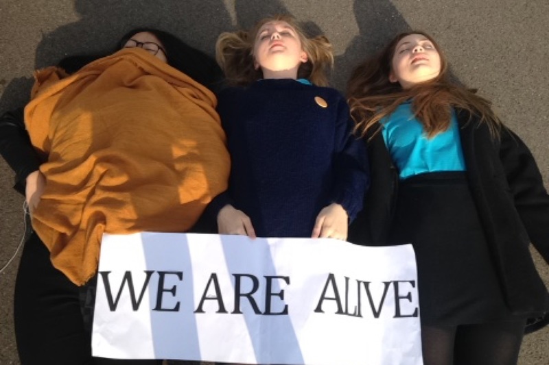
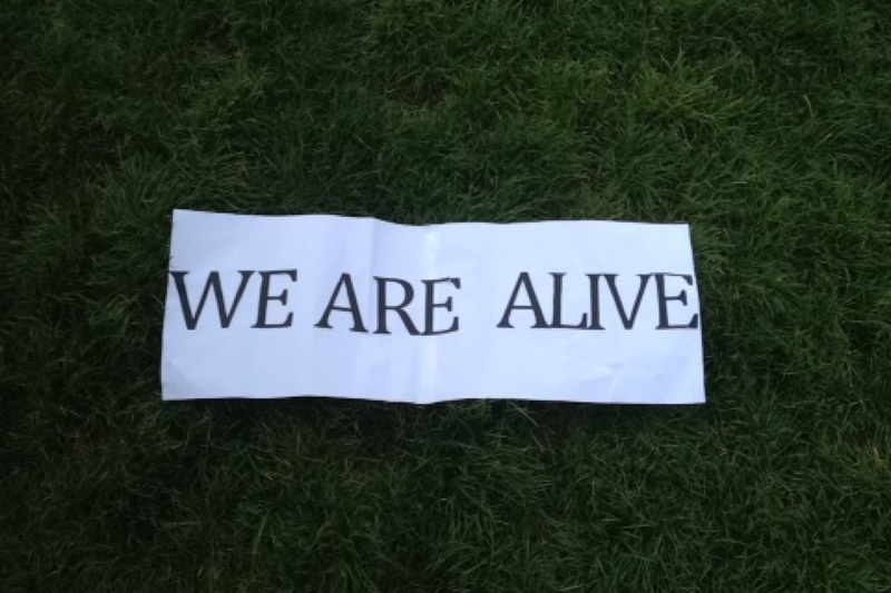
This was the first experiment I did with signs. To make the signs I used word to write out the "we are alive" and the printed each letter off. Then I got 2 sheets of A3 paper, and stuck them together with tape. Then I cut each letter out and stuck them onto the paper. Because this sign took me quite a bit of time to make, I only ended up making this sign. However with the "we are alive" sign, I wanted to have 2 or more people laying down, like in the picture, as if they were dead. I wanted to do this, because in one of David Shrigley's image he has animals holding signs saying we are dead. This is where I got my inspiration from. I them tried to think of different things I could use the sign for and I thought maybe some fruit of some plants. Instead I chose to put the sign on the grass as I though it was something different and absurd. I didnt take any more images as i didnt know what else the sign could work with so to improve i think that i could of made more signs to use instead of just one.
Fifth experiment
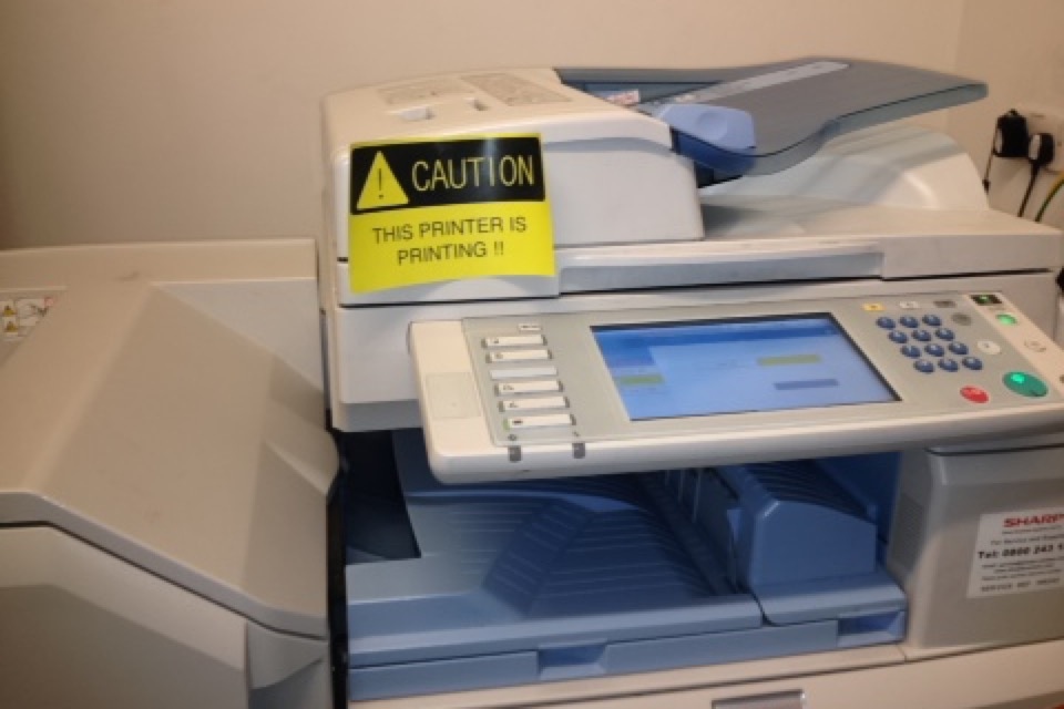
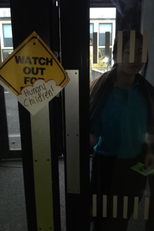
This was my fifth experiment of the signs. To make these signs I used templates of signs which i got from the internet and then edited them on pages. I decided to make a range of different signs to put around the school. I tried to think of different absurd signs I could make that were original and different to normal signs. I also tried to think of funny signs to make to put on different things for example the third image on the top line. The sign says ' caution the printer is printing' and I stuck the sign on the printer. I think that the sign is kind of comical because obviously the printer is going to be printing. Also the printer printing isn't dangerous so you wouldn't need to be cautious of it which is why the sign becomes comical. This is also the same for the fourth sign where it says 'watch out for hungry children'. These are comical because you wouldn't see a sign saying watch out for hungry children.
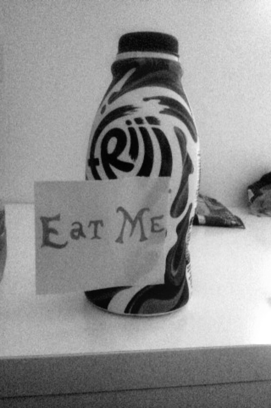
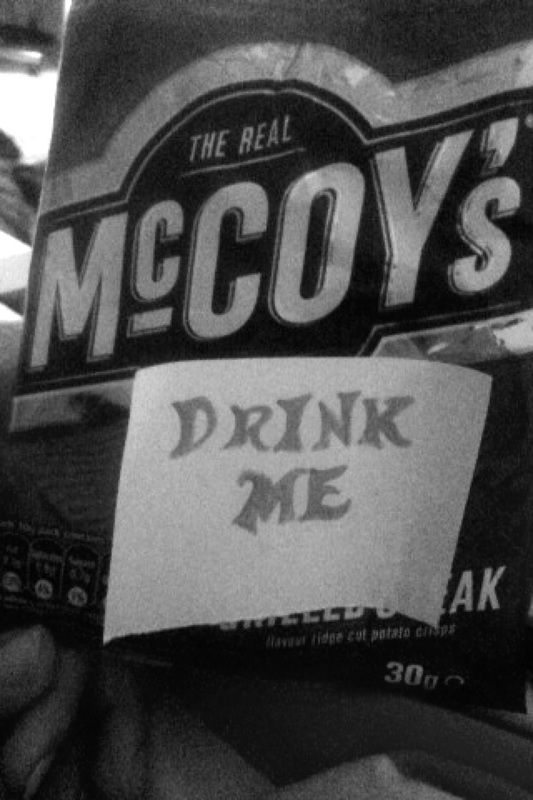
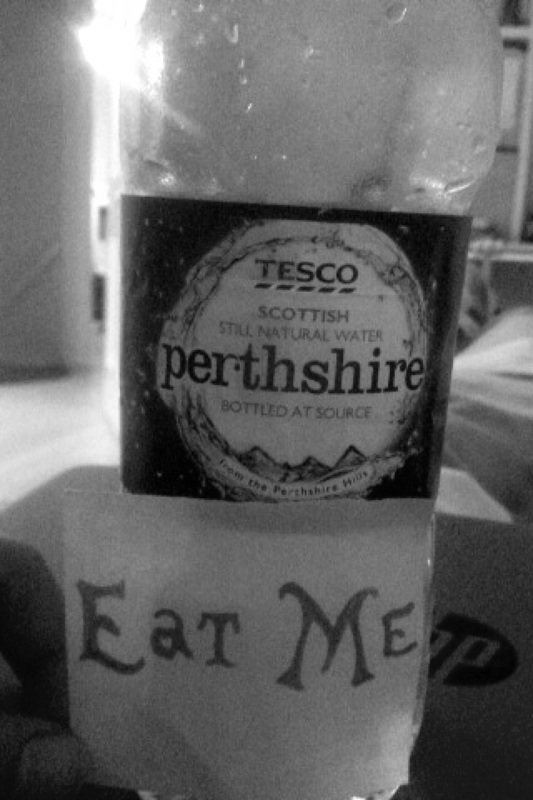
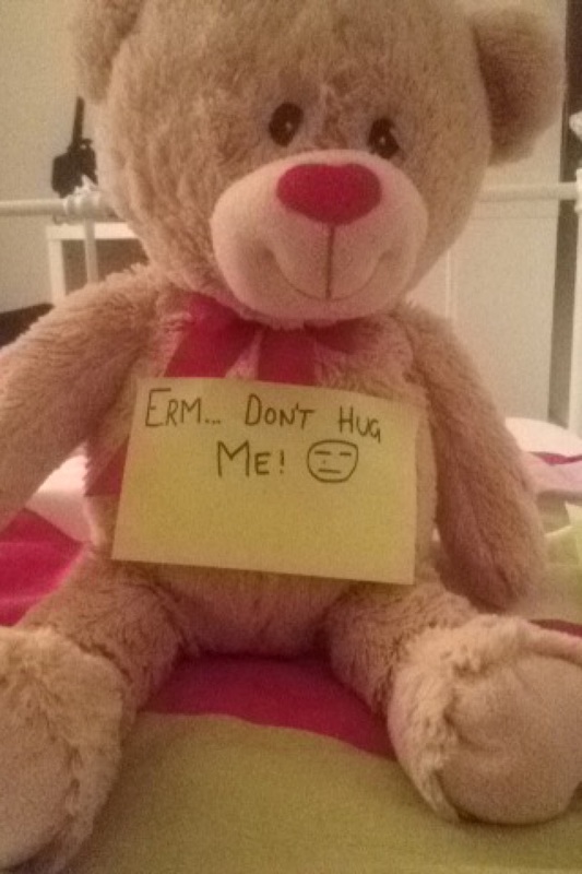
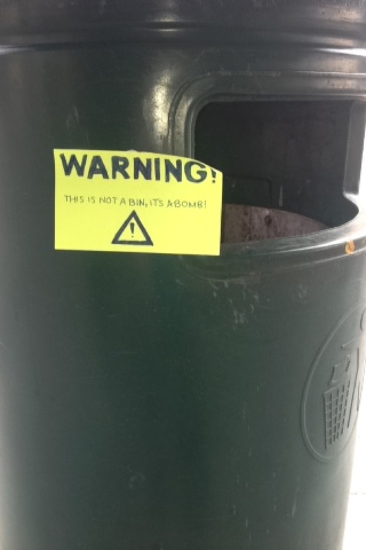
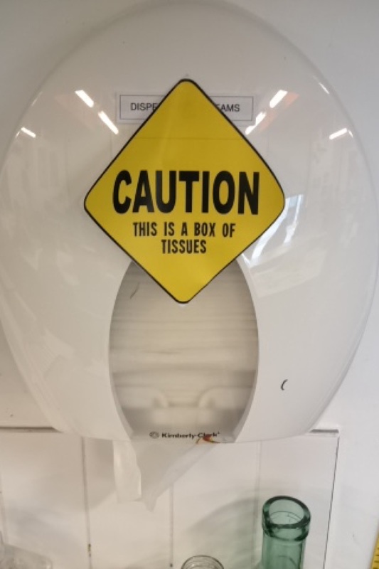
These were my experiments done at home using signs. When Taking these signs I wanted to try and add a comical aspect to it. For example the first two images have been swapped. The sign says eat me on the first one however you don't eat a drink. You drink and drink. On the second sign, it says "drink me" on a packet of crisps. This again is similar to the first image as you wouldn't drink a packet of crisps, you eat them. In the last image, I have tried to find another comical aspect to my signs, so I had a sign that said "erm....don't hug me." I put this sign on a teddy bear as I thought it would be humorous. When little children or even older people first see a teddy bear, your first instinct is to hug it and you wouldn't get a bear telling you to not hug him. So I though this would be a funny sign to have. To improve I think that i could have taken more image using differnet signs and then improve them .
Forced Perspective.
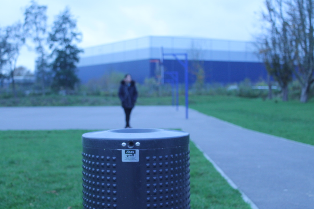
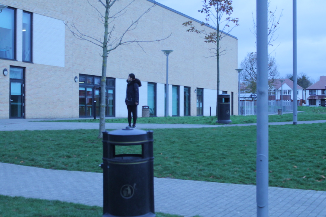
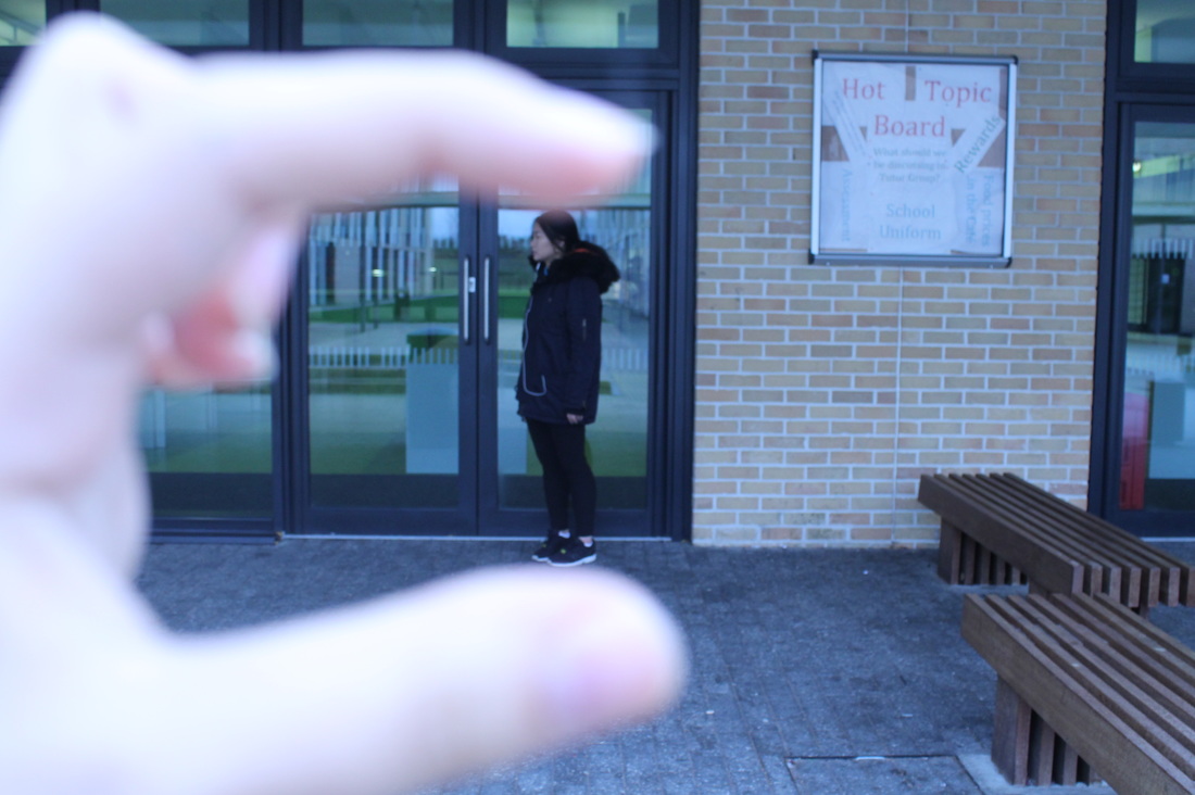
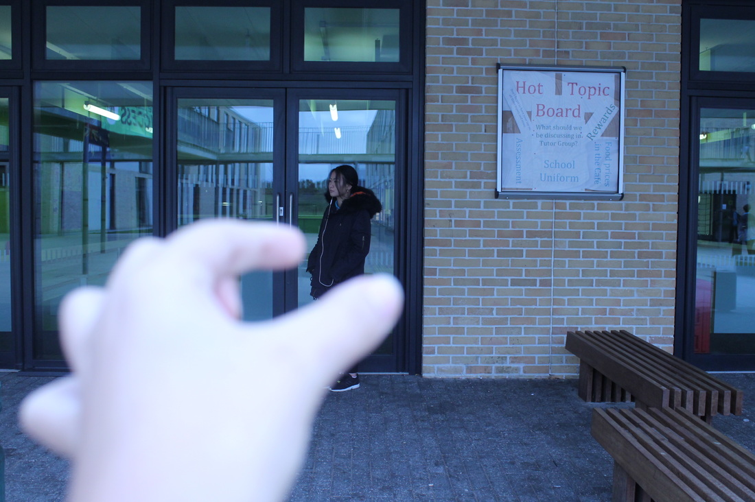
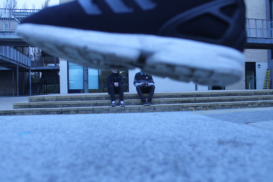
This is my first experiment on Forced perspective. To take the images I used a DSLR camera. I wanted to focus on having the theme of one subject in the image being smaller than the other. I think that some of theses have worked out but on others it was hard to have the right focus on it. One image I feel that worked well was the one of Amy on the bench. The bench in the image is much bigger than her body size. I did this by making Amy stand further back from the bench so it looks like she was standing on it but also makers her look really small compared to the other stuff around her. Another good image that worked out well was the image of Amy on top of a bin. Both the first and second image have worked out well as it looks as if Amy is really small and is standing on a really big bin. The first image has turned out well but Amy Is a little bit blurry to improve that image I would make sure both Amy and the bin are in focus like the second image of here on a bin.
Next Steps
Next I think that I need to research an artist that does forced perspective. This would allow me to have new ideas to help me take my next set of images. For example I could be inspired by a way a certain artist focuses on one part of the body like the face or hand or even a certain way they capture the image. I also need to make sure I experiment thoughtfully when taking more image or even when editing them on photo shop. When taking new images I need to make sure I am refining them and not just gong out and taking similar photos to the last set of images I took. Also I need to make sure that after every single set of images or experiments I take I evaluate them because sometimes I forget too and that's one of the most important things I need to do as by evaluating them I can see what I need to improve on and I can see where I need to go next. The final thing I need to make sure I do is make sure I note down what I need to do next so when it comes to it, I can get straight on with it.
Next I think that I need to research an artist that does forced perspective. This would allow me to have new ideas to help me take my next set of images. For example I could be inspired by a way a certain artist focuses on one part of the body like the face or hand or even a certain way they capture the image. I also need to make sure I experiment thoughtfully when taking more image or even when editing them on photo shop. When taking new images I need to make sure I am refining them and not just gong out and taking similar photos to the last set of images I took. Also I need to make sure that after every single set of images or experiments I take I evaluate them because sometimes I forget too and that's one of the most important things I need to do as by evaluating them I can see what I need to improve on and I can see where I need to go next. The final thing I need to make sure I do is make sure I note down what I need to do next so when it comes to it, I can get straight on with it.
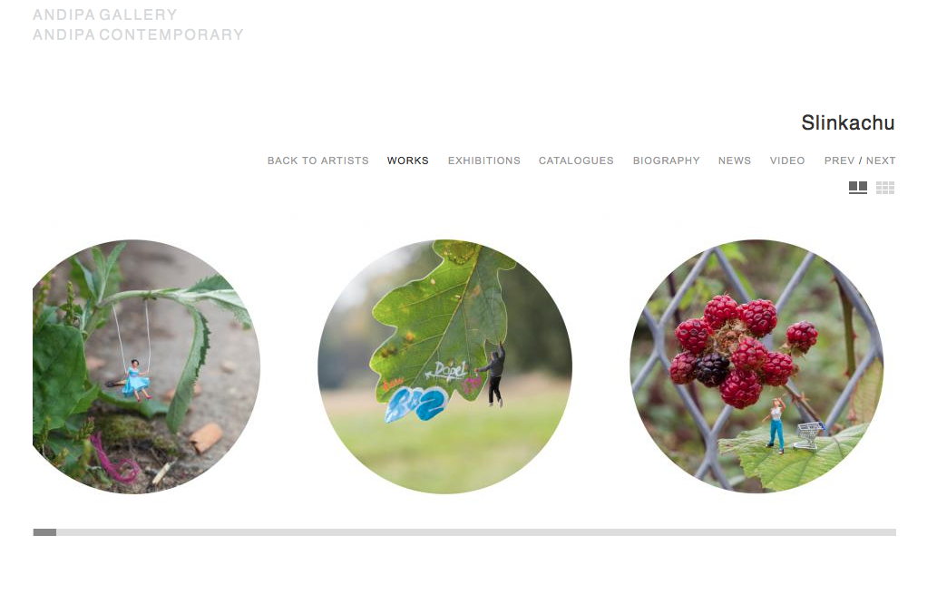
This is an example of forced perspective. This photographer has used miniature people and placed them on diiffernt enviromental pieces like leaves and trees to make them look unproportional to the rest of the objects in the image. I think that this makes the image work really well and follows the absurd theme well. The objects around the people look really huge compared to the people and this is odd and absurd as you would see the opposite of this. You would see the people bigger than the objects. For example with the raspberries, we eat them in everyday to day life and in order to eat them they have to be smaller than us and in the images there much bigger than the person as if its almost like a tree. Adding the trolly into it aswell make it look like shes buying them to eat but again their much much bigger than her. In the first image, theres a miniture women on a swing attached to some sort of plant weed on the ground. Again something we see in everyday to day life just because of the fact that the aphotographer has used a miniture person. The plant weed looks much more bigger than the miniture women which again is opposite to what we would see in everyday when we past some plants. This again fits well with the absurd theme./
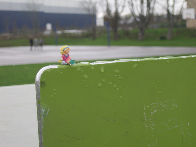
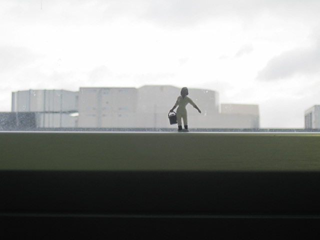
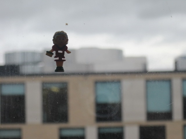
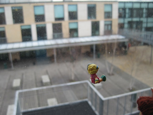
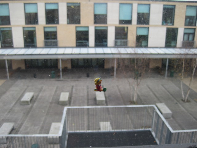
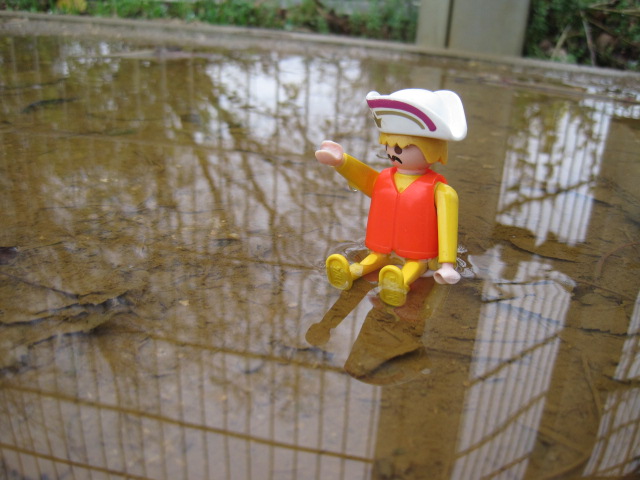
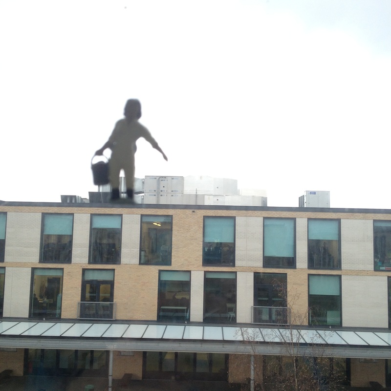
This was my first experiment on forced perspective. I think that some of them have worked well and some of them haven't. One of the images that worked well was the first image. I think that this worked well because the way it was captured look well and the way the little toy is sitting looks like its real and actually looks good. The rest of the images looks good too however I don't like the way some of them turned out. For example the ones of the girl toy sitting on a bench. I don't think that this image has turned out well as I think it doesn't look realistic and doesn't really work too well. Also with the one of the toy in the puddle, I think it would've looked better if I captured just the main image and not the background of the trees and bars as it looks weird.
|
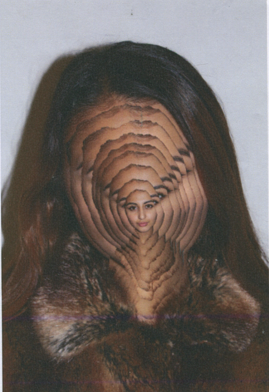
This is an image I created on photoshop. I based this image on another image I had seen on Pinterest and I wanted to create my own image similar to it too. I had taken an images on the main subject and on photoshop and then re pasted the same image just made it smaller each time to look like her face was getting sucked in inside.
|
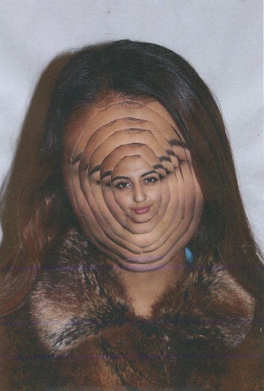
This is another image that I have created which is similar to the one next to it. The only thing which is different to that one is that I didn't do this picture on Photoshop, I created this image with paper.
|
Matthieu Bourel
|
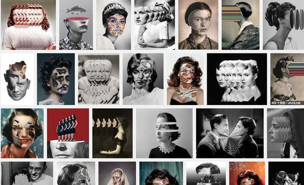
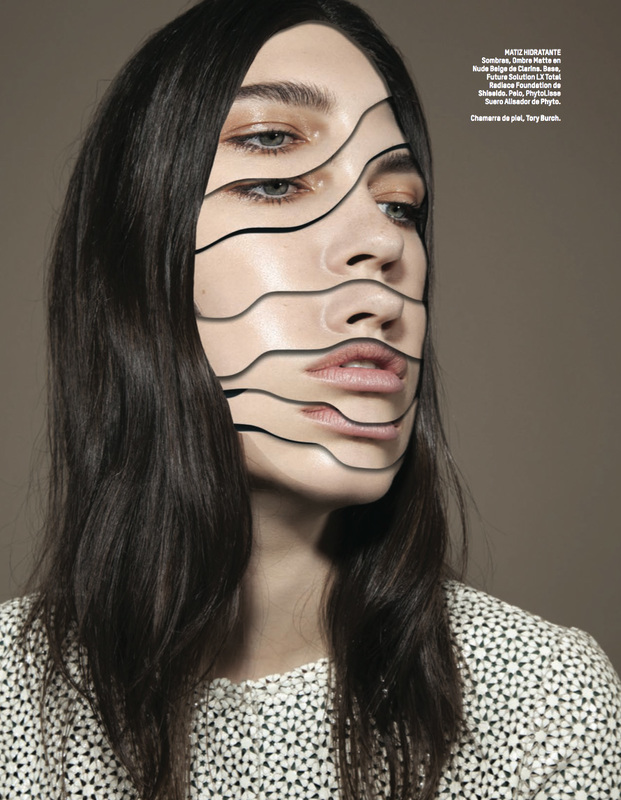
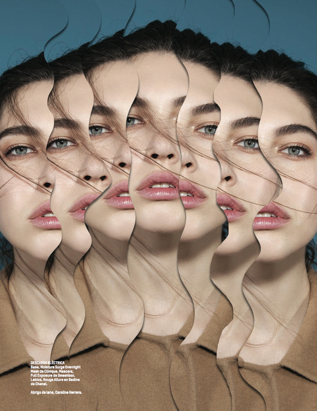
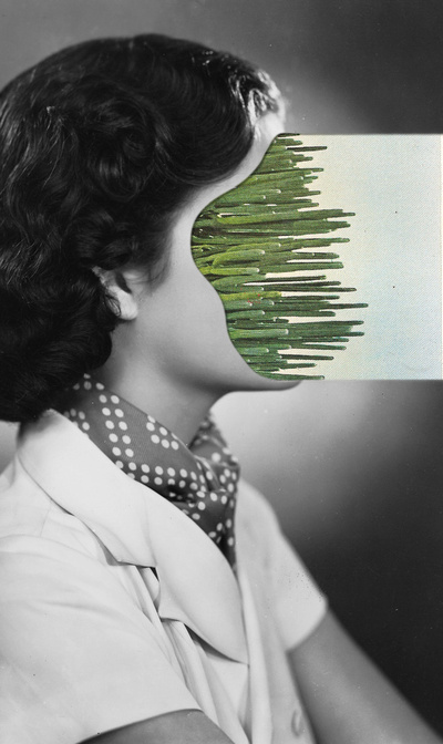
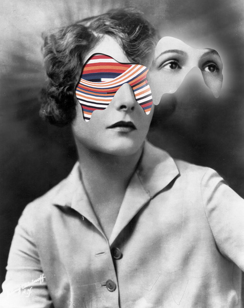
This is some of the work of Matthieu Bourel. I love the work he does, I really like the idea of multiple faces air multiple body parts, and cutting out different parts of the body and then adding a pattern to it. To the right there are some more images created by Bourel. The top two images have been layered on top of each other. This stretches out the image and makes the image look absurd. The bottom two images have parts of the subject cut off and have another image of a pattern put into that placed. I want to have a go at doing both of these kind of images. I think id feel more comfortable creating images similar to the two top images. I want to gave a go at creating these images on paper and also on photoshop because I haven't really experimented with photoshop before and I think it will help me get comfortable with it. |
|
|
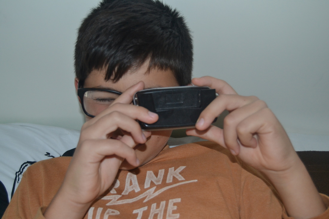
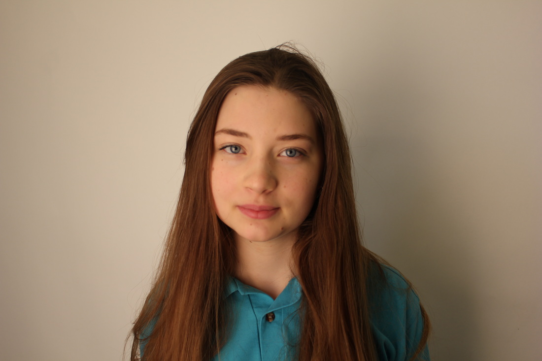
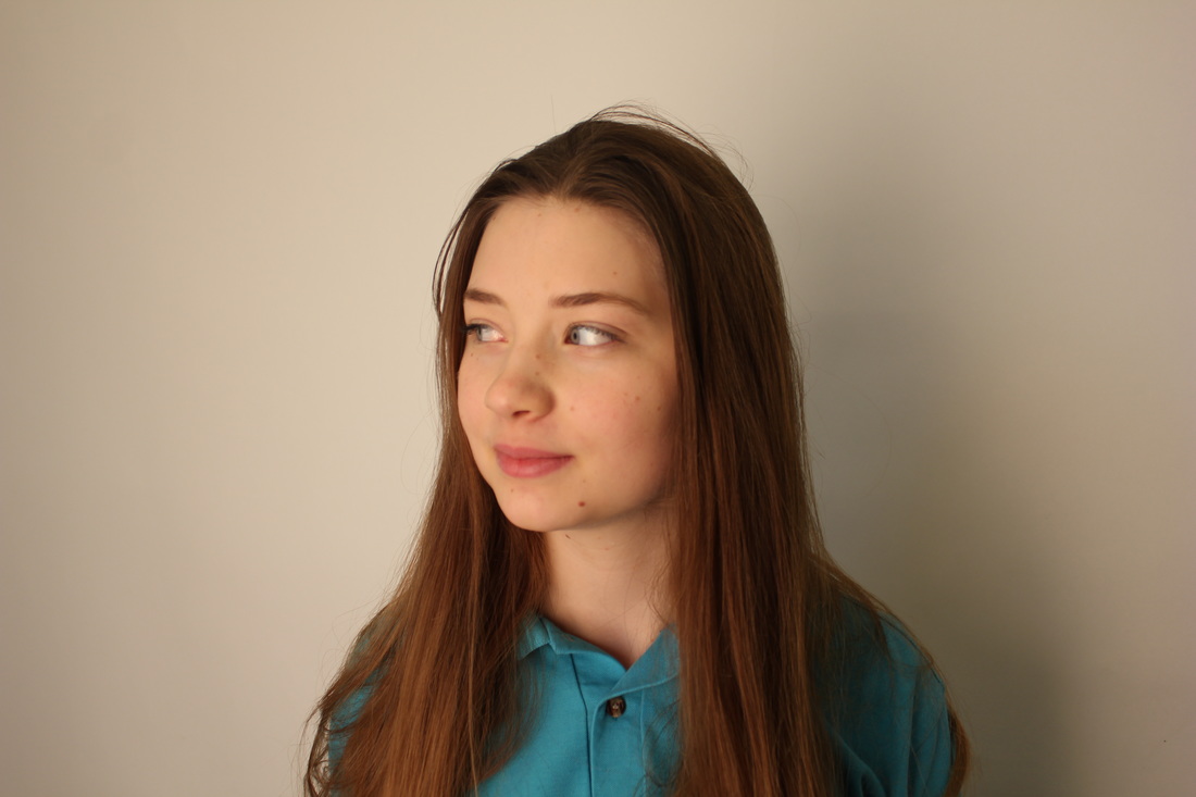
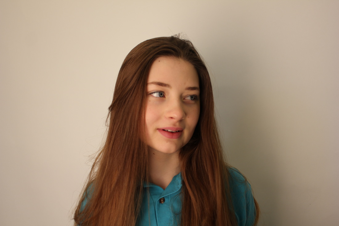
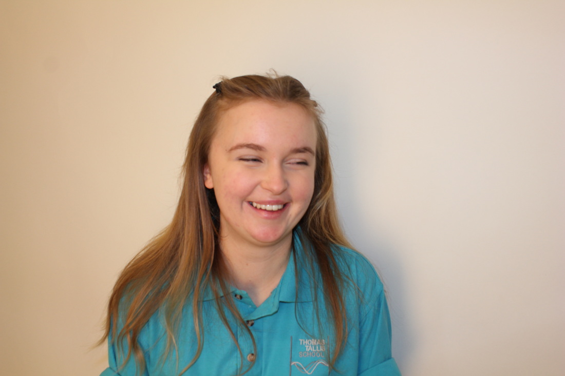
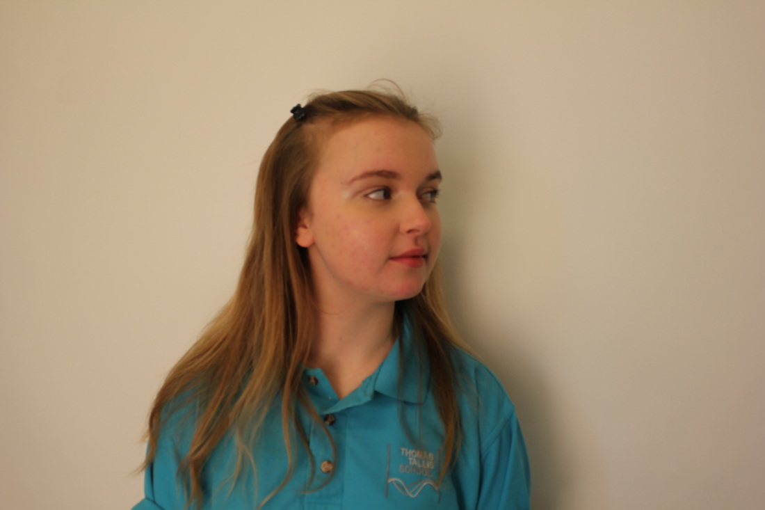
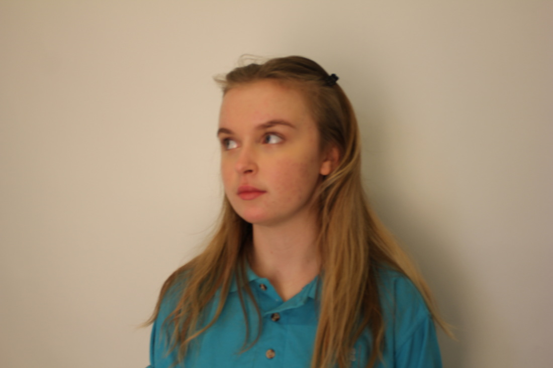
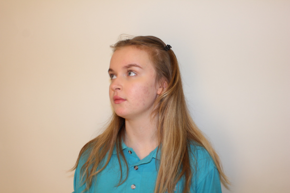
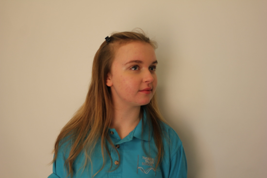
I have taken these images to use in my final piece. With these images I'm going to use either photoshop or printing them out and making them physically. I'm going to cut them up into pieces and try and do a similar thing like the work of Matthieu Bourel. |
|
Final Evaluation and pieces.
|
|
|
|
This is my fifth image I created. This image is similar to the first image above however instead of creating it on Photoshop, I created it physically. I printed out around 10 pieces of the same image. After doing this, I cut up each of the pieces of paper into slices to use. I used a base image which was the same and then layered the other pieces of the
|
|
The first experiment I did was based on an image I saw on Pinterest which I found really interesting. I wanted to have a go first at experimenting on Photoshop as I didn't use much of it in the previous images. The first image I created I think went well and was a goof first success on Photoshop. During the process of creating these images I wanted to create images that were similar to the work of Matthieu Bourel as I really liked and was drawn into them. I looked at some of his work on Pinterest and I started to get more and more ideas to use to start to create some images like his. The first thing I noticed with Bourel's work was that a lot of it had parts or segments of he body that were layered on top of each other or he had taken one image and cut of parts of the face of the subject and replaced with another image with was usually a pattern. Bourel also has used images which are sort of old fashion and looked like the kind of images you would see in the 60's. This is the other thing I noticed when I first started looking at Bourel's work, so I wanted to try and keep these two themes running through out my experiments.
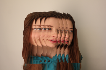
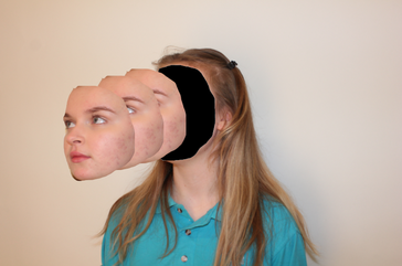
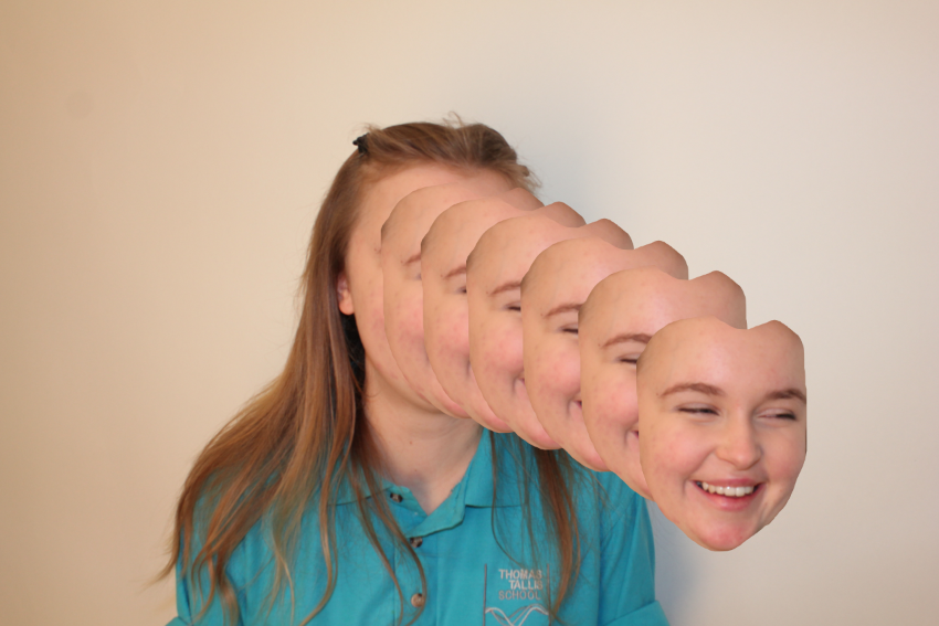
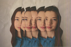
The first image I created was on Photoshop. I created this piece based on the work of Matthieu Bourel. I used the image I took above with a SLR camera. On Photoshop I cut out pieces/strips off the image and placed them on top of the original image. I carried on doing this which eventually created layers on top of each other. This made it look like the subject had a face which had been kind of stretched in both direction. This made the image look absurd as you wouldn't see someones face like this in everyday life and it makes you more engaged with the image. Again with the second image I had one image and took parts of the image then repeated it to create layers. However with this image I have only taken the face from the image and layered it. On the background image, I filled the face completely black. Matthieu did the same in with his images however instead of having the faces completely black he had them filled with a pattern. I wanted it black because I felt like it look more absurd as it looks like her face has completely been torn of the head and been pulled out in front of her and been layered too. This image is similar to the previous image. I created this on Photoshop as well but instead of having the face blacked out I used the original face. However with this image I continued to copy the segment of the face more times than the other image. I wanted to do this as I thought it would look more absurd then to just have two or three faces layered over each other.
The first image I created was on Photoshop. I created this piece based on the work of Matthieu Bourel. I used the image I took above with a SLR camera. On Photoshop I cut out pieces/strips off the image and placed them on top of the original image. I carried on doing this which eventually created layers on top of each other. This made it look like the subject had a face which had been kind of stretched in both direction. This made the image look absurd as you wouldn't see someones face like this in everyday life and it makes you more engaged with the image. Again with the second image I had one image and took parts of the image then repeated it to create layers. However with this image I have only taken the face from the image and layered it. On the background image, I filled the face completely black. Matthieu did the same in with his images however instead of having the faces completely black he had them filled with a pattern. I wanted it black because I felt like it look more absurd as it looks like her face has completely been torn of the head and been pulled out in front of her and been layered too. This image is similar to the previous image. I created this on Photoshop as well but instead of having the face blacked out I used the original face. However with this image I continued to copy the segment of the face more times than the other image. I wanted to do this as I thought it would look more absurd then to just have two or three faces layered over each other.
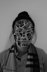
The last image I created, I created on Photoshop. With this image I used one back ground image and used another image of a pattern. Then on Photoshop I took different parts of the pattern image and pasted that on to the face of the subject in the background image. I carried on doing this until most of the subjects face was covered up. I think that this made the image look absurd as it looks like her face is actually like that. I got the idea from the research I did on Matthieu Bourel. I really liked his work and the ones similar to this so I wanted to have a go at creating one myself.
