Abstraction
abstraction
noun
1.
the quality of dealing with ideas rather than events.
"topics will vary in degrees of abstraction"
2.
freedom from representational qualities in art.
"geometric abstraction has been a mainstay in her work"
noun
1.
the quality of dealing with ideas rather than events.
"topics will vary in degrees of abstraction"
2.
freedom from representational qualities in art.
"geometric abstraction has been a mainstay in her work"
|
WHAT IS IT?
Abstraction in photography usually focuses on the Formal Elements like Line, Tone, Form, Shape, Pattern and many more. Using the Formal Elements it creates Interesting surreal images which makes the main subject the less interesting object to look at. It makes the other objects around it more interesting and over powering too look at. Capturing the Formal Elements, It creates abstract images in a way that you would not see in normal images captured. ARTISTS WORK
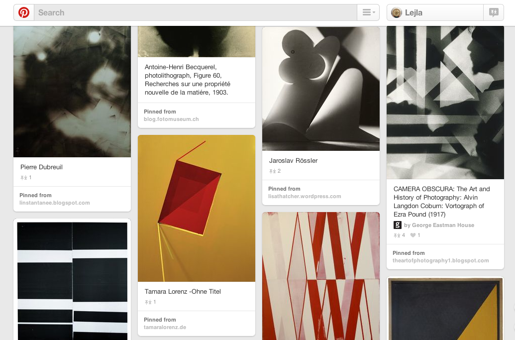
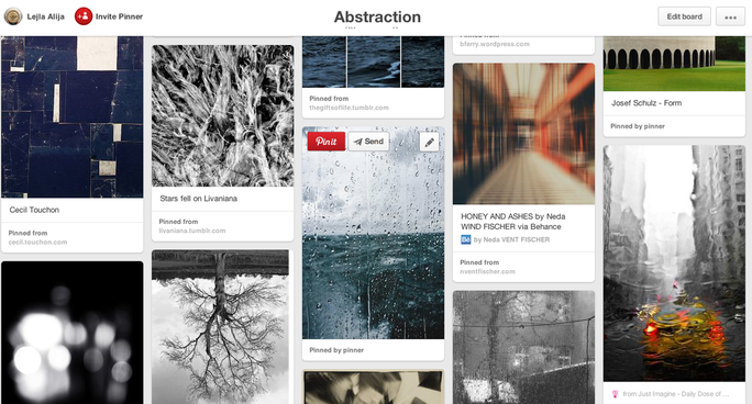
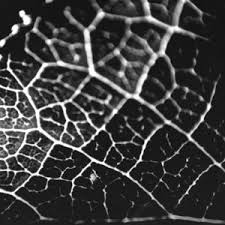
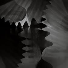
Most abstract photographers focus on the everyday objects around them, familiar things that they show us to be less familiar than we think. They isolate a subject. Many abstract photos have no clear subjects, while others make the subject appear like an unlike object. Have a look on the pinterest (by clicking on the images to the side) at some of the work various artists create on the theme of abstraction. EXAMPLES OF ABSTRACT PHOTOGRAPHY |
MEANING AND MOOD Many artists try and create a certain meaning or mood behind the images they capture. They sometimes use things like cool colours and smooth lines to create a sort of calm and soft effect and feelings for the audience and viewers. One the other hand they might decide to capture blurs, grains or dark settings to create an eerie, mysterious or down mood/feelings for the viewer. TEXTURE
Texture is a factor that many abstract photos have in common. Repeating patterns is what many abstract photographs tend to do. A common extension of is a single break in the pattern an unusual gap between a crowd of people walking down a sidewalk. Texture varies from dust to drip patterns. |
Have a look at My Pinterest account and have a scroll down to look at different pieces of abstraction work.
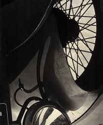
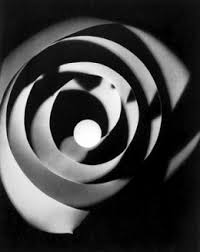
PAUL STRAND
Strand was introduced to photography as a high school student at New York City's Ethical Culture School. His first teacher was documentarian Lewis Hine and his mentor's commitment to social improvement through photography can be felt in all of Strand's work. Later on in life after his trip to Europe, Strand became a self employed photographer. Strand's favoured the rich detail and tonal range made by the the use of large format cameras. The pureness of Stand's images of natural forms and architecture forshadowed the work of other American Photographers seeking to express abstract values.
|
|
“The work is brutally direct. Devoid of all flim-flam; devoid of trickery and of any ‘ism’; devoid of any attempt to mystify an ignorant public, including the photographers themselves. These photographs are a direct expression of today. We have reproduced them in all their brutality.” |

FIRST SET OF IMAGES
|
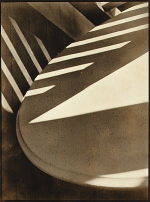
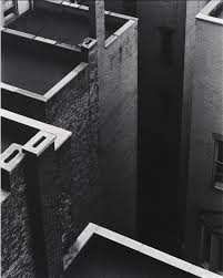
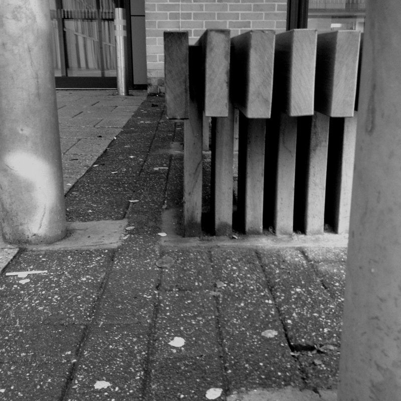
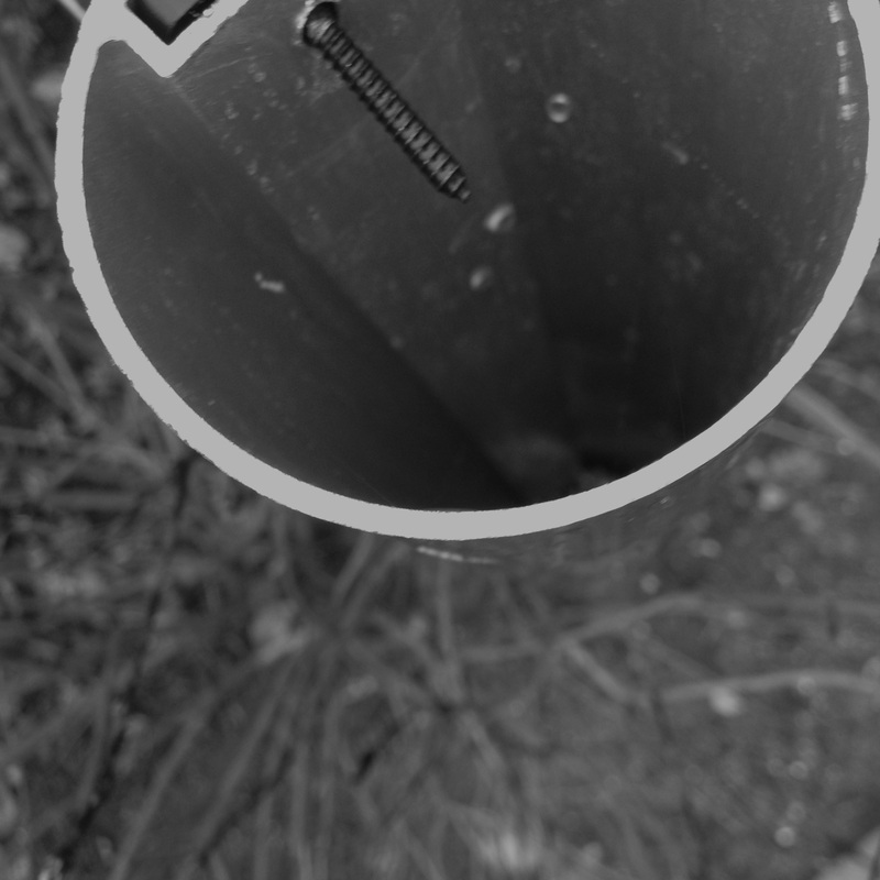
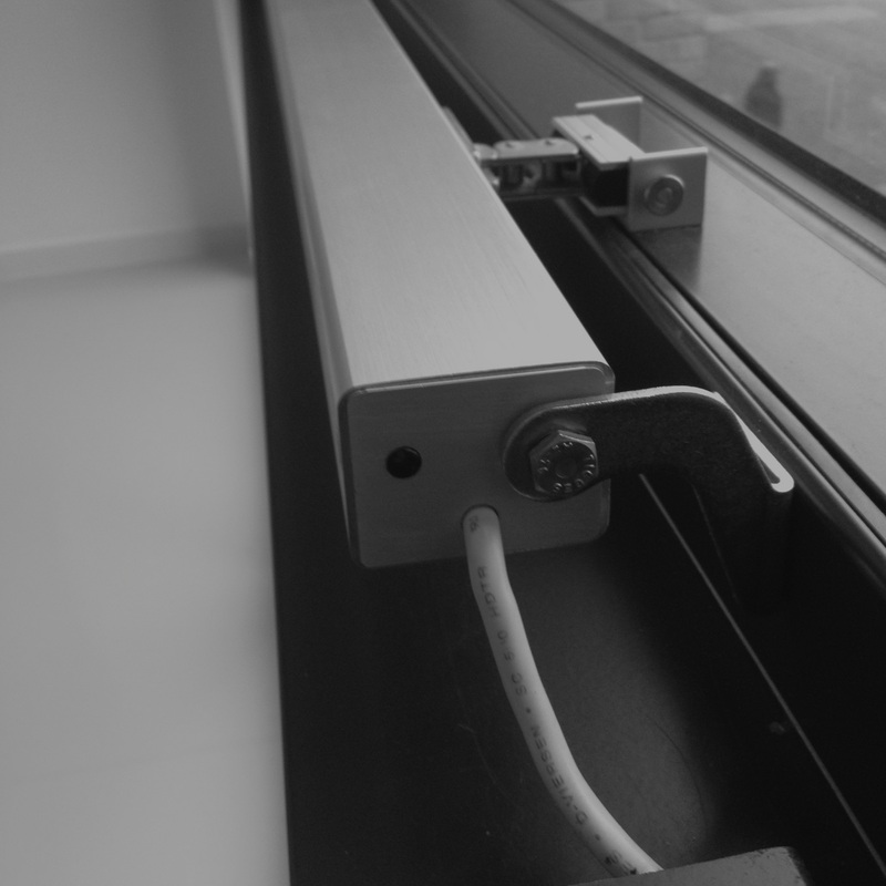
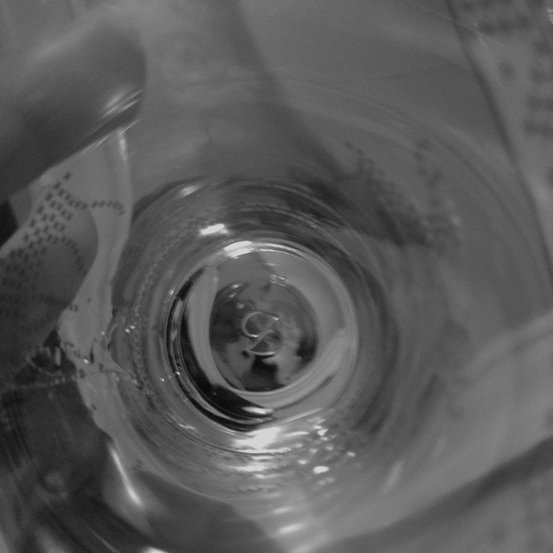
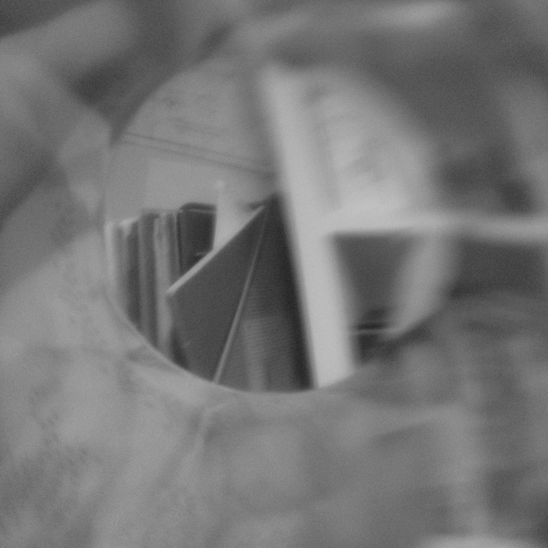
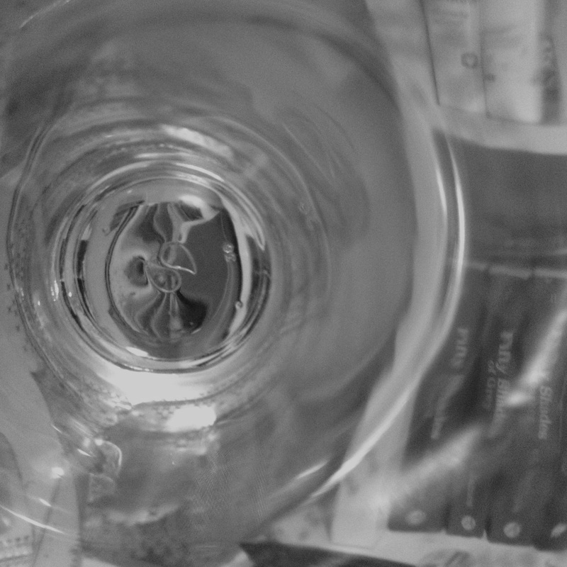
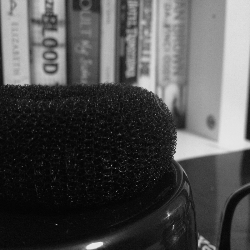
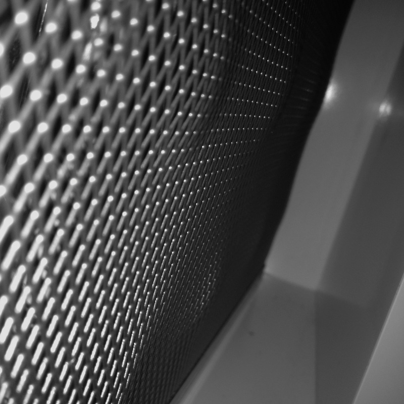
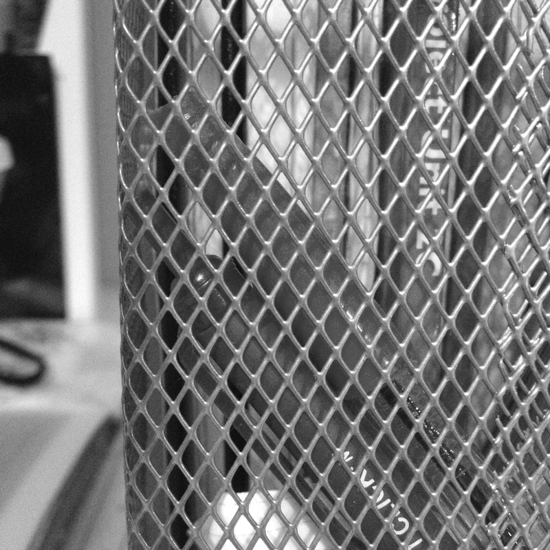
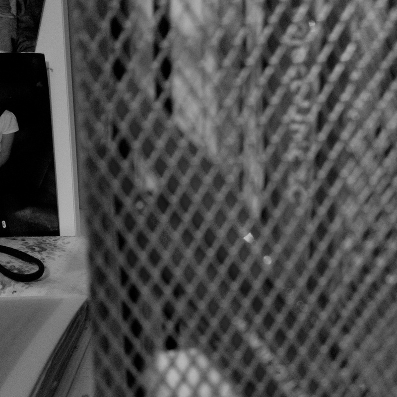
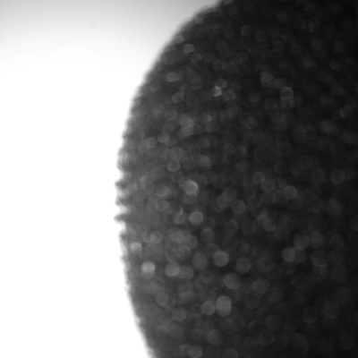
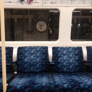
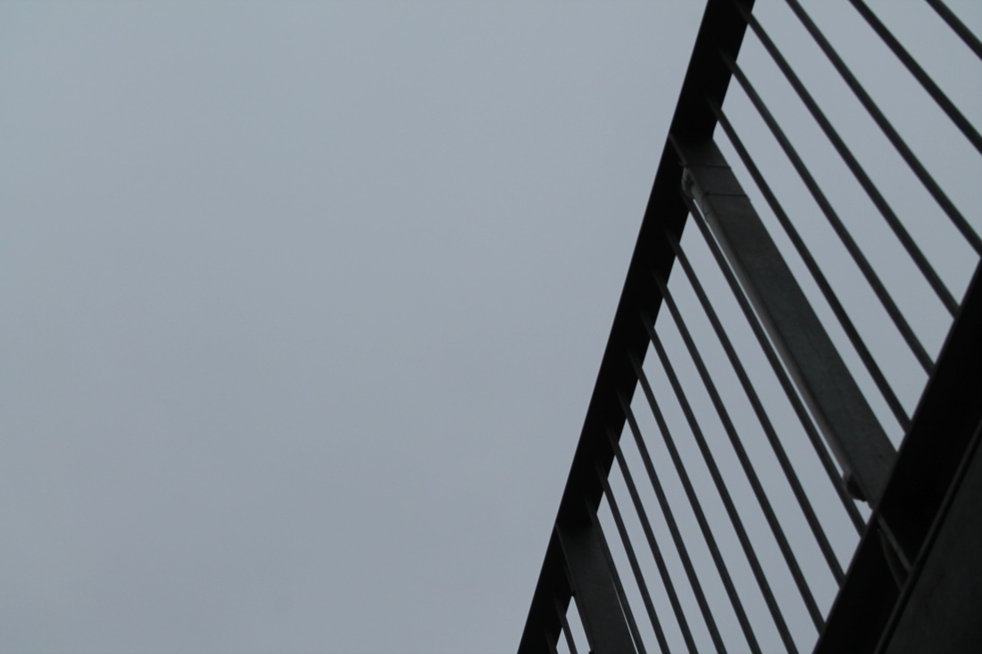
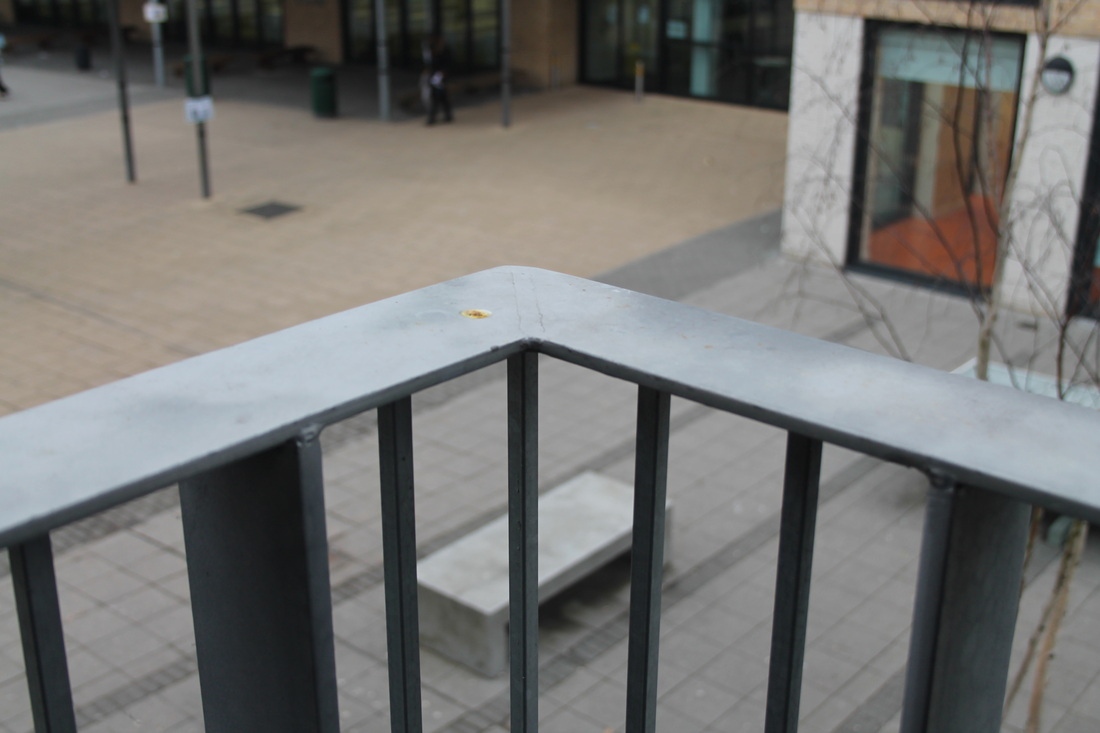
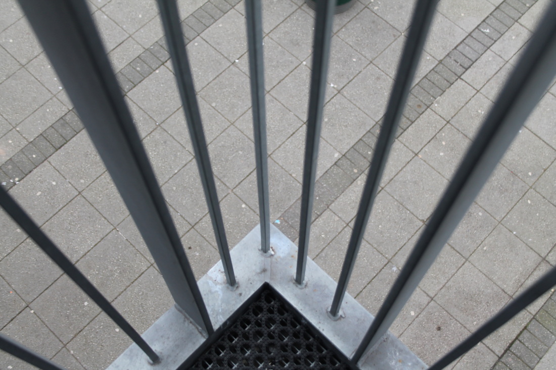
The images to the side are my first set of experiments of the theme of fragments. I think that I mostly focused on the technique of Lines. In the first few images there are various lines for example in the first image of the bench, there are lines through the bench and also on the floor going down. I think that the angle was also effective as the lines on the floor seem o be going inward towards the wall making it seem like the floor is getting narrower as it goes further down. In the third and fourth image I have also done the same, focusing on lines going straight down and also going across. I think that I have also focused on the technique of texture. For example in the last few images I have taken photos of a case that had a zig zag, diamond shapes and I thought that I looked quite nice and it was a really interesting texture to focus on. The images on taking through the glass cup, I thought looked quite interesting. They looked quite surreal and had a weird effect and made me feel I was looking through a glass container, similar to a goldfish, which I think made it look quite cool and interesting to look at. I took all of them in black and white as I think that It really brings out the shadows and the darker colours, contrasting with the lighter whiter colours in the image. |
|

|
|
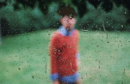
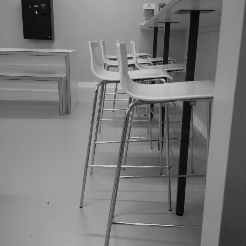
TO IMPROVE: In my next task I want to focus on the focus of the image. I want to have some images in focus and some of them out of focus. I want to capture plain subjects each with one person in them. These images below I think focus a lot on the focus of the subjects. One of them is in focus and the other two are out of focus. These images are a clear example of the elements of focus.
|


SECOND SET OF IMAGES

|
WWW:
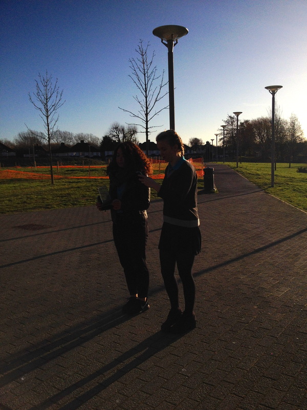
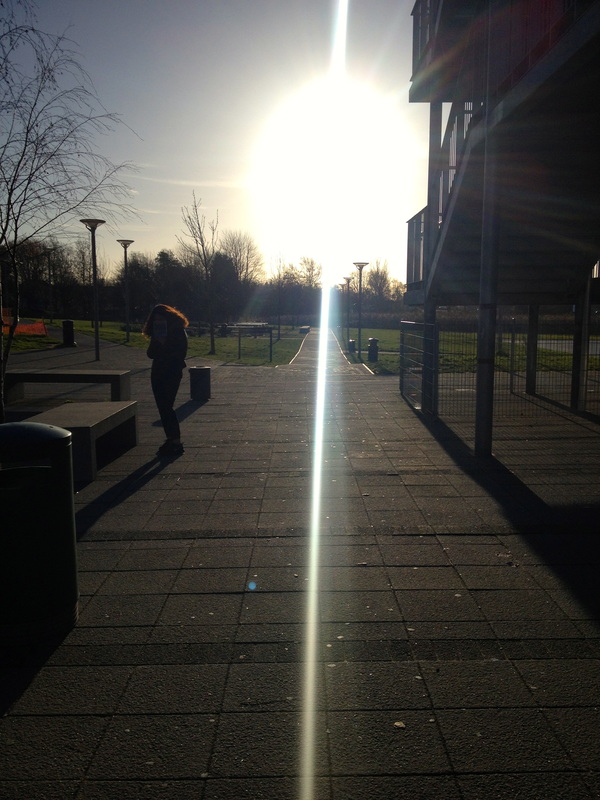
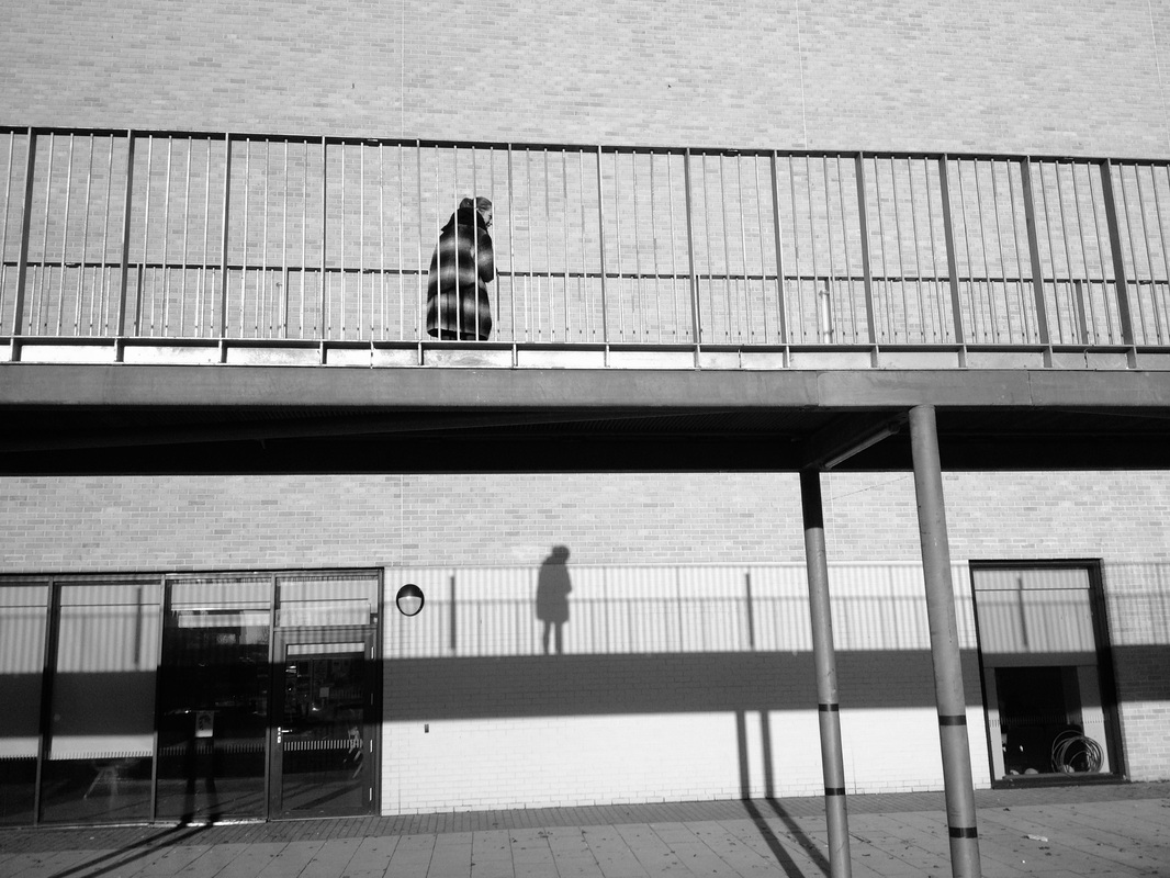
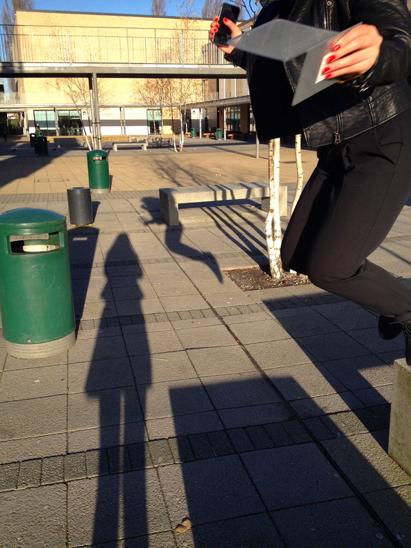
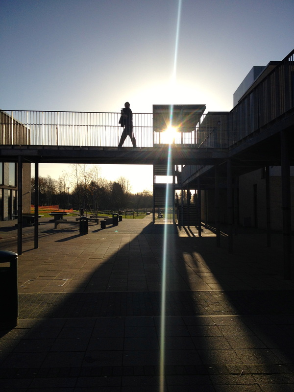
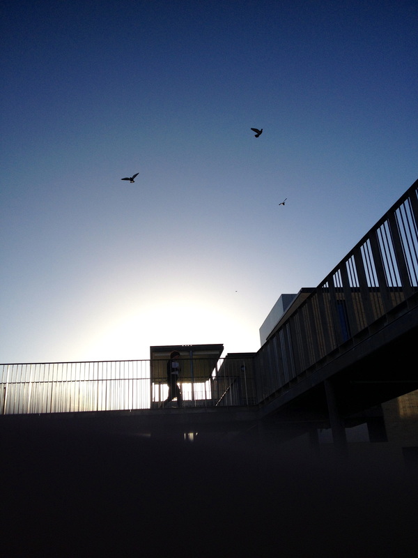
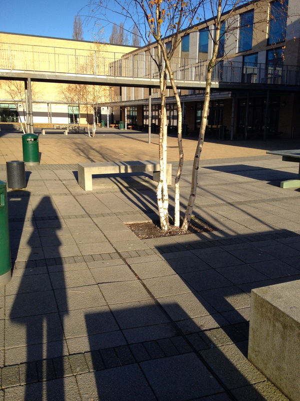
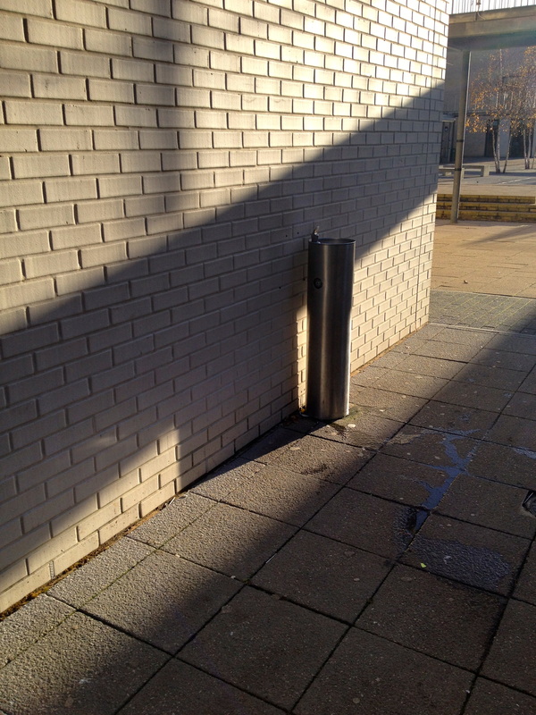
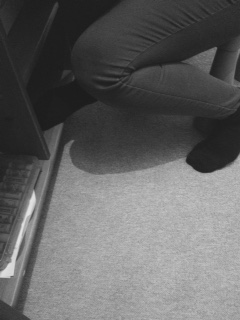
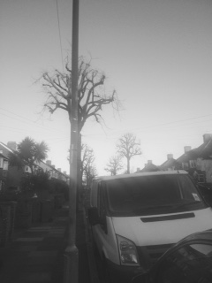
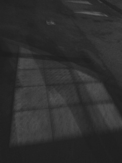
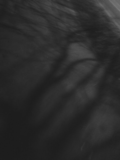
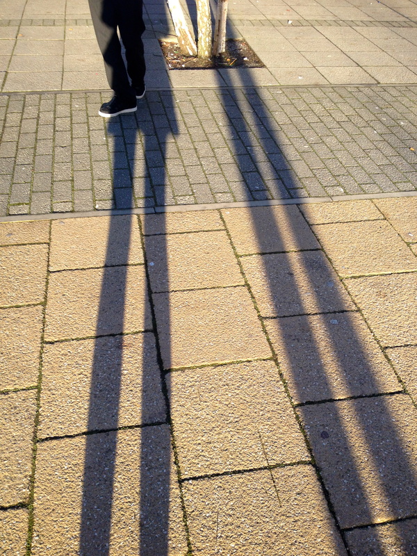
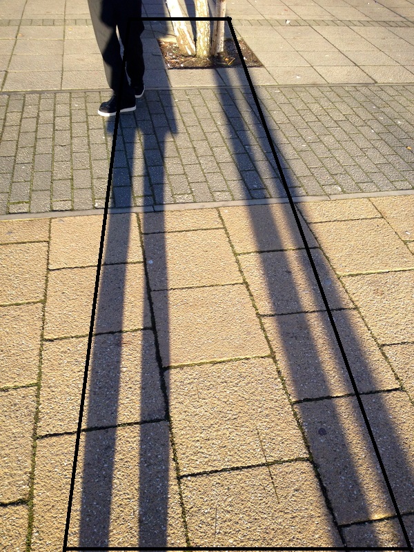
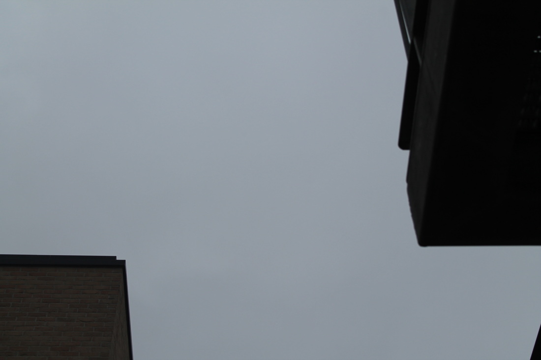
These images were taken on the concourse at school. At first I wanted to focus the focus of the images, having some of the images in focus and some of them out of focus. However I decided to focus my images on Line and Shadow. In the images i've captured at least one person standing, walking or jumping. In the images the lines that have been captured are part of buildings or trees and objects. The lines are also within the shadows captured, for example in the third image to the left, I have captured a shadow of two trees along side the shadow of my two legs. The shadows in this image are the legs and the trees and the lines are also the shadow. There are four straight lines going down. |
EBI:
To improve these images I think I need to use a DSLR camera to focus the images on the subjects I want focus and to get a better quality of my images and also make sure I don't always have the sun directly facing the camera as I can't always see the subject that I have focused on. |
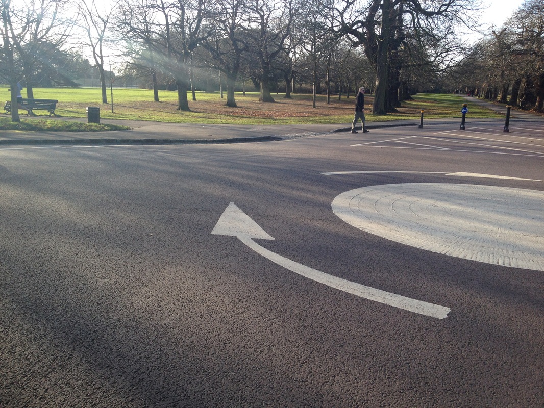
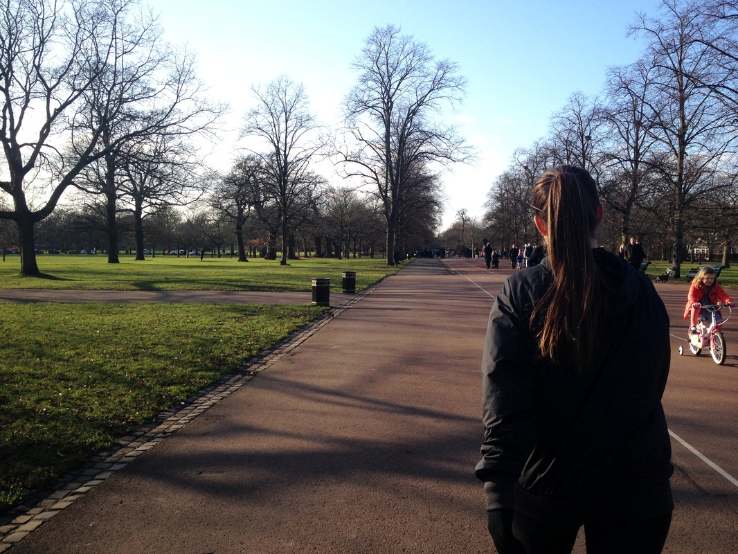
HALF TERM IMAGES

|
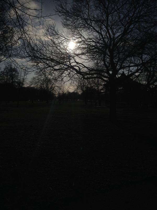
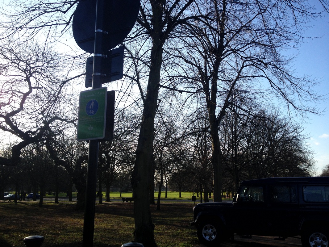
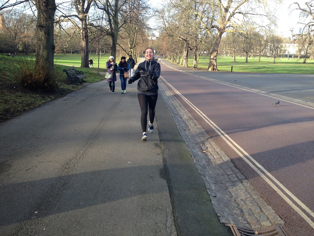
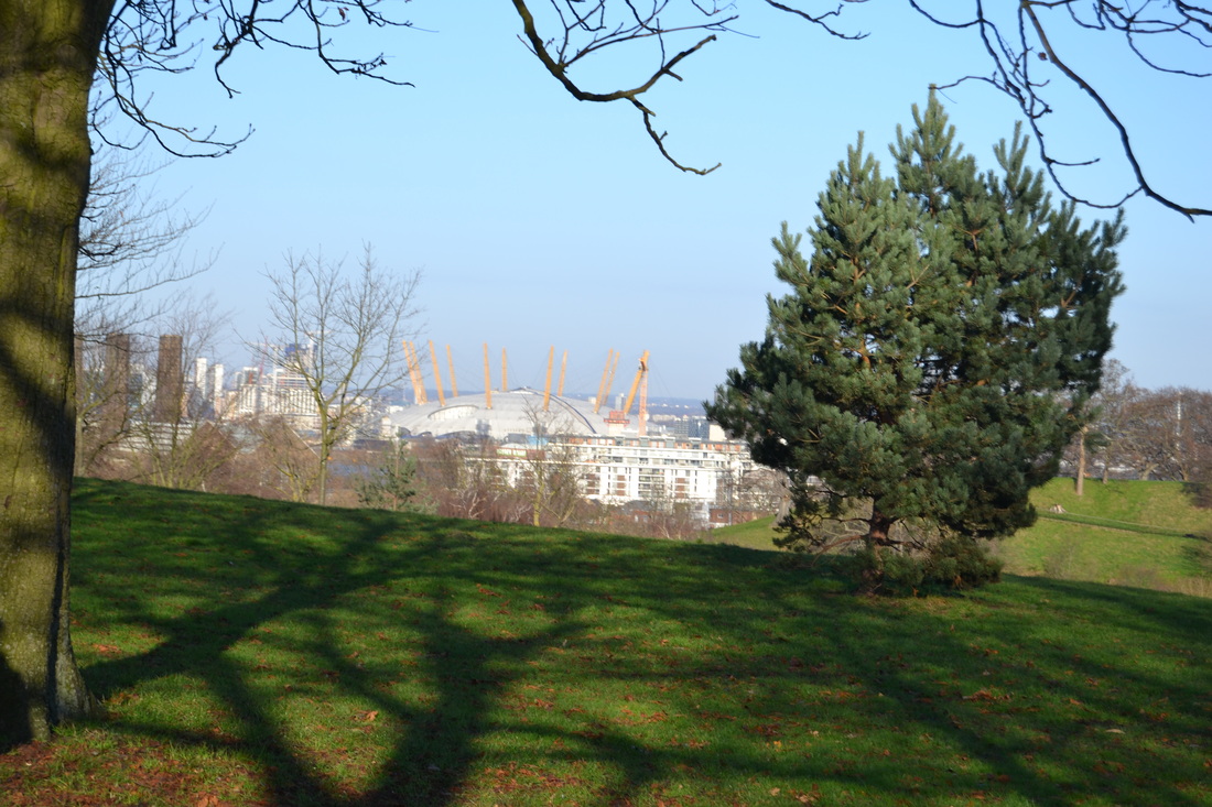
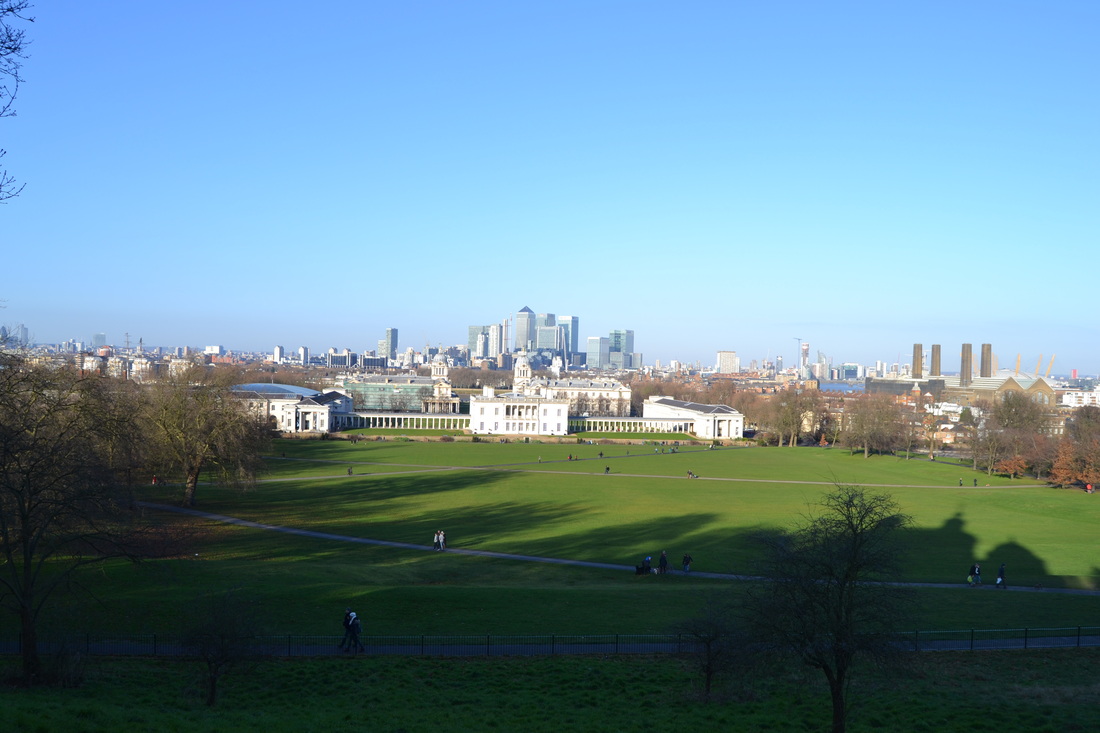
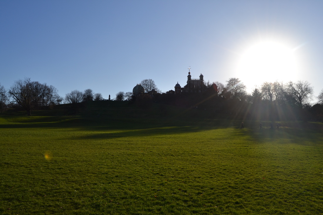
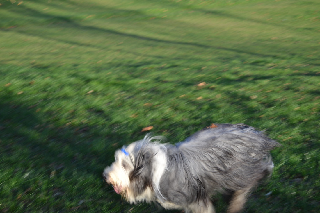
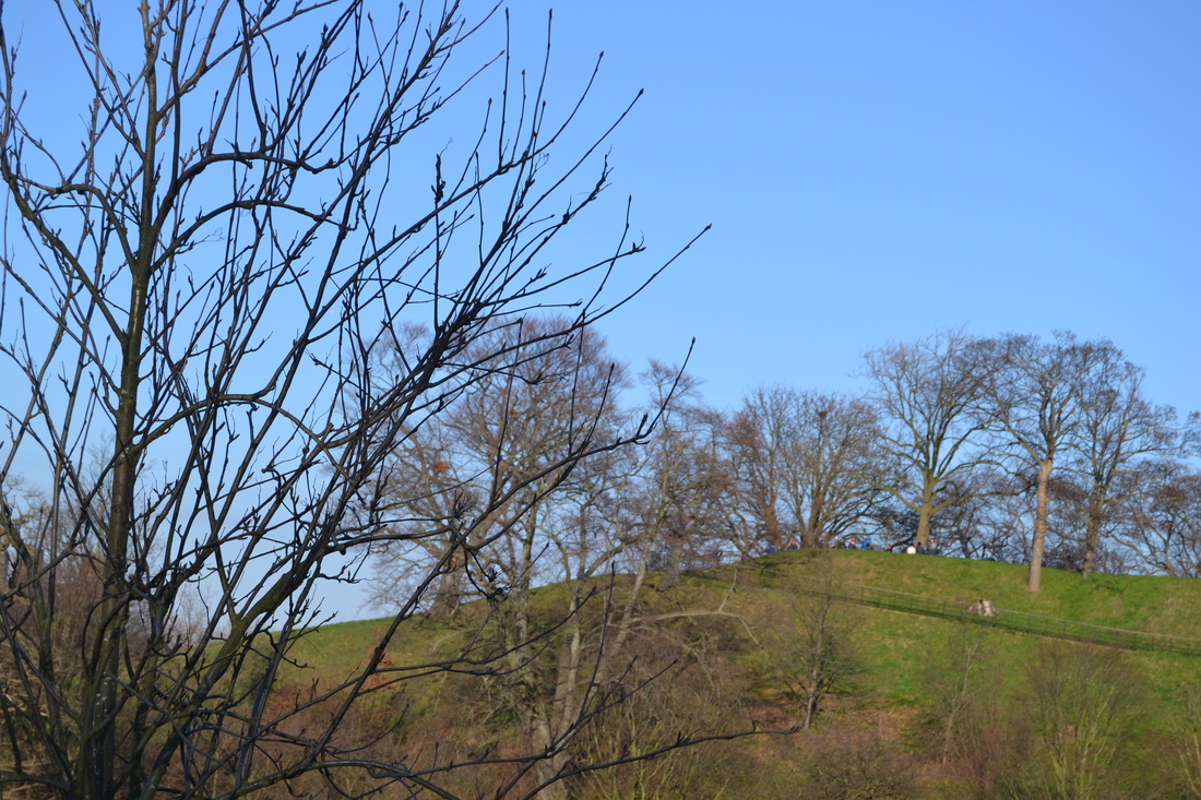
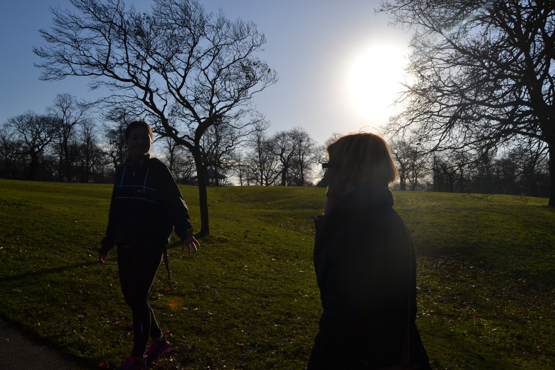
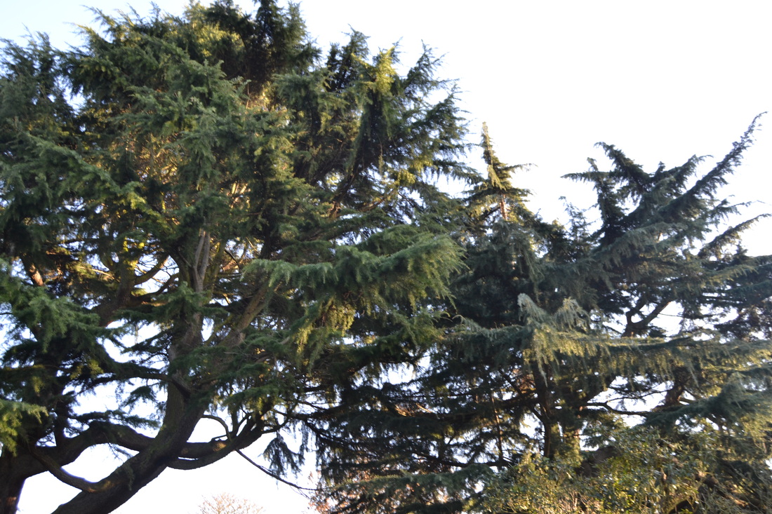
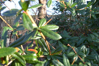
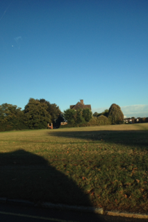
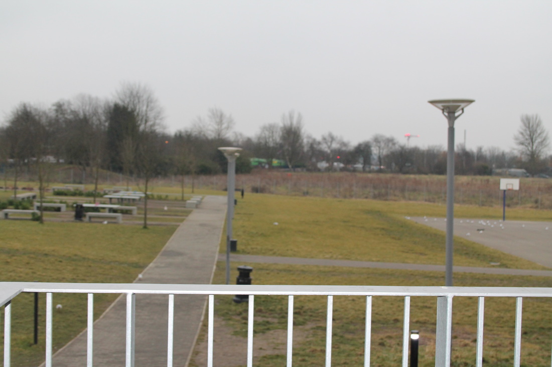
WWW: I took these images over the Christmas Half term. I went to Greenwich park. In the images I focused on nature also on Landscape as the images are taken from far distance covering the whole lot. All the images are taken in colour and have been taken by my iPhone and also a DSLR camera. I focused on trees and grass for nature. In some of the images I have focused on shadows as well. I decided to carry this on from the other images I had taken before as I really like how they turned out.
|
EBI: I think to improve the images I think I need to focus on one formal element instead of focusing on lots of them. Also I think that I should focus on just on artist or photographer next and take some images based on their work. I think I might have a look at Matthew Tischler's work or maybe Francesca Woodman's work and take photographs based on theirs.
|
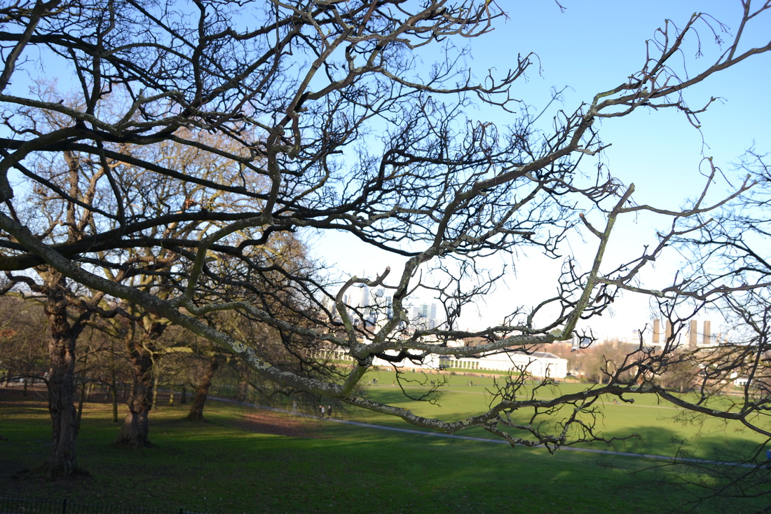
This is one of my favourite images. In this image I have focused on nature and also have focused on the focus of the image. The image has a deep depth of field. The leaves at the front of the image are out of focus. However the leaves and plant in the middle of the image are in focus and the leaves right at the back are out of focus too. This makes the image look more interesting as it doesn't just focus on the first thing that is seen but on another part of the subject.
Fourth Set of Images.


|
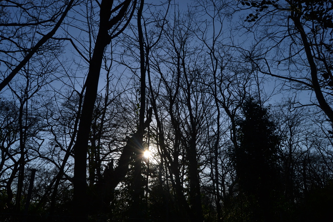
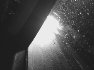
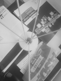
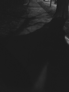
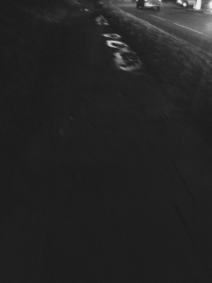
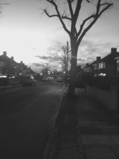
WWW: In these images, I have focused on the formal elements of shadows and line. The images have mostly been taken in Black and White although there are some that have been taken in colour. I took most of the images in the evenings as i wanted to get the shadows from the car lights and the street lights to from the shadows because during the day there isn't really any shadows I can take a photo of as there is less light. However I did manage to take a few images during the day as it was a bright day and the sun was out meaning I could find shadows around.
|
EBI: I think that to improve my images that I have taken I need to maybe focus on taking them either in black and white or in colour. I also think i need to take them standing still and not move too much as in some of the images there is a lot of movement and you can't always see whats going on within the image. I also need to make sure that I stick to 2 formal elements as I have taken some of the images based on another formal element.
|
Francesca Woodman
|
|
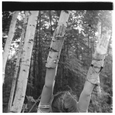
Francesca Woodman was born in 1958 into a family of artists. She began taking photographs at the age of 13. After completing her degree she moved to New York and made several large scale personal projects where She experimented with fashion photography. Her photos explore the issues of gender and self, looking at the representation of the body in relation to its surroundings. Woodman places herself in most of her images where she is hidden within the objects around her, merging with them.
Her work has been exhibited widely across Europe and the United States since 1986 in museums like the Guggenheim, in New York and the Foundation Cartier pour l'Art Contemporian in Paris. One of her exhibitions considered the Zigzags and abstract geometrical forms. An artist described one of these pieces in a letter to a friend in 1980. ‘It will be … a long string of images held together by a long compositional zigzag, thus the corner of a building in one frame fits into the elbow of a girl in the next frame into a book in the third frame, the images are both very personal mysterious ones and harsh images of outdoor city life. It is hard to get the adjoining images to fit the rigorous structural scaffold’. |
|
The image to the right is one of my favourite Francesca Woodman Images. I like the way that she has camouflaged her arms within the tree. This image is part of her Zigzag Exhibition. The zigzags are going from the first arm on the left down to the corner of her head. The other zigzag is on the other side, by the other arm and down to her head again. The image also include a lot of the formal element line, having straight lines going down in rows from left to right. The focus of the image is on her hands and the tree she is camouflaged with. Trees and the surroundings behind her are out of focus.
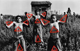
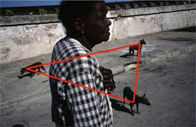
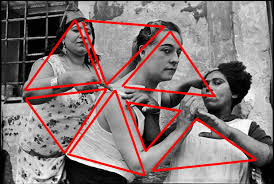
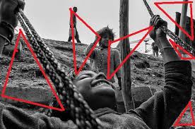
To move on from where I have got so far and where i've done, Im going to base my images on Francesca Woodman's work. Im going to pick one geometrical form and focus on that through out my images. Ive tried to come up with a few ideas on what Geometrical form to do and I think Im going to focus on triangles. Im going to keep that as my running theme through my next images. Ive also had a look at some artists who include triangles within their images and I found Erik Kim has some interesting pieces. The images to the side are two examples of his work. Im going to combine his work on triangles and Francesca Woodman's idea on using geometrical shapes within her images like the zigzags to create some of my own. |
|
|
WHERE I PLAN TO GO NEXT
To move on from where I have got so far and what I've done, I'm going to base my next images on Francesca Woodman's work. I'm going to pick one geometrical form and focus on that shape through out my images. I've tried to come up with a few ideas on what geometrical form to do and I think I'm going to focus on triangles. I'm going to keep that as my running theme. I've also had a look at some artists who include triangles or any other geometrical form within their images. One Photographer I found was Eric Kim. The four images to the side are examples of his work with triangles. Using Francesca's theme of the geometrical shape of zig-zag, I'm going to use Eric Kim's photos for inspiration to create my own set of images based on triangles. |
|
|
|
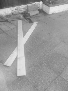
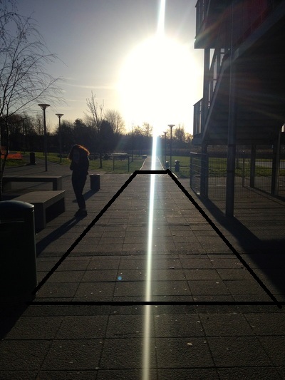
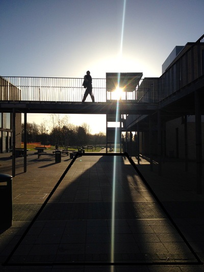
These images to the left I think are similar because they all are based on the same formal element. They all have shadows within the image. The shadows in each of the images are also lines. Iv'e combined two formal elements into one. They also all have The theme of geometrical shapes in the image. This fits well with my next idea for the images. The images below the top set have been edited by me to show the rectangular shape in all the images. In my next images I want to do this again but instead of rectangles I'm going to use Triangles. |

|
I have had a look at this "Abstract Square" book. It contains abstract photography work. All the images are taken in or have been framed in squares, which refers back to the title "abstract Squares". All the images have bright bold primary colours. In all the pictures in the slide show they all have the running theme of the formal element line in them. What I like about the images is that they all are really simple but they are each uniquely interesting and different. In my next images I also want to capture them similar to these images, using the bright bold colours.
|
|
Final Pieces
1st Final Piece


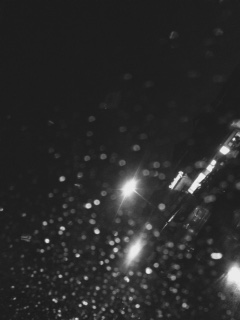
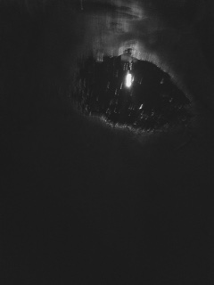
This is my first final piece. I've grouped these images together as they all fit well with the theme of lights. The images are taken in black and white and have been taking in the evening. I choose to take them during the evening as the lights are on the streets and the car lights are on so there are more ways I can take the images. I think that they look nice together as a final piece because they are all similar. The lighting in the images are similar. They all have bright tones in them and also some darker tones like the 3rd image for example.
2nd Final Piece

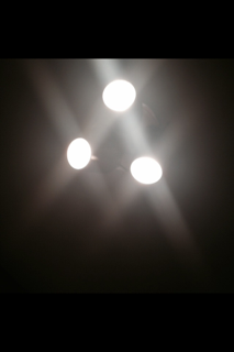
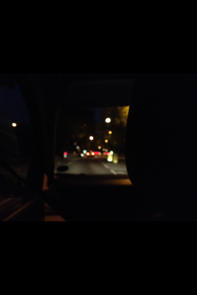

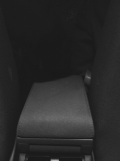
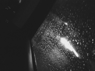
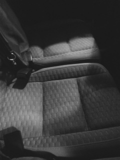
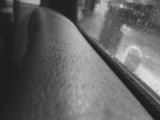
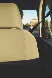
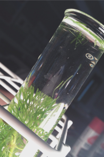
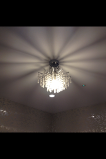
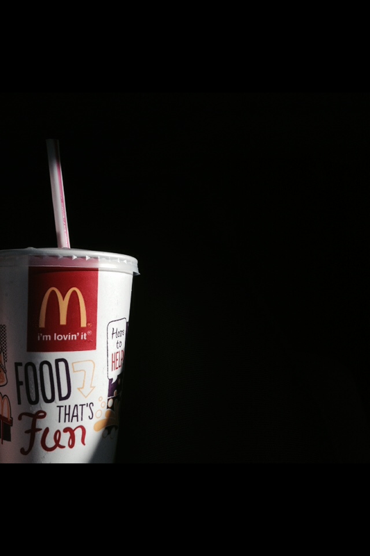
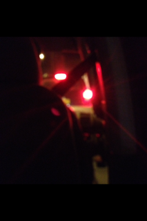
This is my second final piece. In this final piece I combined he images of the fourth set of images I took. I combined these four images together because they all fit well under the formal element of lights. I took the images towards the evening as there are more interesting lights during hat period of day and you can capture them in a variety of different ways due to this. The light in the images comes from different source. The first and the third images are both taken in similar surroundings and have the same light source. The second and fourth images have been taken in different surroundings to the other images. They have both been taken in an inside area. The light in the images are both from the same source. Their both from ceiling light shades. All the images also fit well with the formal element of line. In the first image there are curved lines of the chairs, straight lines from the seatbelt and the outline of the car. There are also lines coming from the lights, for example on the red light, there are lines coming off from it. In the second image there are lights coming off from the three lights and it sort of like a reflection as well because they have all reflected in the same way. In the third image the main line is the outline of the car and some of the road lines further into the background of the image. The final image has shadowed lines right round the lamp shade.
FINAL EVALUATION
For my Abstraction Project I have researched lots of photographers, such as Francesca Woodman and Paul Strand, for inspiration and ideas for my own work. I looked at their work, exploring their techniques and looked for the different formal elements used by them in their images. The main Formal Elements I focused on in my work were Line and Lights. In the work of these artists, I wanted to find a link between their work and my developing work. Inspired by their work I went out and experimented in taking some images of my own. Once I took these images, I uploaded these images onto this weebly website and then went through them and decided which images were the most successful and the least successful. After doing this I was able to go and take more images, making the improvements from the previous images.
For the project, I also had a go at editing my images on Photoshop. I used some of the images I had taken previously. However they didn’t work out very well as I’m still learning how to use Photoshop. The outcomes of the images I had edited didn’t really turn out how I wanted them too. So next I decided to look at another artist. I looked at Francesca Woodman’s work. Her photos explore the issues of gender and self, looking at the representation of the body in relation to its surroundings. Francesca’s work focused on the Formal element of line as the theme of her work was zigzags. Because this was one of the main formal element I had taken my previous images on, I decided to further take some more images based on her work. After doing this I, again, figured out which images were the most successful and least successful. As Francesca Woodman’s images had the running theme of Zigzags in them, I decided that I could also have a running theme of another Geometrical shape in my images. I wanted to add a running theme of Triangles in my work. I had previously looked at Eric Kim’s photos in a previous project and remembered that he also includes the geometrical shape of triangles in his images. So I decided to base my next images that I had taken on Eric Kim’s work and Francesca Woodman’s work. The outcome of most the images I had taken were good. Some of them included both of the chosen elements. However not all of them followed the theme of the triangles, but they had worked well with the formal element of line.
After all my experimenting and editing of the images, I had to pick 3 final pieces for the Abstraction project. I looked at all the images I had taken and uploaded onto the website. In one set of images I had taken, I realised that there were a set of 4 that worked well with each other when grouped together. So I decided to have them as one final piece. The second Final Piece I decided to group a set of 4 images again that worked well with the theme of Lights and Line. All the images worked well as they were quite similar and they each compromised each other. They all had the main formal element of Light in them but they all also included some sort of line in them. In the final piece I picked a set of 2 images. They both included the formal element of line. I chooses all these images t be the 3 Final Pieces because they all fitted with either the Formal Element of Line or element of Light, which were my first choice of a running element to run through my images.
My first final pieces were all taken in black and white as I felt like This would be better as it would show the abstract theme better. With the whole set,I tried to take some images of normal every day to day life but tried to make them look as abstract as possible. I chose these Four images out of the whole set as I felt like they showed and turned out better then the rest of them. They all contained the lines of Woodman's work and Eric Kim's work too which was the aim of my work.
My second final piece were all images based on light. I wanted to capture light in abstract ways whether that being the reflection of the light or the shadowing of the light. I think that all four images portray this nicely as they all have light in some of their images whether it being small little blurry lights or big bright lights which create most of the image. The lights in all the images
