Chiaroscuro
|
In art is the use of strong contrast between light and dark usually bold contrast affecting a whole composition. Its a term used by artists for the use of contrast of light. In paintings the description refers to
clear tonal contrasts. Artist who are famed for the use of Chiaroscuro include Leonardo Da Vinci and Michelangelo Merisi da Caravaggio. |
|
Leonardo da Vinci
|
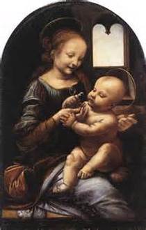
Painter, sculptor, architect and designer Leonardo da Vinci created some of the most famous images in European art. The picture to the right is of Mary and her son. Leonardo paints Mary’s blue dress in shades with different tones from black, to pale blue, to very light blue/nearly white. This demonstrates the Chiaroscuro Leonardo uses in his pieces. He uses a range of colours. What Leonardo said about his technique:
“I would remind you O Painter! To dress your figures in the lightest colors you can, since, if you put them in dark colors, they will be in too slight relief and inconspicuous from a distance. And this is because the shadows of all objects are dark. And if you make a dress dark there is little variety between the lights and shadows, while in light colors there will be greater variety.” |
Benois Madonna, Leonardo da Vinci, c. 1478
|
Trent Parke
|
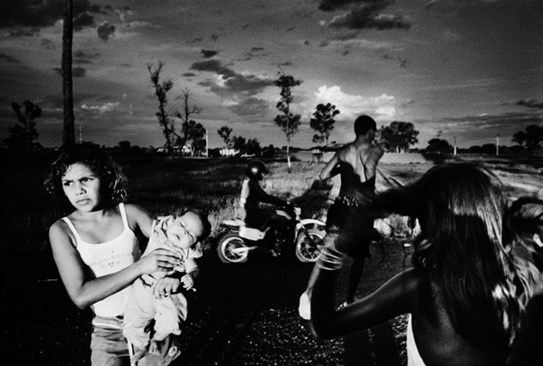
Trent Parke is an Australian photographer. In his picture to the left, Trent captures a wide range of tones in the foreground and the background. The lighter tones such as the white and the very light grey are in both the fore and back ground. At the front of the image, The young girls top, holding the baby, has the brightest tone in the images. In fact her whole figure is very brightly captured compared to the surroundings of her. I think there must of been a car light or something shining towards them because the images looks like its been taken the evening and the rest of the images is dark. Behind the young girl the tones start to get a whole lot darker. Towards the left of the image, the tones are very dark especially at the bottom where there are very greys and blacks. The tones then start to get lighter in the skyline. The dark greys and blacks start to turn into medium greys and some light greys in the clouds and on the grass in the middle of the images where the light source has obviously shone on it. The image has used the chiaroscuro technique well.
|
Michelangelo Merisi da Caravaggio.
|
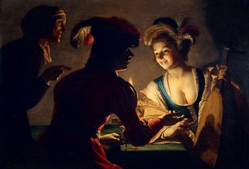
Michelangelo was an Italian artist active in Rome, Naples, Malta, and Sicily between 1593 and 1610. In his painting to the side, he demonstrates the chiaroscuro technique well. There is a mixture of light and dark techniques. The lighter tones are on the women. Her dress had very bright white tones on it but goes darker towards the bottom turning into a orangey colour. The darker tones are in the settings around the women. There are blacks, dark greys and even dark red in background. On the mans body there are light and dark tones. Caravaggio demonstrates the Chiaroscuro techniques well in this image. |
|
Tom Hunter
|
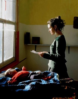
Tom Hunter is a London-based artist working in photography and film. His photographs often reference and reimagine classical paintings. In his image to the left, he has used natural daylight to clearly demonstrate the Chiaroscuro technique. The light is directly shinning onto the women and the babies head only. They are the only two subjects that are lit up by the sunlight. In the surroundings around them, there are much darker tones ranging from dark blues to black. In the background there are colours of white and yellow which are usually considered being bright and jolly colours however they have been captured to be looking dull and dark. This creates a down and sorrowful atmosphere. It also kind of creates a story behind the picture. When I look at this picture, what I think about is a women receiving a letter from the army letting her know of he husbands death maybe.
|
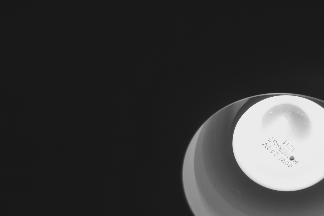
Experiments on Chiaroscuro
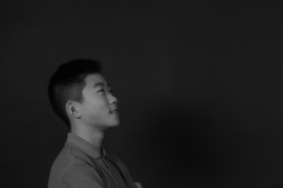
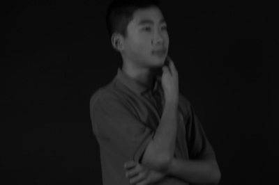
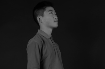
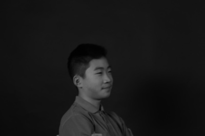
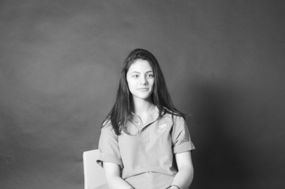
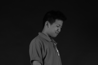
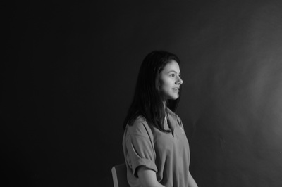
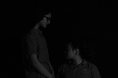
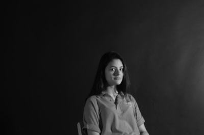
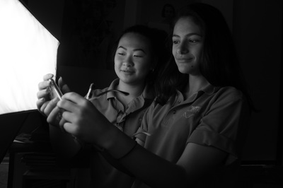
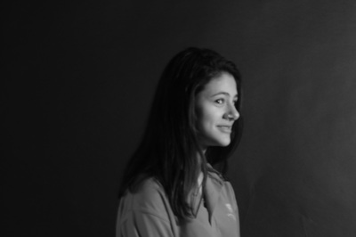
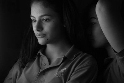
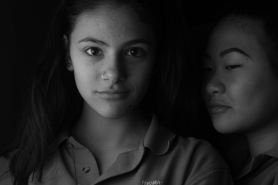
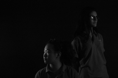
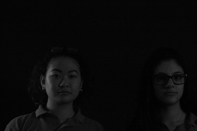
These are my first set of experiments on chiaroscuro. I think that they have turned out well. As a group we tried to make sure we got a balance of light to dark and made sure it was facing the right angle so it contrasted well with the light. Some of the images turned out better than the others. For example the first and last images didn't turn out so well. This is because there wasn't enough light let in the image. This caused the image to come out with just dark grey and black tones. The first image on the 3rd row also didn't turn out so well either. However this was for the opposite reason. This time in this image, there was too much light exposed into the image. This is why the subject in the image is much more brighter than the background and then all the other images. Images that turned out well though was the 1st image on the 2nd row and the last image on the 4th row. These turned out well because the light was balanced well with the darkness, which created a lovely contrast between the two. For example in that last image on the 4th row, there is a good balance of dark and light. The light has been let in just the right amount. You can see this by the background being pitch black and then the only light being let on the subject.
Image Based On Edward Weston's Pepper.
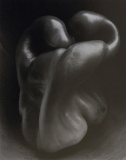
When I first looked at this image I couldn't really tell that it was a pepper. To me, it looked like a foot at first, form a far distance, and also looked a bit like a tongue. Once I got told that it was a pepper, I kind of started to a see the figure of it. The picture has been taken in black and white, which gives us a clear view of the light and dark chiaroscuro. The darker aspect of the image is mostly at the back, behind the pepper. The light, I think, has been shone from the top right hand corner, shining directly onto the pepper. This is where the lighter tones in the image are. The in-between tone of the greys are mostly on the left side of the pepper, mostly on the top half. Weston has clearly thought about the composition well and has thought about the lighting well due to the fact that he has effectively captured the Chiaroscuro effect.
|
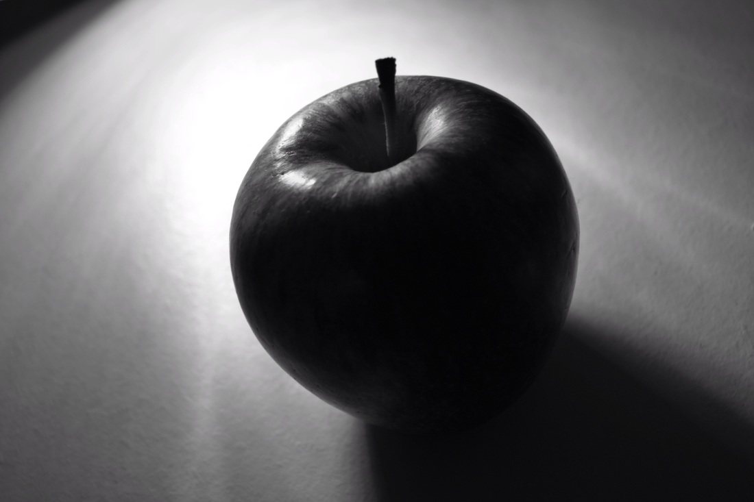
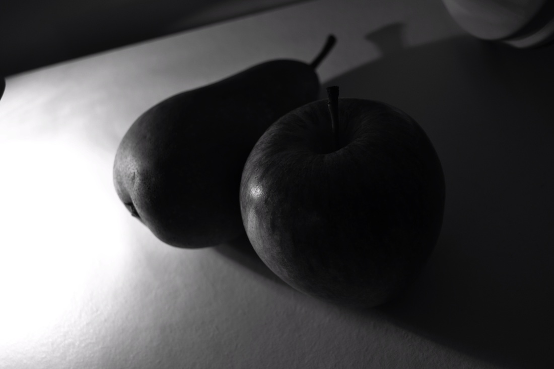
This is a image I took which I have based on Weston's pepper image. I have focused it on one object like he has done with the pepper. Instead of the pepper I used an apple. To take this image I used my iPhone and the monochrome effect on it. I used a lamp as my light source for the image. The direction of the light was coming from the middle left corner. I think that I have captured the chiaroscuro effect well as there are a mixture of different tones in the image. The lighter tones are at the top of the image as that's where the light source is coming from. The darker tones in the image are from the shadow given off from the light. The rest of the image has a mixture of light and dark greys. I think the image has been captured effectively as it has come out similar to Edward Weston's pepper piece. |
|
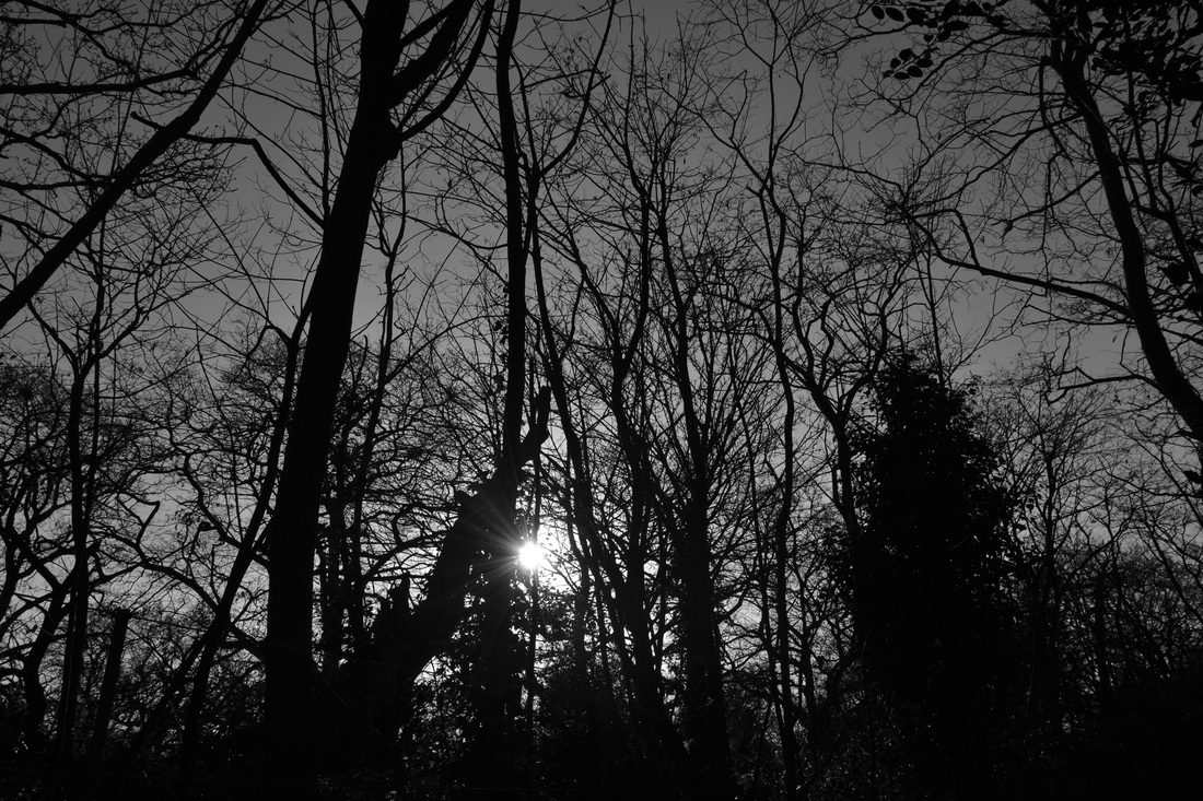
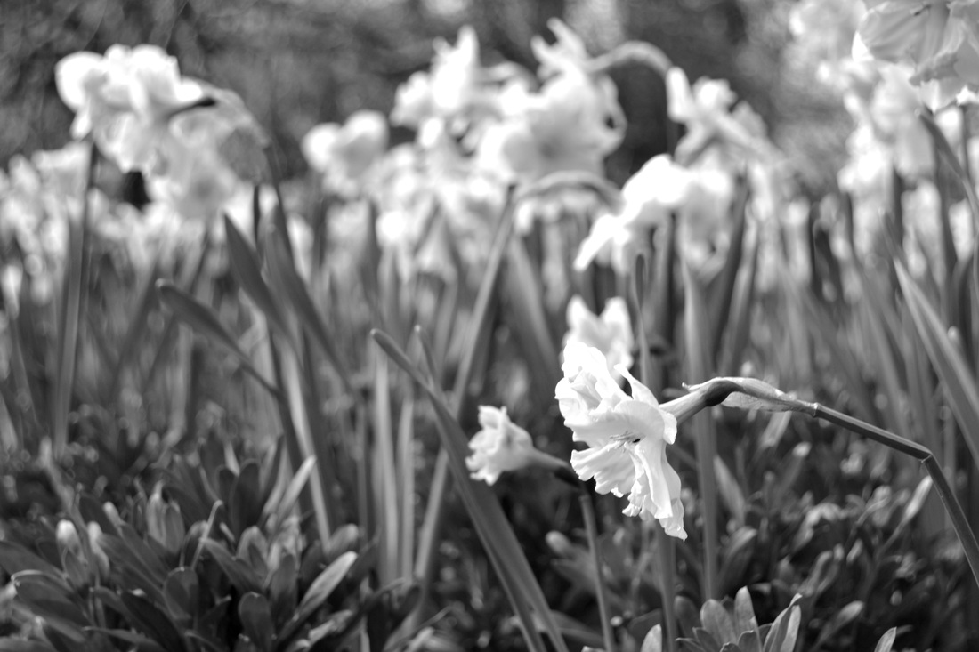
Natural Daylight images.
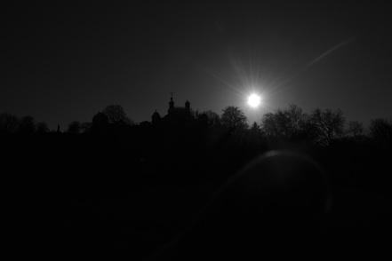
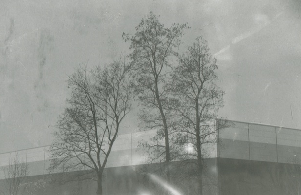
In this image, I've captured the natural daylight of the sun directly. Because I have done this it has created a big dark outline of all the trees and the buildings. The tines go from medium to light to dark in the image. At the top of the image, the tones are dark however they aren't completely back. They are a sort of grey that becomes lighter in the middle of the image. In the middle there is a bright tone on the sun. This is the only main bright tone of the image. The tones then switch to a deep black showing an outline of the setting in the image.
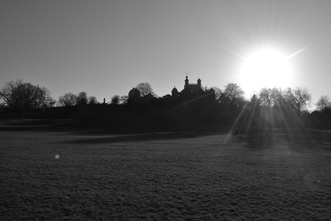
In this image there is a mixture of both light and dark tones. It has a balance of both the tones. The background has a simple light grey tone to it. The sun again had the brightest tone in the image and the surroundings of the sun have bright tones as there is light shining on it. The dark tones are the strips of tree trunks and branches. There are a lot of trees spread out across the image which gives a wide spread of dark tones.
|
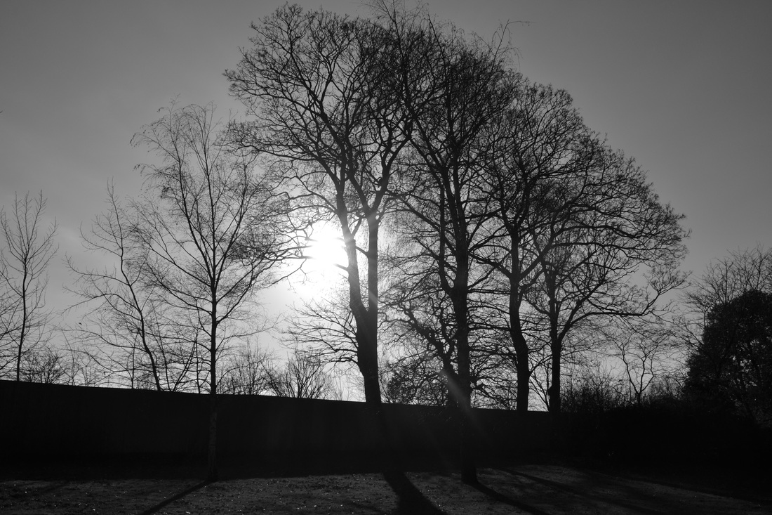
This image is similar to the image to the left. However it hasn't been captured with as much darkness in it. The sun has come through a lot more on this one. There are mostly bright tones in this image. The dark tones are in the outline of the setting and the shadows on the grass caused by the sun. In the top half of the image the tones are very bright greys and the white from the sun. In the bottom half of the image, the tones remain quite bright. Apart from the dark tones in the shadow, there is only a medium grey tone running through the bottom half.
This images is similar to the others as well. I have focused it on trees again and used the sun as my main light source for the image. In the top half of the image, there are brighter tones then the bottom half. The darker tones in the bottom half are deep blacks. The blacks are also in the outline of the trees again. The lightest tone comes from the sun like in the other three images. The sky has a simple grey tone to it again giving the whole image a equal balance of all the tones.
|
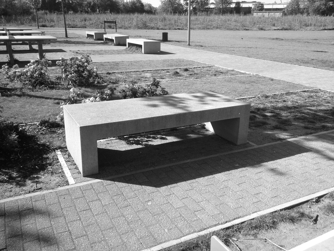
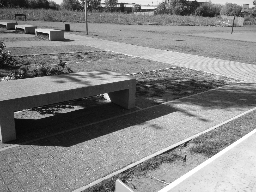
Experiment Images
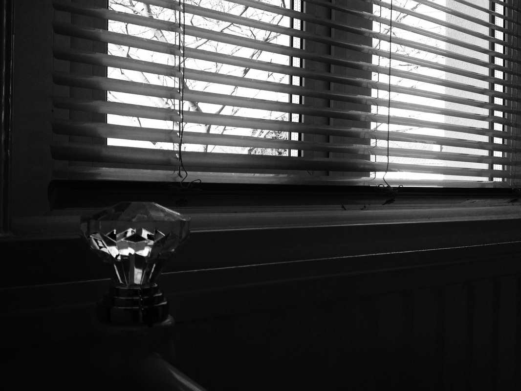

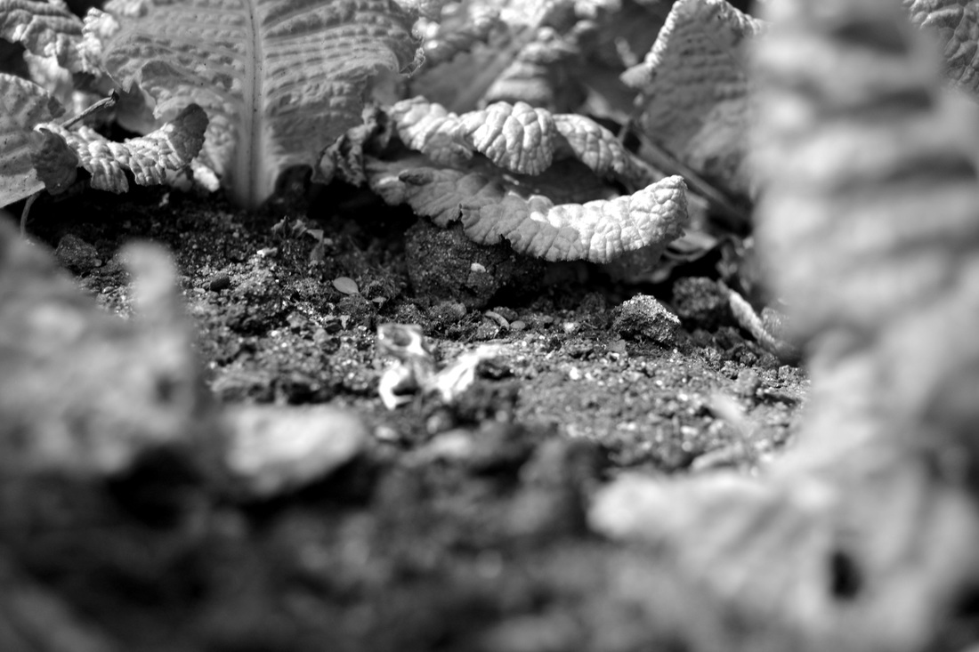
During the half term we had to take images based on the Chiaroscuro. To take the images I used my DSLR camera. I took these images around the house and also at the park and in buildings. Throughout the images I tried to get as much of the light and dark in the images as I could. In some of the images, there is more light then dark and in some of the other images here is more dark then light. I think overall the images have worked well as there is a contrast between light and dark in each of them. I think the image at the to in the middle was one good example of contrast. You get this bright light in the corner of the image but then all pitch black around it which created a good contrast. However you can see some tones of grey in there too. To improve, I could have tried to capture a deeper contrast of the tones in some of the images.
Pinterest.
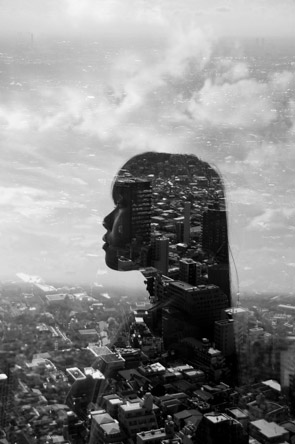
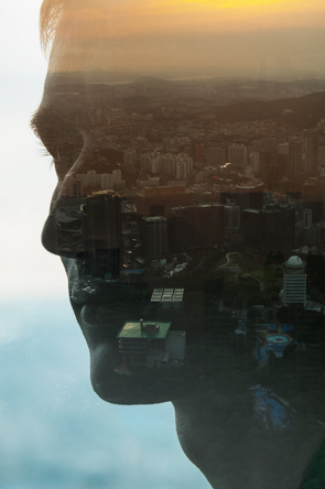
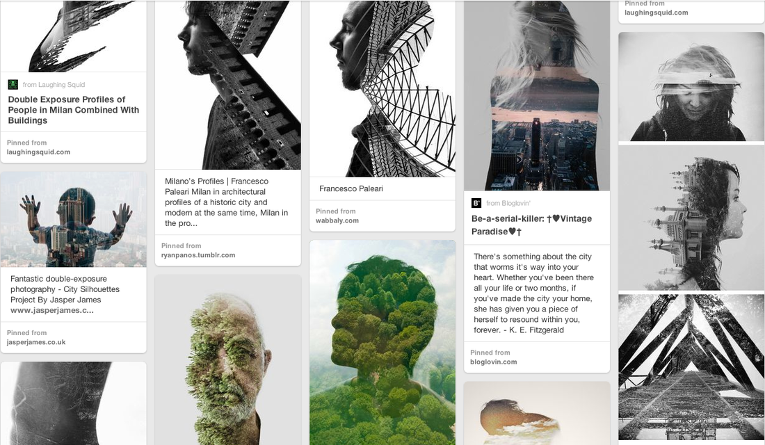
Jasper James: City Silhouettes.
|
Jasper James is a China based photographer working in Shanghai and Beijing. Over the past decade he has lived and worked in New York, London and Beijing, covering assignments around the globe for some of the worlds leading magazines, design and advertising clients. In his images he transfers silhouettes of people in the city he is in, onto landscapes of the city he's in. Also in some of the images, on top of the silhouettes he adds a faded out image of another environmental setting. I want to have a go at creating some images like these myself and explore Photoshop as I am not too confident with it. |
|
|
|
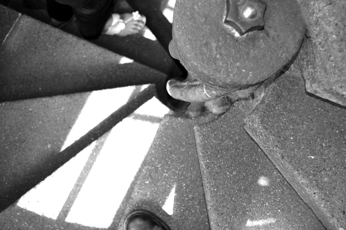
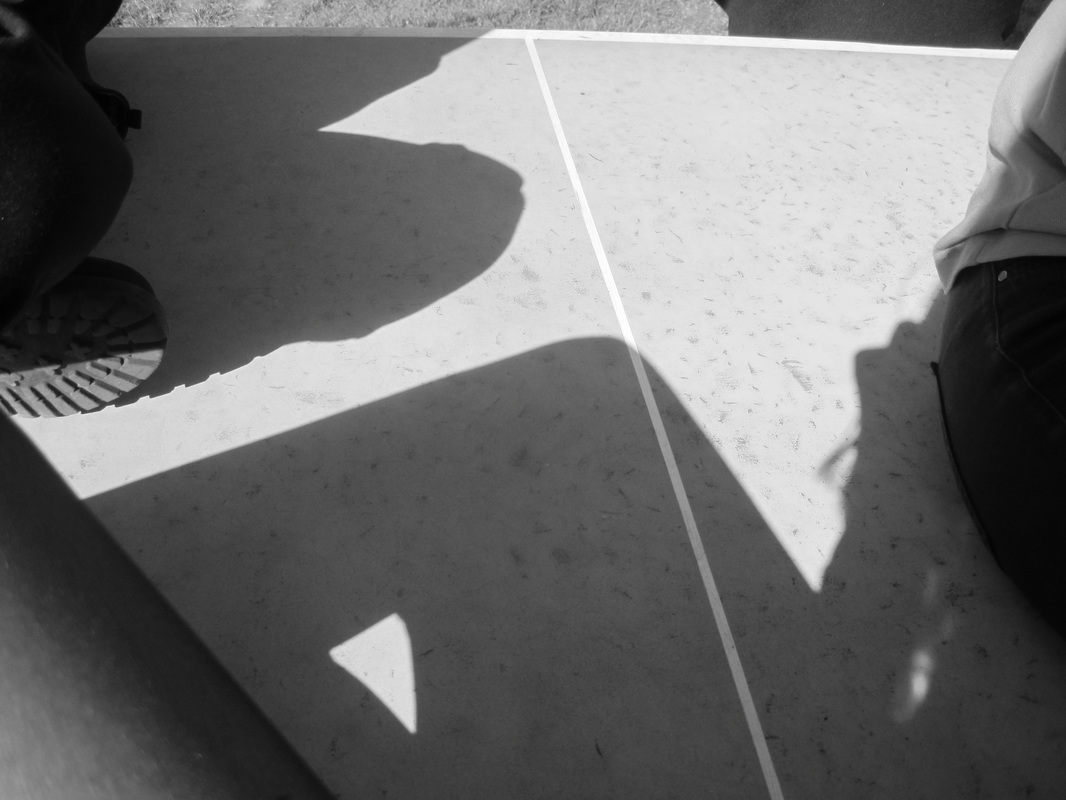
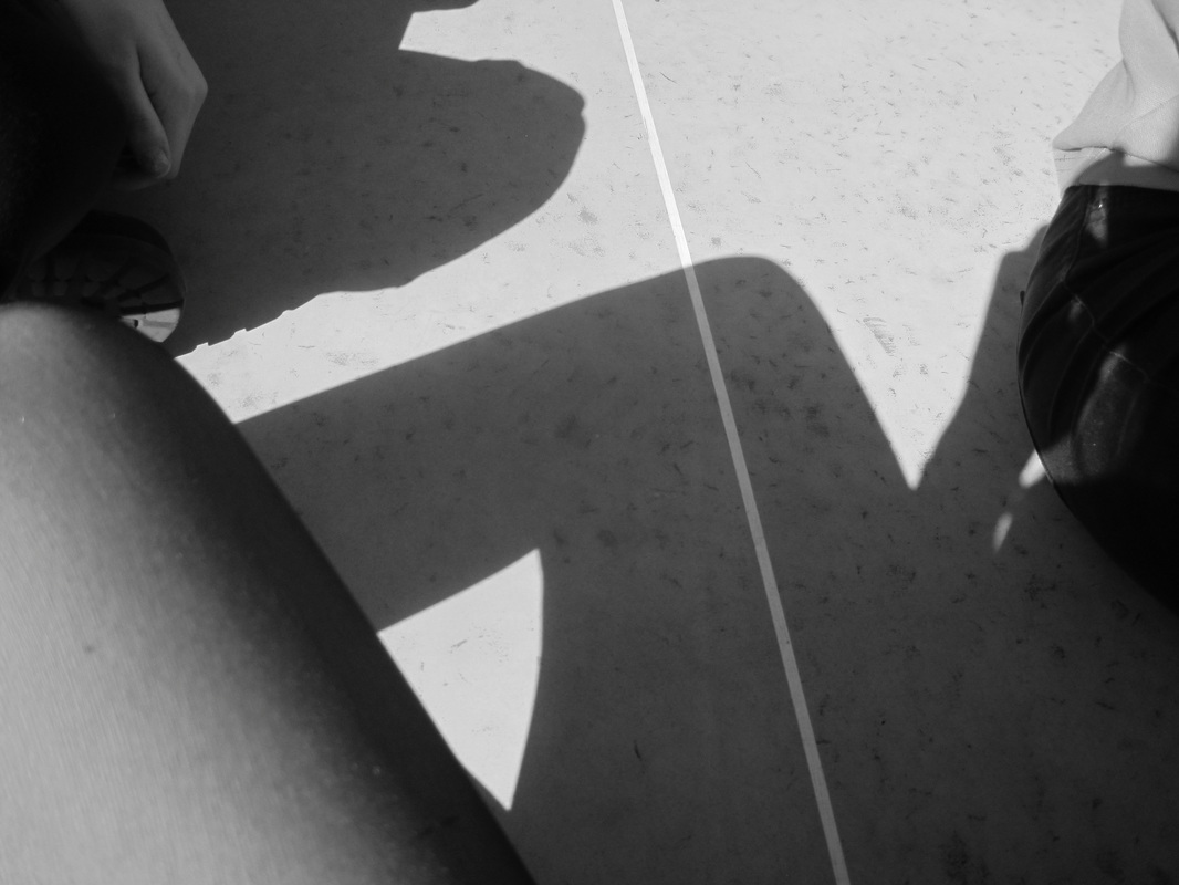
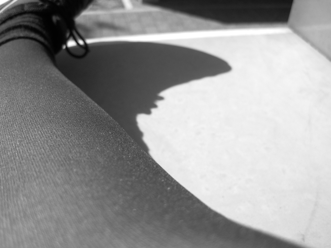
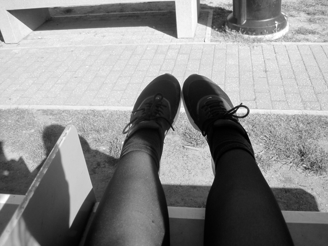
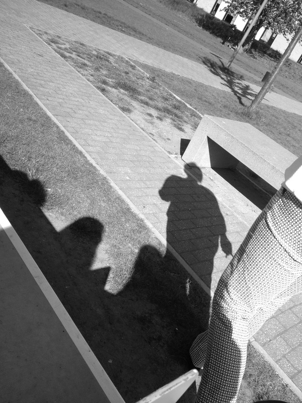
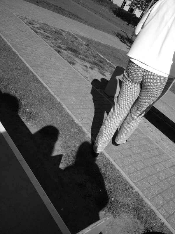
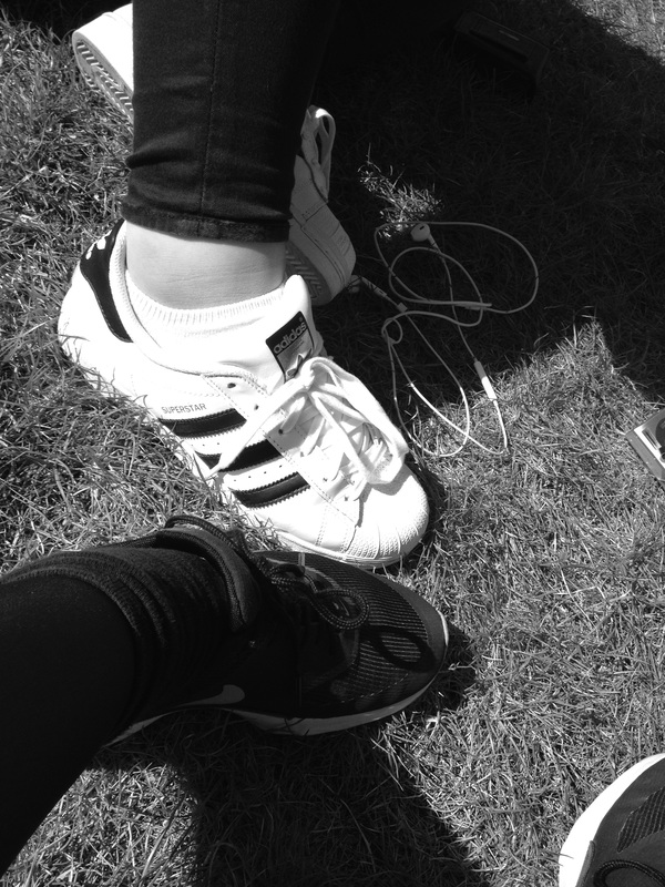
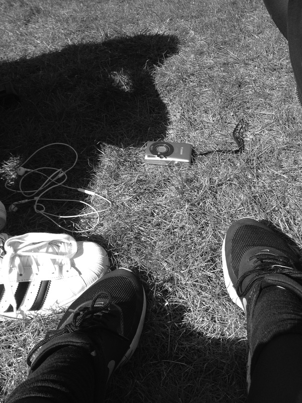
These were images I had taken with a digital camera. I used a digital camera because I wanted to experiment with a different type of camera instead of just using the same over and over again. I based my images partly on nature, because I wanted to use them to experiment with photoshop and create some images based on Jasper James' pictures. I based my other half of images on shadows because the weather was nice and i could capture some interesting shadows. Using some of these images, I want to go onto photoshop and experiment on creating images the way Jasper James does. I'm going to take some pictures of faces and people and use the nature images above to create the images. In some of the images there is a clear contrast between black and white as well. For example the last two images have created a contrast between the white and black shoe, but also the dark shadows and the light that is shining on the grass. I feel like some of these images are successful however I need to take some body or facial images to go along with the nature images. |
Another Set Of Images.
|
|
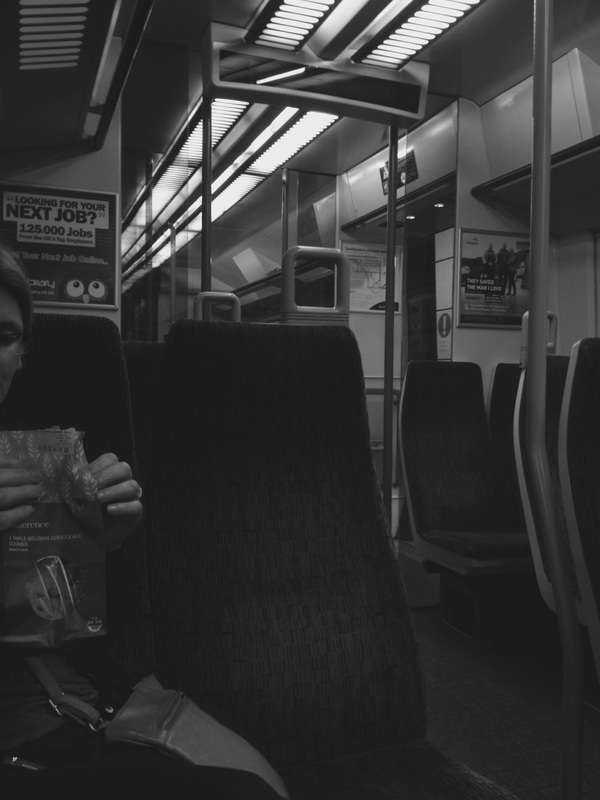
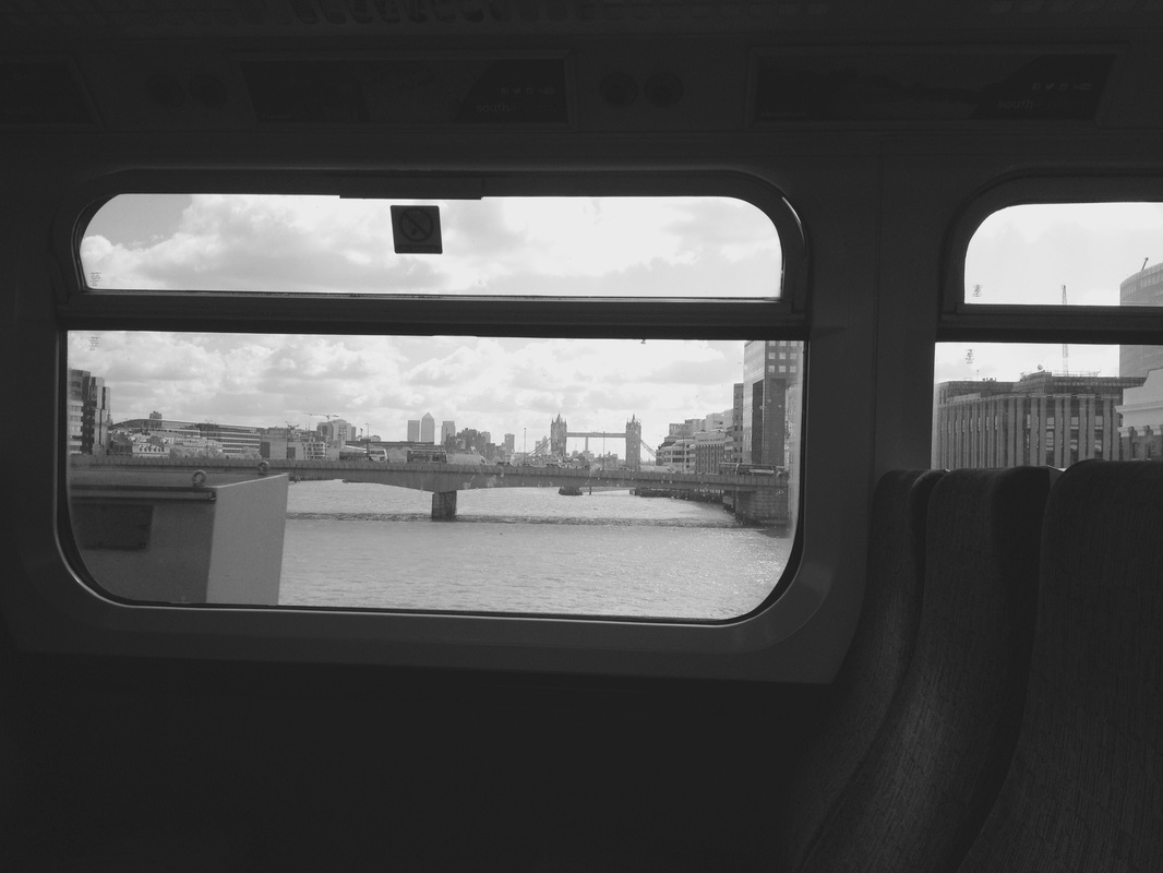
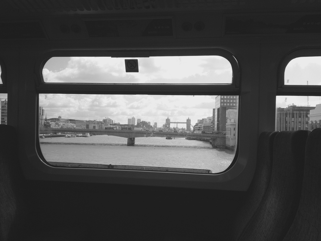
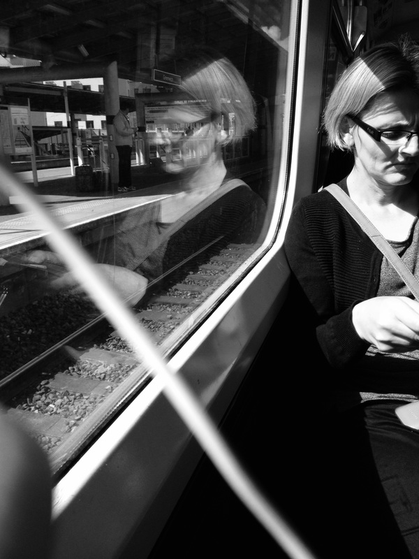
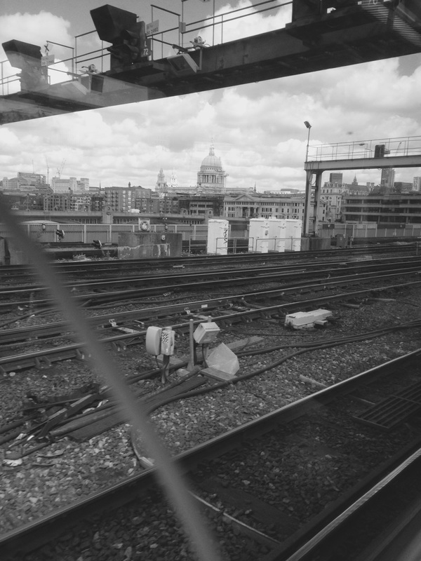
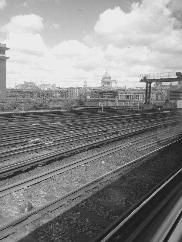
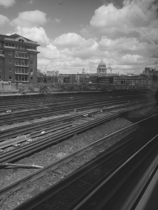
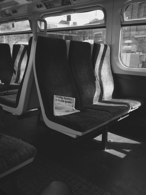
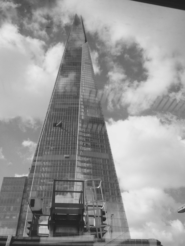
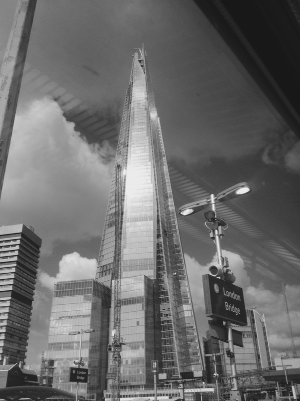
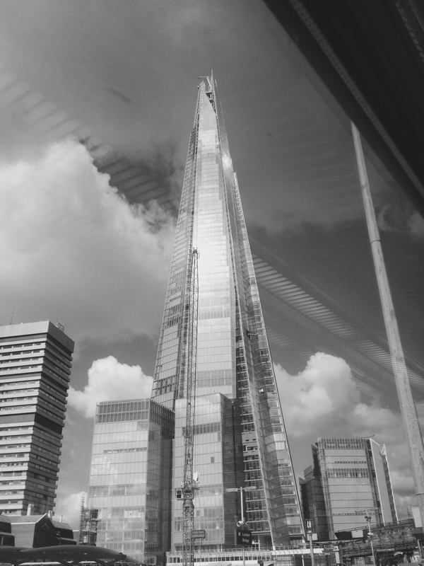
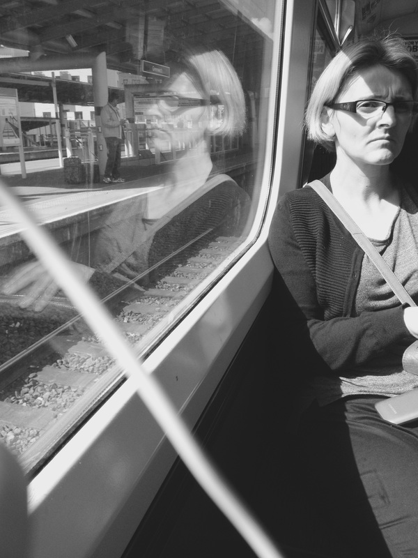
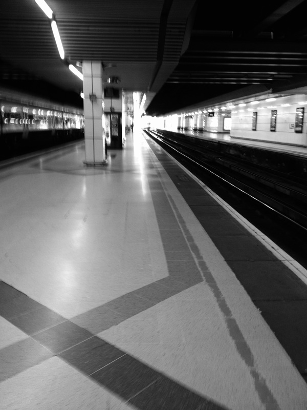
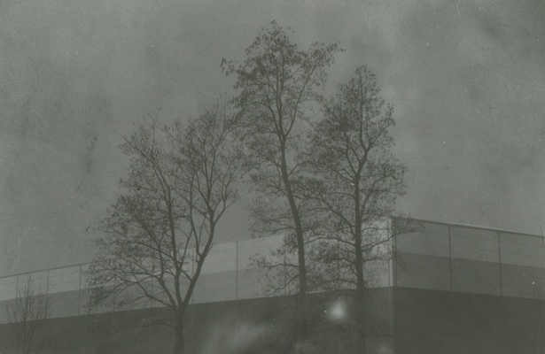
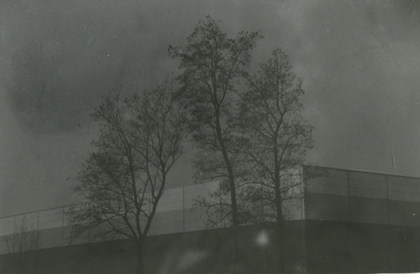
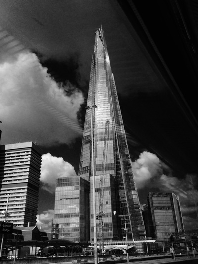
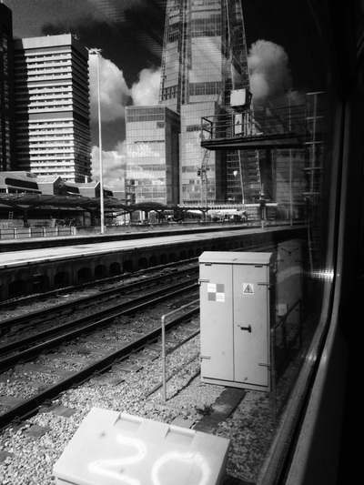
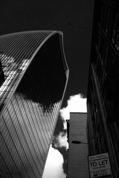
These were some images I took in my spare time out side of school. I have taken them with a iPhone camera, and taken them on a train. I used a black and white filter on the camera because I thought that using a black and white filter would show the contrast between the light and dark more. In my images I wanted to base them on light and dark contrast and having the black and white filter, I thought that it would be clearer to see. One of my favourite images that I have taken is the 5th one of the building. This is because I like how it the sky has reflected onto the glass of the building and how it has made the image look different. Also in the image it has a clear light and dark contrast, which shows that it has been a successful image that I have taken. The light and dark contrast has also created shadows, which is another element I have added in the images. This is seen in most of the images to the side for example in the 9th image of the chair on the train. The sun has come in through the train window but has only leaked in through part of it, creating and interesting shadow shape on the chair.
|


First Experiments.
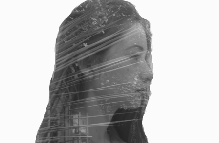
These are my first experiments done on Photoshop. I think that these were good first attempts on using Photoshop I think that the first one was was good attempt. I tried to follow the kind of pattern from the research I had done on Jasper James. I think all of them were based on that actually, they all follow the same pattern. I think that the image that turned out the best is the 1st image. This is because the image there is a big contrast between the image of the figure and the background image. I think the image that didn't work so well was the image of the bigger side face as the background image wasn't my own picture and the image of the face didn't work well with
To move on and improve from these images, I am going to take a few more images on natures and backgrounds, like buildings in my spare time. Then also I am going to take some images of figures and parts of the body and try and combine them both together and get images like the ones before and maybe end up using them as a final piece.
|
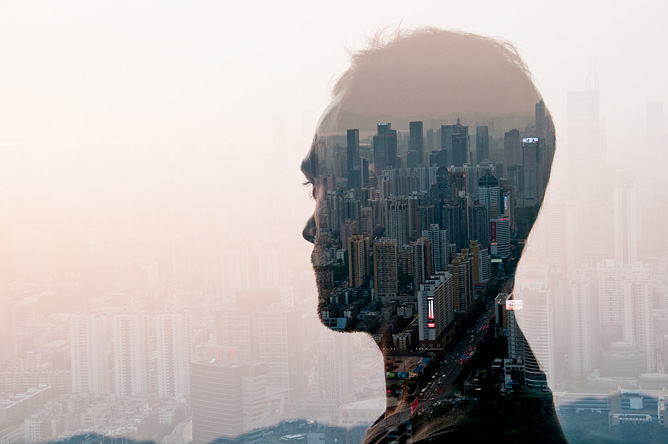
I've gone onto Pinterest and looked at some more artists that do similar work to Jasper James. One artist I found was Paleari. He does a similar thing to Jasper however he has his images on a plain white background, instead of having the city silhouettes or the nature images as the whole background. I'm going to research Paleari's work and look at some of his images and see whether i can take some images to create some similar pieces of work on photoshop. |
|
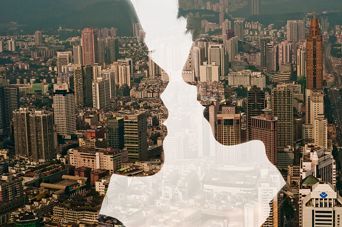
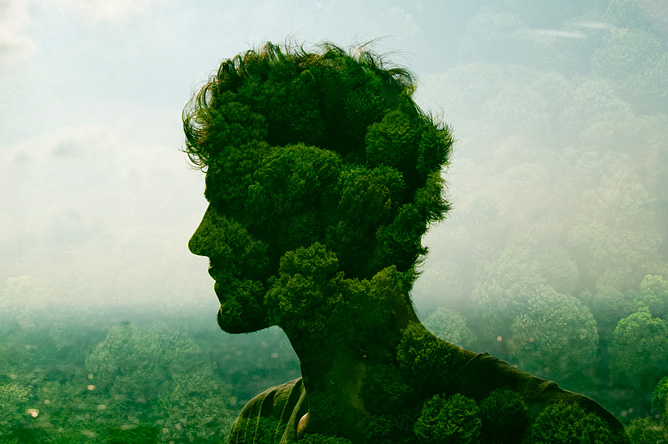
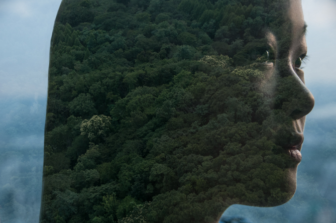
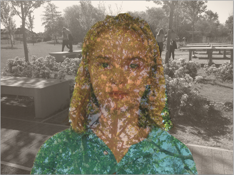
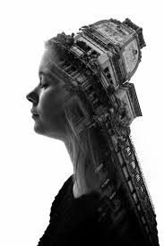
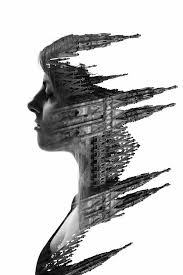
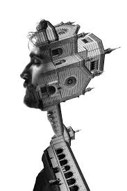
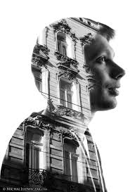
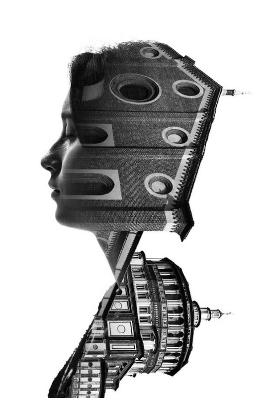
Francesco Paleari Double Exposure.
|
|
In this double exposure portraits series, Italian photographer Francesco Paleari
mixes the architecture of Milan with faces from the people of the city,creating
magnificent monochrome compositions. The beautiful black and white images present a myriad of Milanese architecture and landscapes. Each portrait is both dramatic and peaceful, giving a unique look at a artistically rich city and its people.
As you can see from the images to the left, Paleari uses the shapes of the buildings to create the right side of the image while maintaining the facial features of each person on the left. " A tool to extract and fix particular aspects of reality " -how Paleari describes his camera.
|
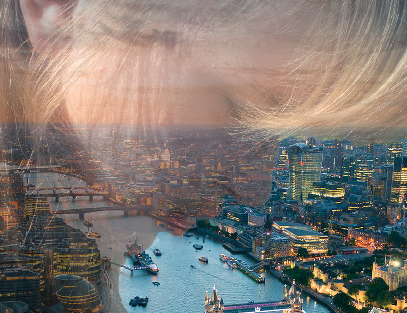
To move on from this I will be taking some images of faces and buildings around London to have a go at creating images like Paleari's, however I might also take some images of different body parts and have a go and see if it works with them. I'll go onto Photoshop and experiment and see whether I can get similar images or maybe even different looking type of images.
    |
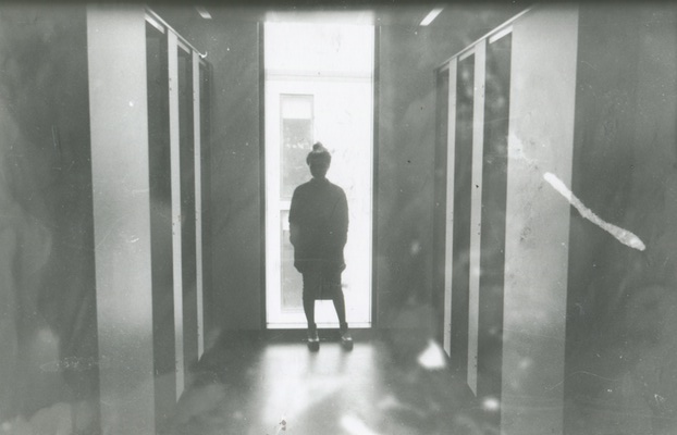
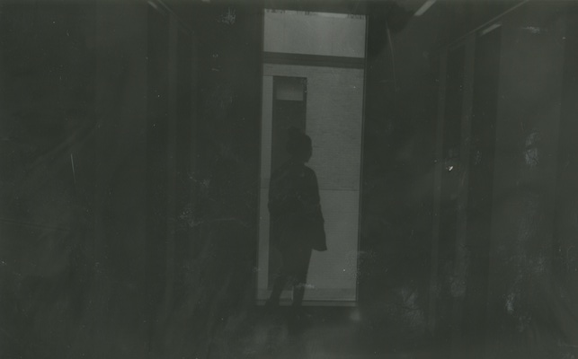
These are one of my experiments I have created in the dark room. With these images I used one single image but developed it 4 times. In the first image I wanted to make the image come out quite bright so I let the exposure of light onto the image for about 9 seconds. For the next image I wanted it to still be quite bright but not as bright as the first development. This time I let the light expose for about 7 seconds. Again the image came out quite bright but the figure was darker then it was in the development previously. For the third image again I wanted to make it darker then the two images before so this time I let the light expose onto the image for about 6 secs. The image came out darker then the images before which is what I wanted to happen. Finally the last image turned out well too. I let the light expose onto the image for about 4 to 5 secs and this worked out well. The image turned out how I wanted it too and turned out darker then all the other previous images. I think that the images as a whole turned out well. |
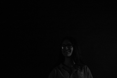
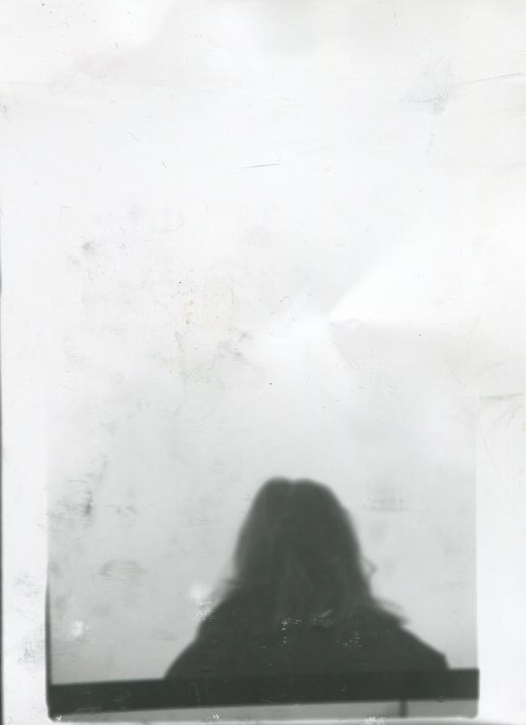
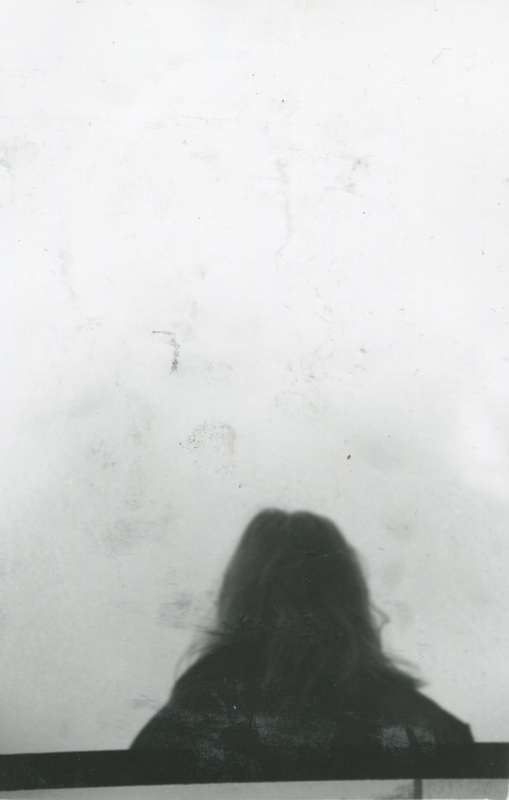
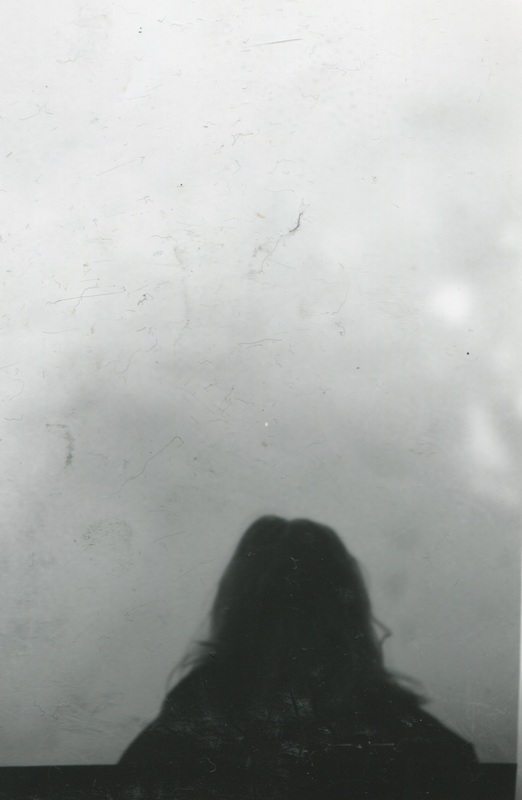
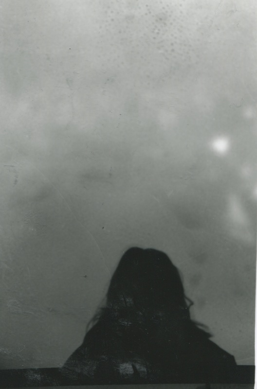
This is another film development that I have done. I took the images with a film camera and then developed it in the dark room with chemicals. I think that one image worked better than the other image which of course would be the first image. This is because when developing the image, I let the light expose for less amount of time then the second image so the image came through more. I think it really shows the chiaroscuro of the image with the light making her figure look like a silhouette. The background also has a range of black, white and grey really allowing us to see the colours. With the second image I let the image expose for more time which meant that the image turned out darker then it should be. I would've liked it to turn out like the first image as I think they would've looked well together.
With these images, I tried to do the same as the very first images I developed in the dark room. Again I took these images with a Film camera and the developed the film in the dark room. With the images I wanted it to turn out like the images of the girls head having on image darker then the others. With the first image I let the light expose on the image for about 5 seconds making sure the image will have enough light for it to come through clearly. With the second image I let the light expose on the image for about 7 seconds to make sure the image will have enough light for it to come through clearly. Finally with the last image I let the light expose on the image for about 10 seconds again making sure that the image has enough light for it to come through but not as much as the other image. I think this worked better as you cans till see the original image clearly.
Final Pieces
Going through all my work, I went through and had a look at all the images I created and tried to work out what images looked the best and which images I thought summed up the whole project so could use them as my final piece. Below are the images that I think are the best images that I have created within the whole project.
Evaluation.
These are my set of final pieces. I decided to choose these as my final pieces as I like the way they all go together and how they all contain the theme of chiaroscuro within them. I like how they all are quite dark and have aspects of light in them but the way the black and white are makes it really interesting. For example the black is either really dark black or the white is really white which makes them really bold and stand out. I took these images with a iPhone and I think this was a good think as it allowed me to focus clearly on what I wanted too. The thing that I like most about my images here is that they all really are bright and bold even though they don't have any other colour apart from black and white. The other thing I really like about the images is how they all contain buildings within them and every day to day lifestyles. For example the first image has a massive building in the centre of it.
